
An Italian retreat, located high on a Tuscan hillside, near Florence
elevate: project three . . .
For my third, and final ELEVATE with Fiona Humberstone project, I selected an Italian retreat, VILLA FLORES, (or VILLA FIGLINE VALDARNO as Fiona had named it!) Located high on a Tuscan hillside, this 18 roomed agroturismo, is 15 minutes from Florence, amidst an award-winning vineyard, olive grove and productive kitchen garden.
The stunning Italianate villa is currently decorated in the very dark, heavy local vernacular style. The new owners have an incredible vision for the restoration of the house, garden and estate, and by breathing new light into the building, they hope to attract a new type of guest. Their classic, calm and understated style will be reflected throughout the house, garden and pool area.
Tuscany, and Florence in particular, is renowned for great food, wine, art, music and opera – passions which the owners are keen to share with their guests. As well as offering a calm, restorative retreat, they also plan to include painting workshops, opera retreats and a spa offering specialist treatments. There will also be an on-site restaurant which will showcase the very best produce that the estate has to offer.
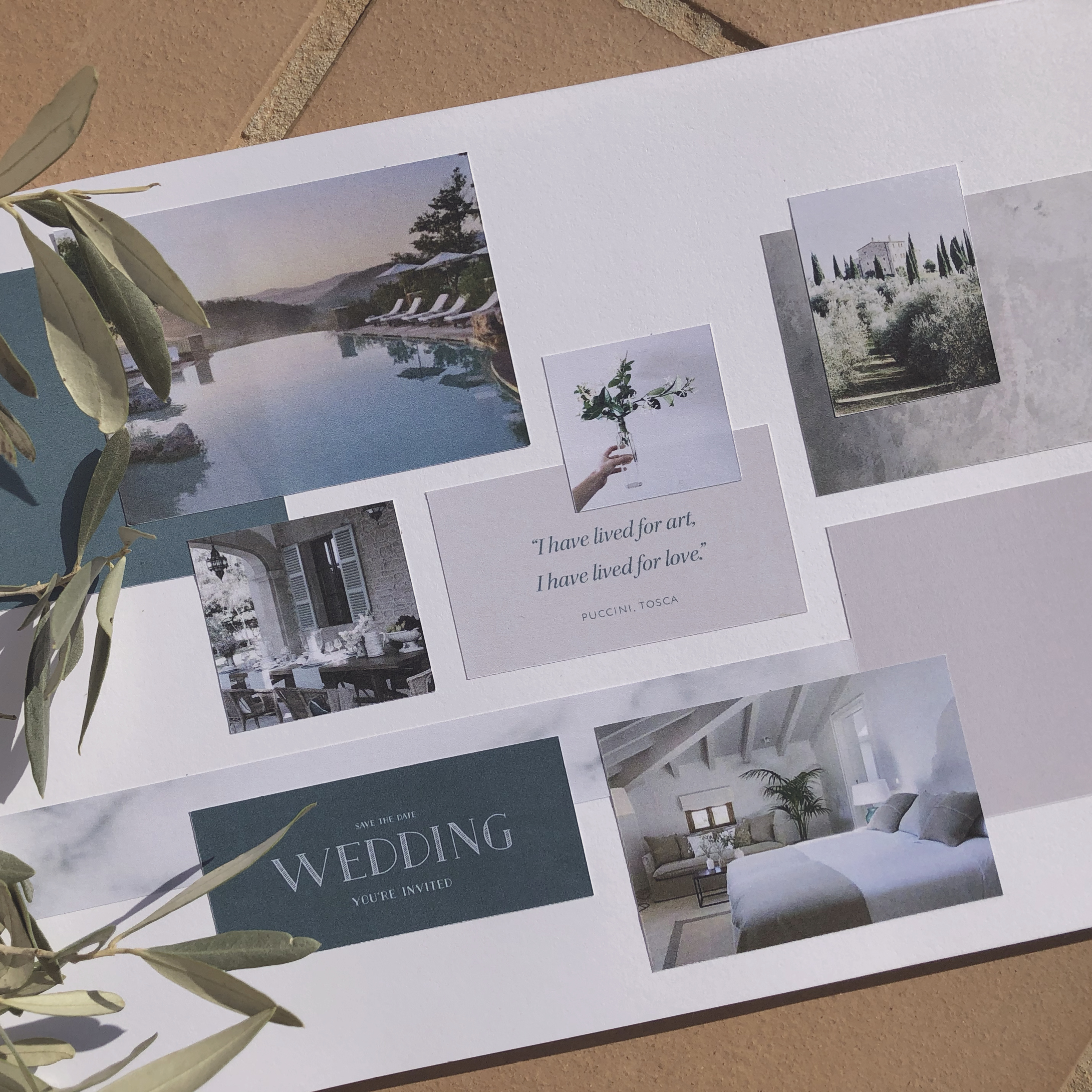
Wow, don’t you just want to go and book a retreat there right now? This brief spoke to me on so many levels – I mean, food, wine, art, music and opera – honestly, what’s not to like?! After some extensive research on the area, the culture, and the local flora and fauna, I created a concept which I loved. I will share more as time goes on, but for now, here is the mood board reflecting the design direction.
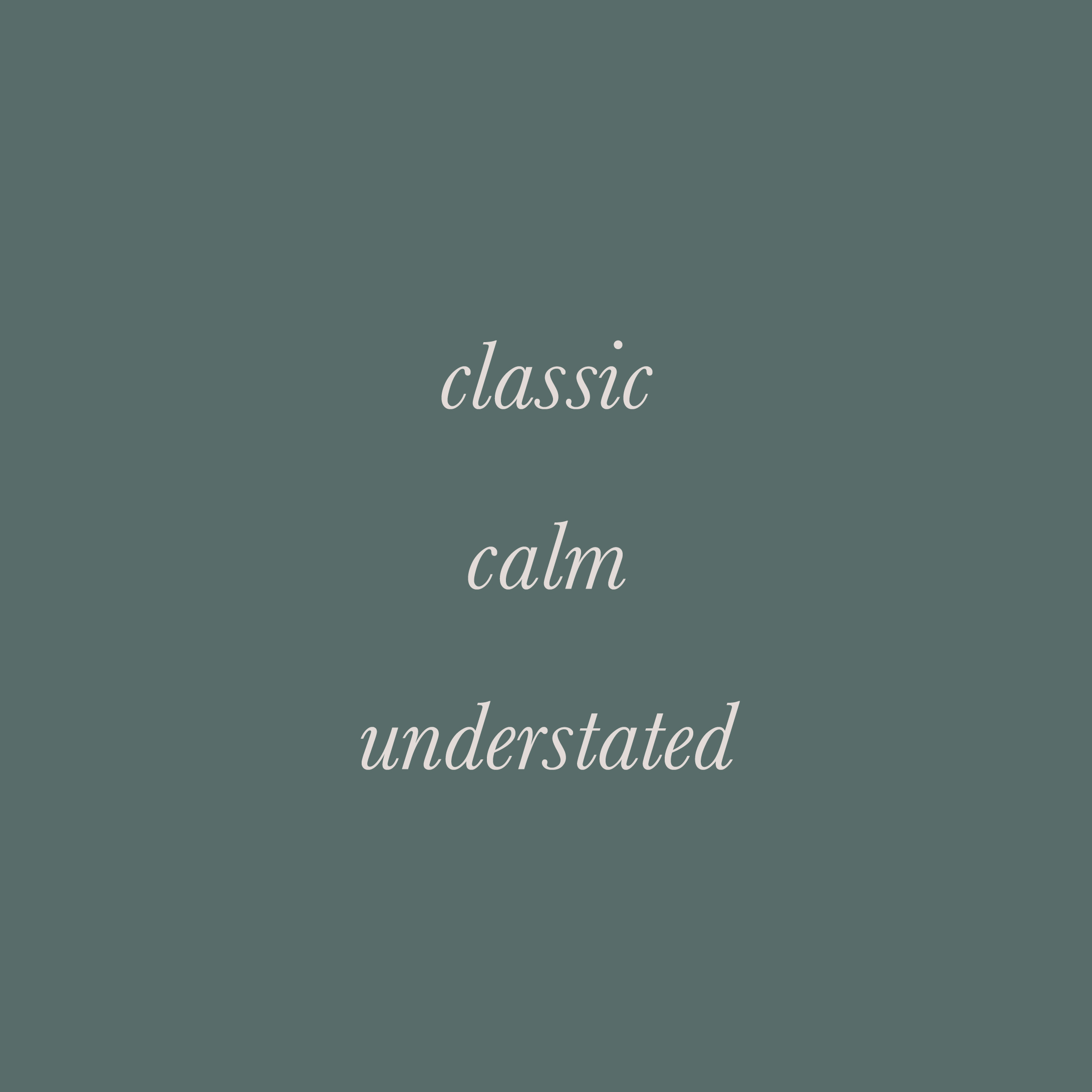
Can you define the essence of your brand? If you can distill the essence of your brand down to three brand characteristics, you will have the perfect starting point to create an intentional brand identity which you can be proud of.
Shown here are the brand characteristics for VILLA FLORES.
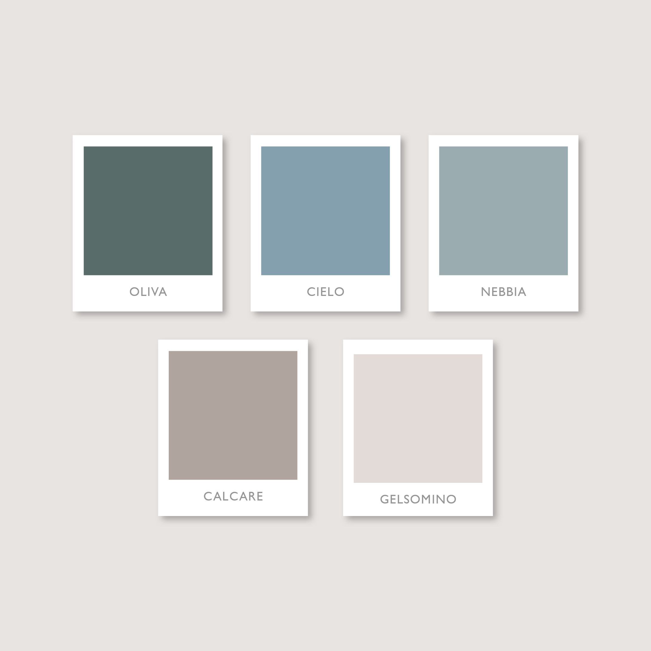
Oh my, I am so in love with this colour palette! This stunning colour palette is the one I created for VILLA FLORES. These soft, faded colours, are evocative of a summer spent under the Tuscan sun: the soft sandstone of the buildings, whispery blues of early morning skies, pale cream of the sweet scented jasmine and dusty greens found in the olive groves.
VILLA FLORES truly is the epitome of classic, calm and understated style.
I took inspiration from the classic Italianate architecture found in the area; referencing the famous Iris Fiorentina. The “giglio”, as it is known locally, is a decorative emblem which can be found on fireplaces and floor tiles throughout the Villa, as well as on the crest of the Flores family.
The serif fonts are a nod to the historical stone carved inscriptions and signs found in local towns and villages all over Tuscany.
The classic, timeless style of the brand identity which I created, echoes the vision that the owners have for VILLA FLORES. It adds to the sense of history of the Villa, but at the same time it has a light, modern influence.
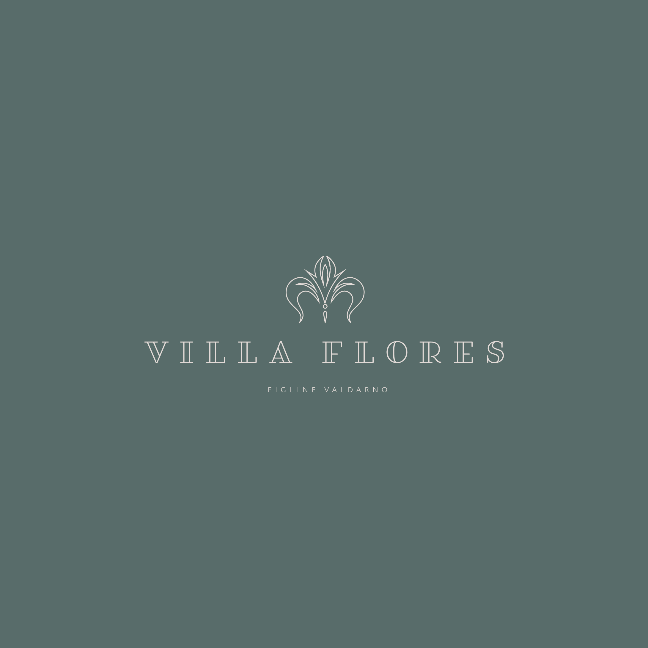
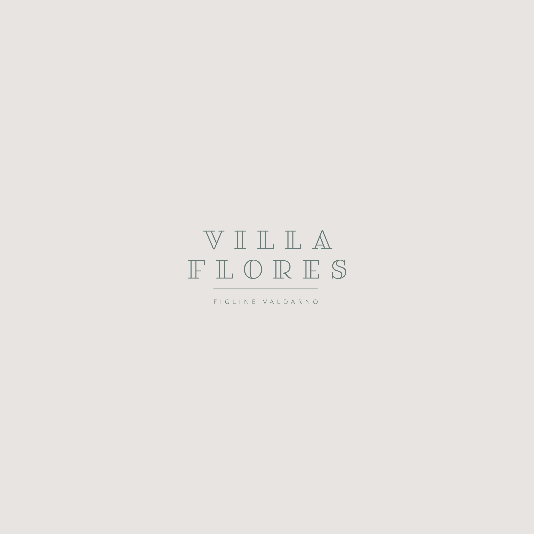
Sometimes, simplicity is enough. As well as the primary brand identity, I also created a secondary brand mark for VILLA FLORES. It showcases how stunning typography and layout, along with exquisite letter spacing can be used to convey the classic, yet understated style in a pared back way, but one which still perfectly reflects the brand message.
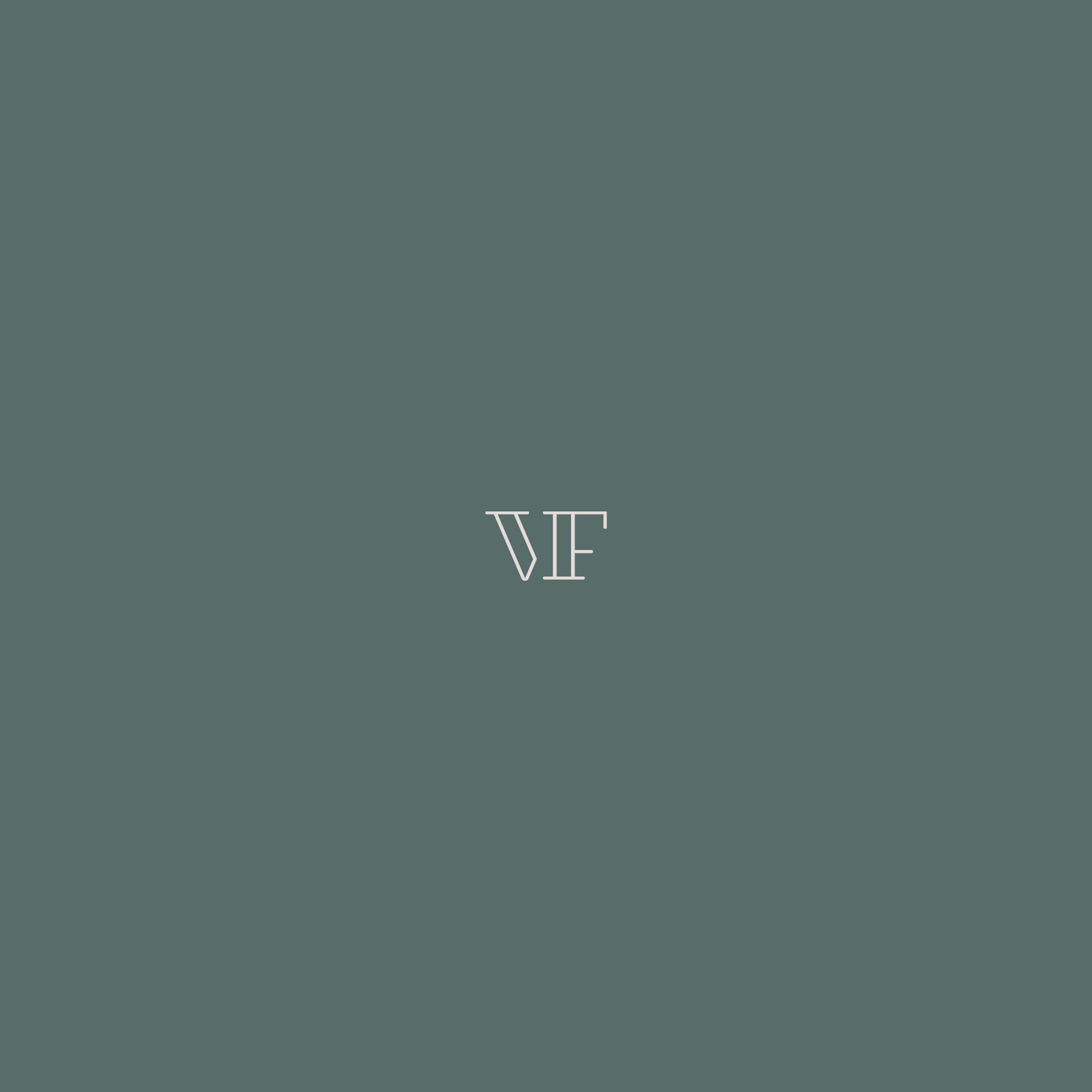
These days your brand identity has to work across many media types and platforms – everything from printed marketing collateral to online profiles. How you make your brand identity work on your social media profile for instance, can be a little tricky. One way to overcome this is with a gorgeous monogram or brand mark, such as the one I created for VILLA FLORES.
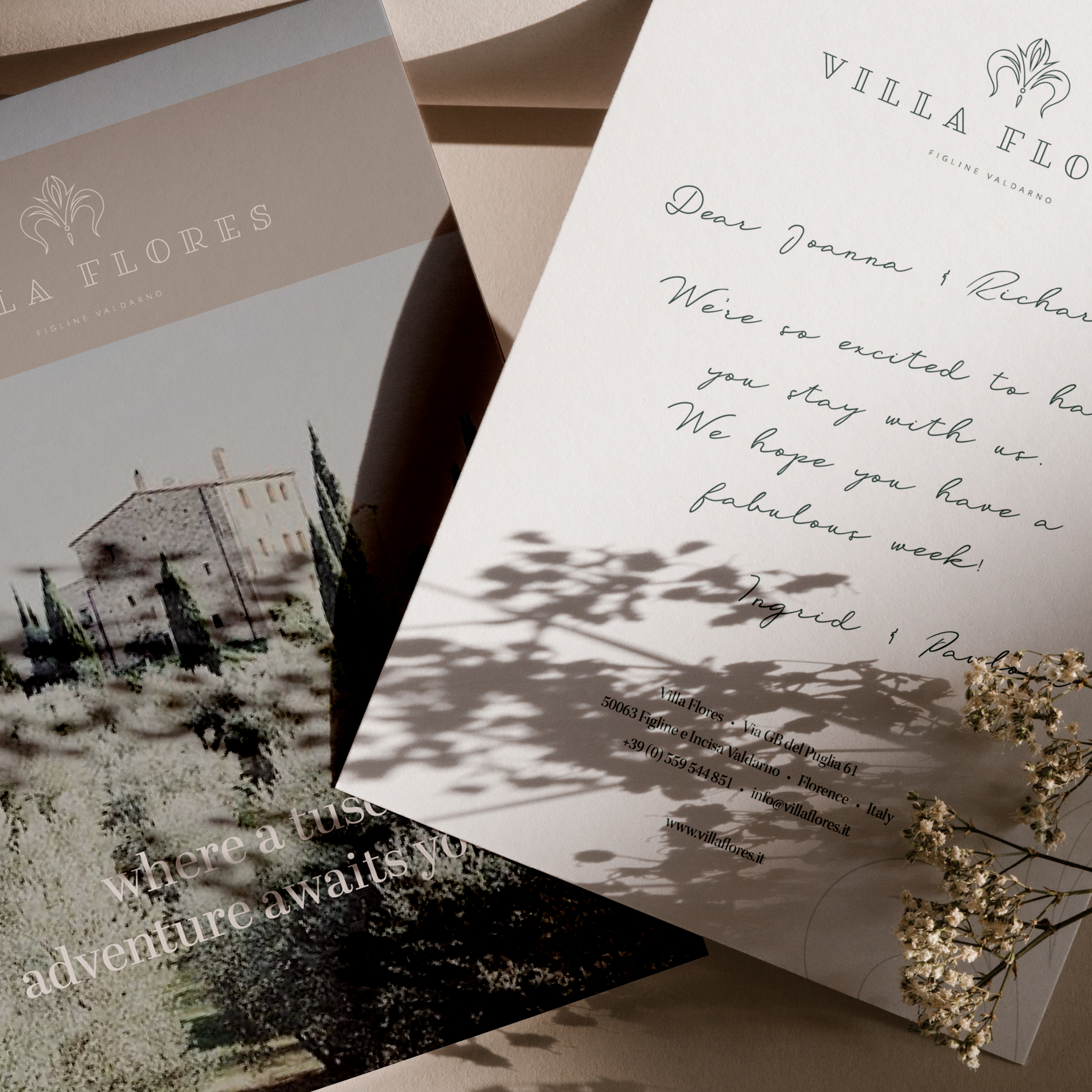
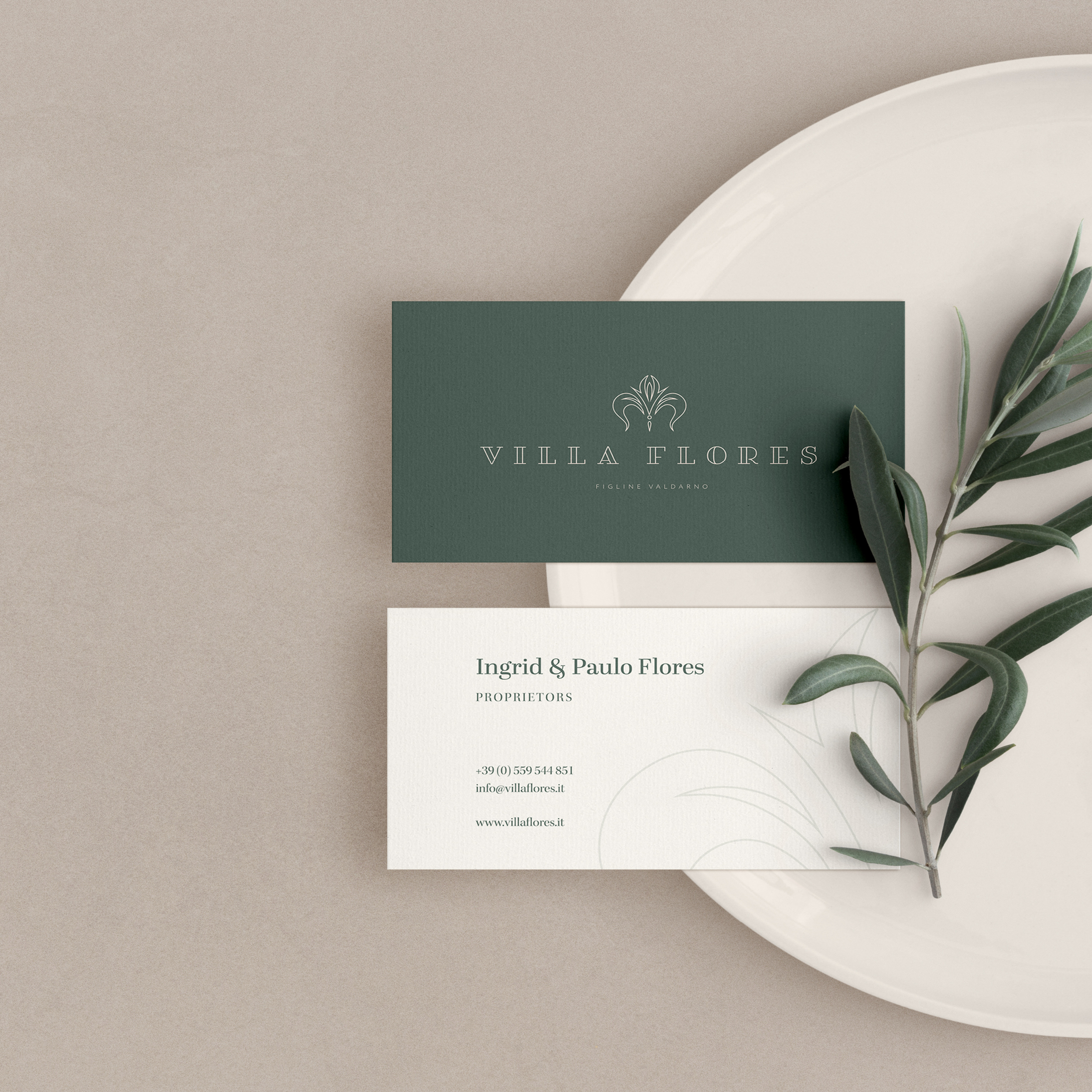
Creating brand mockups really brings a brand to life, especially if those mockups are so “on brand” for your client. I think you’ll agree, that this one from fits the VILLA FLORES brand so perfectly, it could have been custom made, just for them.
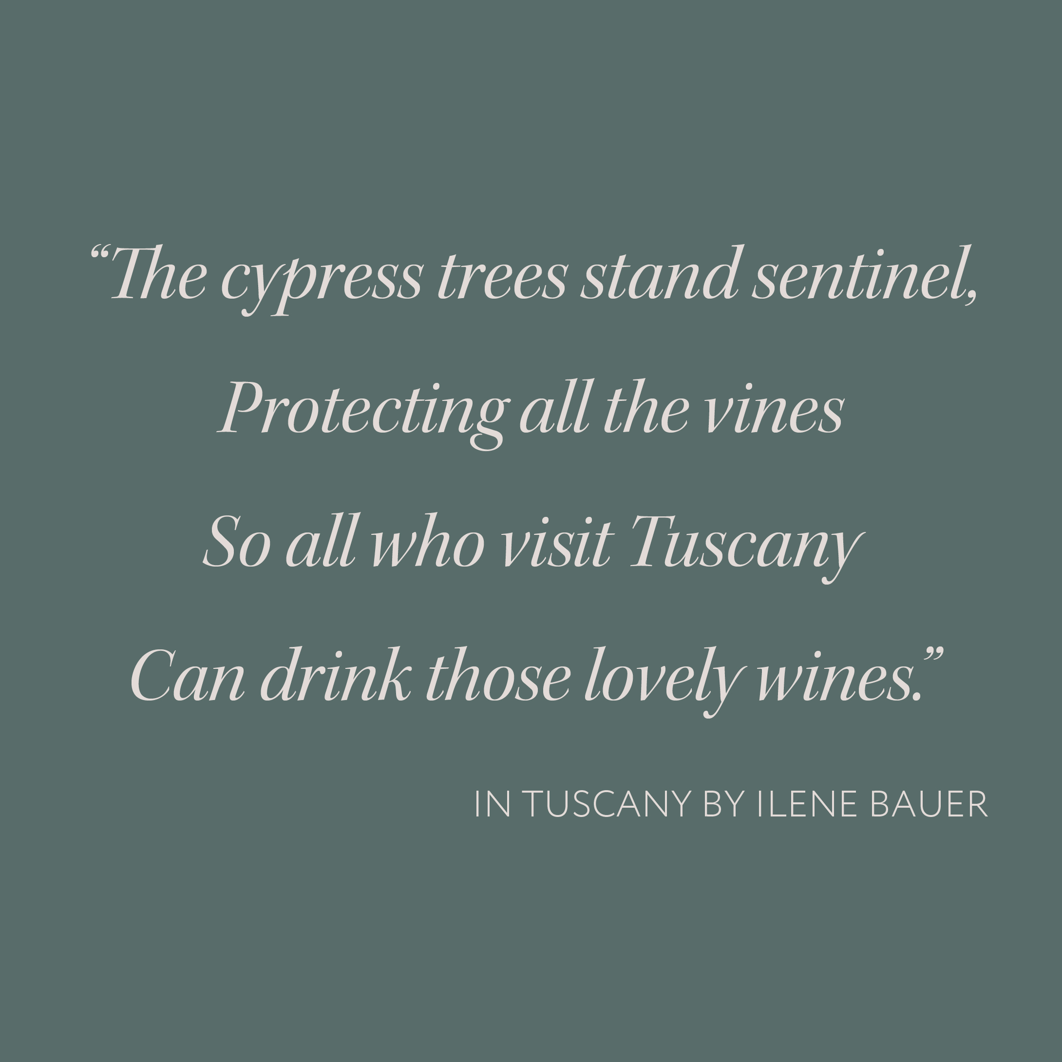
A fabulous quote deserves a fabulous typeface! And, I hope you will agree, that the gorgeous Kepler Italic really is a fabulous typeface! It is a modern re-interpretation of a traditional 18th century typeface – and, as such, it lends just the right touch of elegance and refinement, that suits VILLA FLORES to a “T”. I loved this quote as soon as I found it – for me it really evokes the very essence of Tuscany. You can almost hear the wind rustling gently through the cypress trees, as they stand, high on the hillside protecting the precious jewels, which are slowly ripening and sweetening, in the midday sun on the pale limestone slopes below.
In order to bring your brand to life, I like to go the extra mile and create a mockup of a piece of marketing collateral especially for you. Something so simple as creating a gorgeous personalised postcard (like this one I designed for VILLA FLORES) which you can send to your guests prior to their stay, not only adds that little special touch, but it also enchants your clients and elevates your business in their eyes.