
A restaurant with rooms located in the wilds of Cornwall
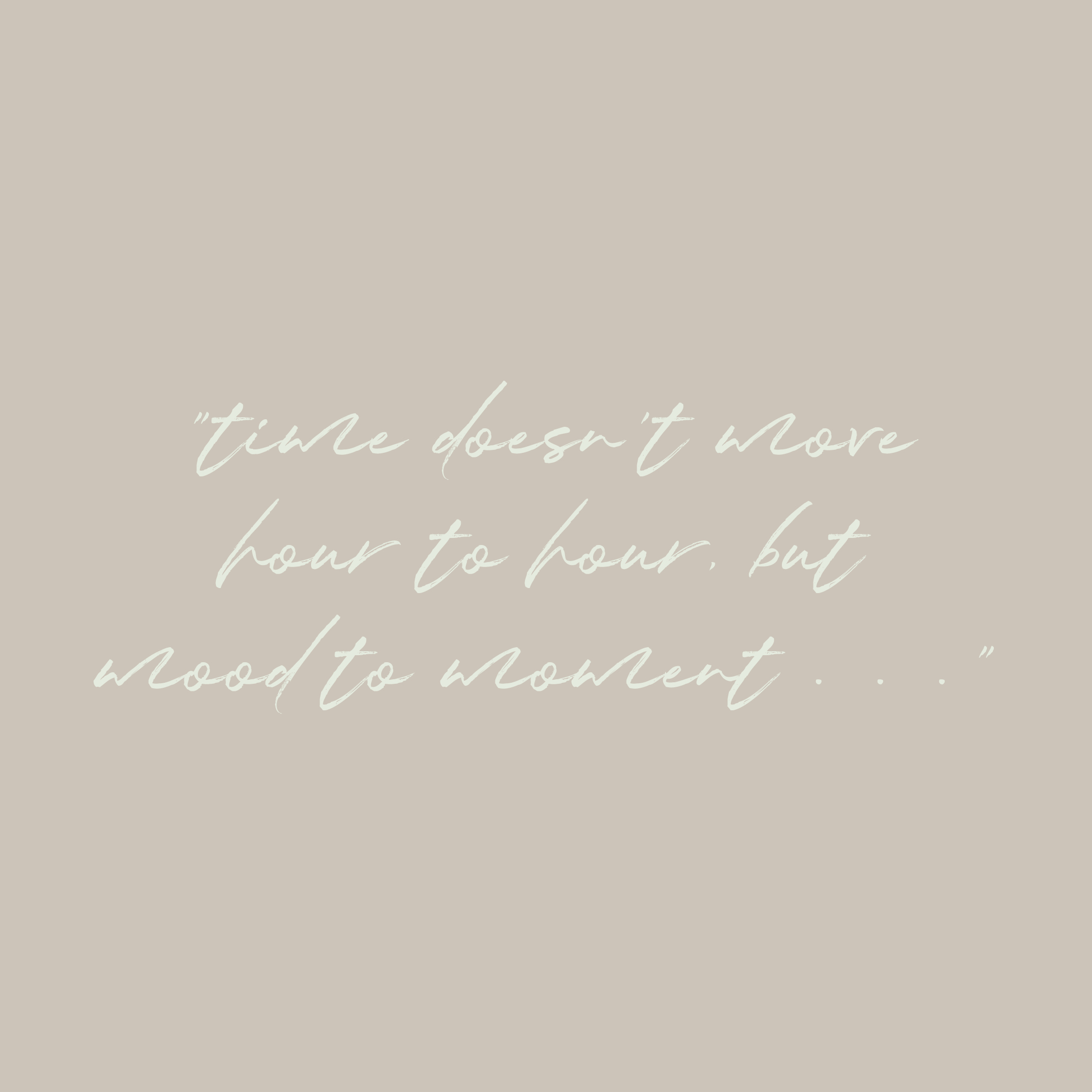
elevate: project two . . .
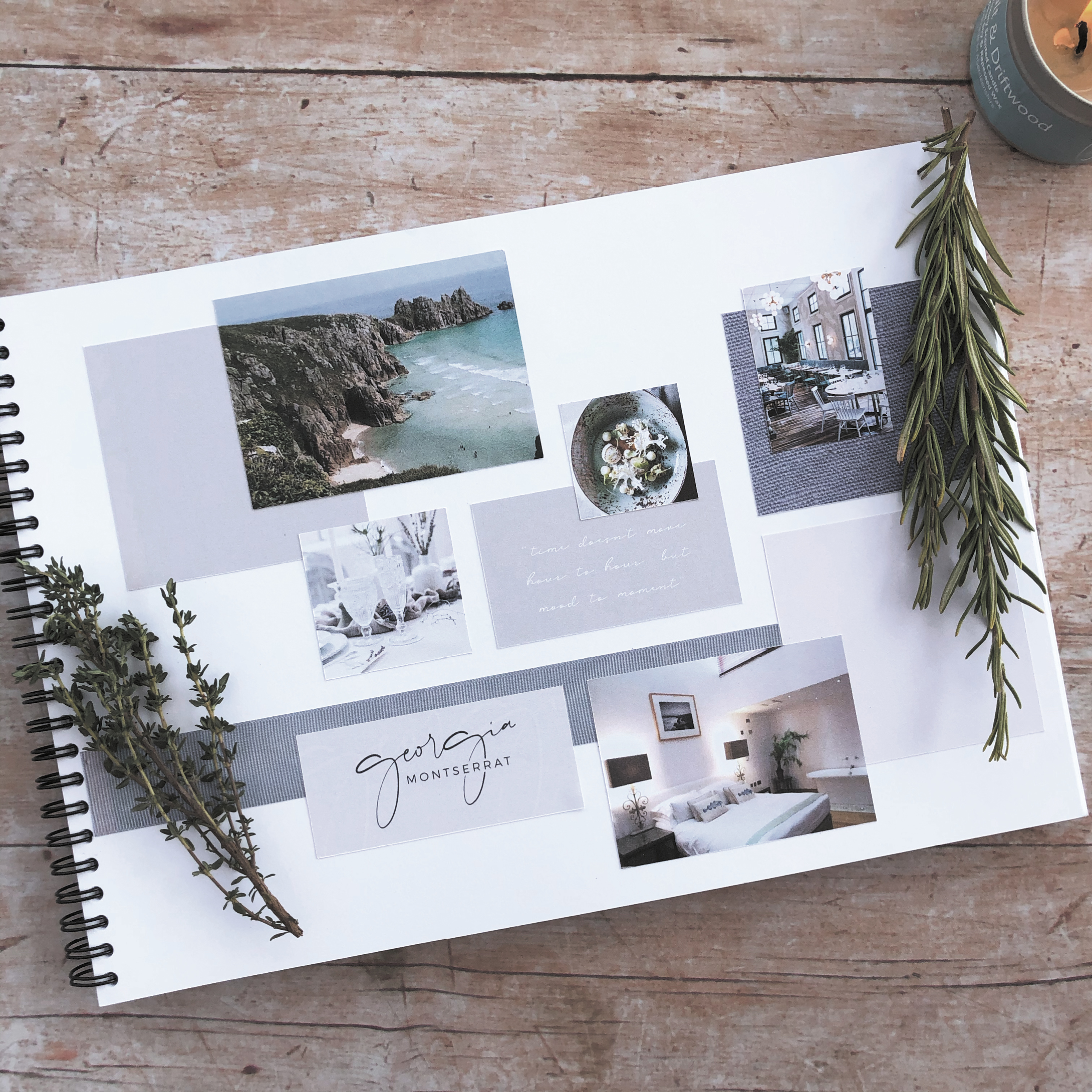
For my second ELEVATE with Fiona Humberstone project, I selected SAMPHIRE, a restaurant with rooms located in the wilds of Cornwall. I totally fell in love with Cornwall after just one visit – I loved the romance of the wild, rugged scenery, the gorgeous coastal colours and also the connection between food and nature which is so prevalent there. This brief really spoke to me – for me there was absolutely no other choice! So, after completely immersing myself in all things Cornish (and foody!), I created a concept which I was proud of. Here is the mood board which reflects the design direction I was heading in.
So, let the detective work commence! A good client brief will provide your designer with background information about your business, the direction you would like to take it in, and what it is that sets you apart from your competitors. The trick to being an intentional designer however, is being able to detect which bits of information are essential to determining the impact that your brand needs to create. Like any good detective story, there are likely to be twists and turns in the plot line, but with time and my expertise, I can help guide your brand in the right direction.
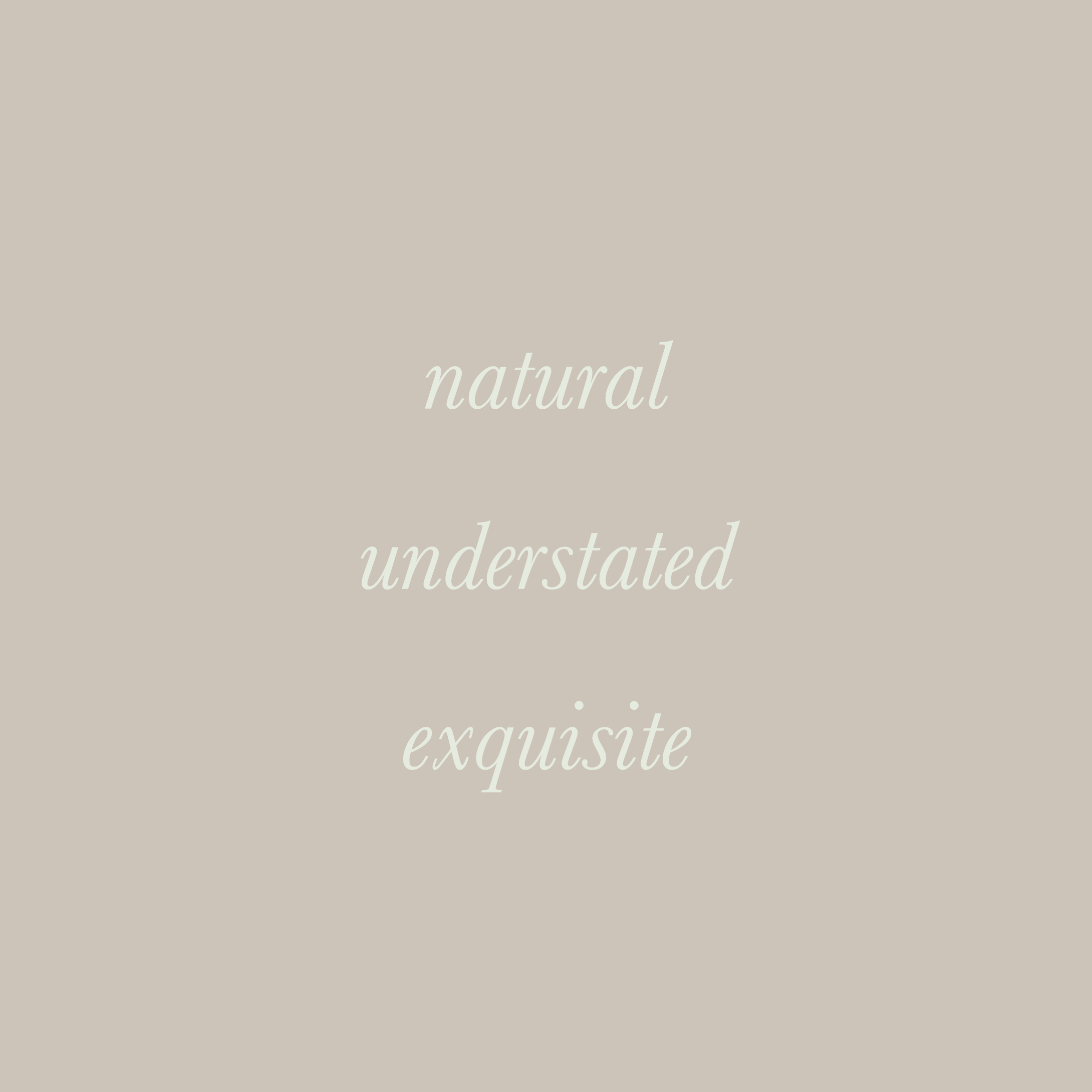
The key to it all is being able to distill the essence of your brand down to three brand characteristics, these will then become the starting point of creating an intentional brand identity which you can be proud of.
Shown here are the brand characteristics for SAMPHIRE.
We learnt more about the magic that colour psychology can bring to our work and how it allows us to create more intentional brand colour palettes for our clients projects.
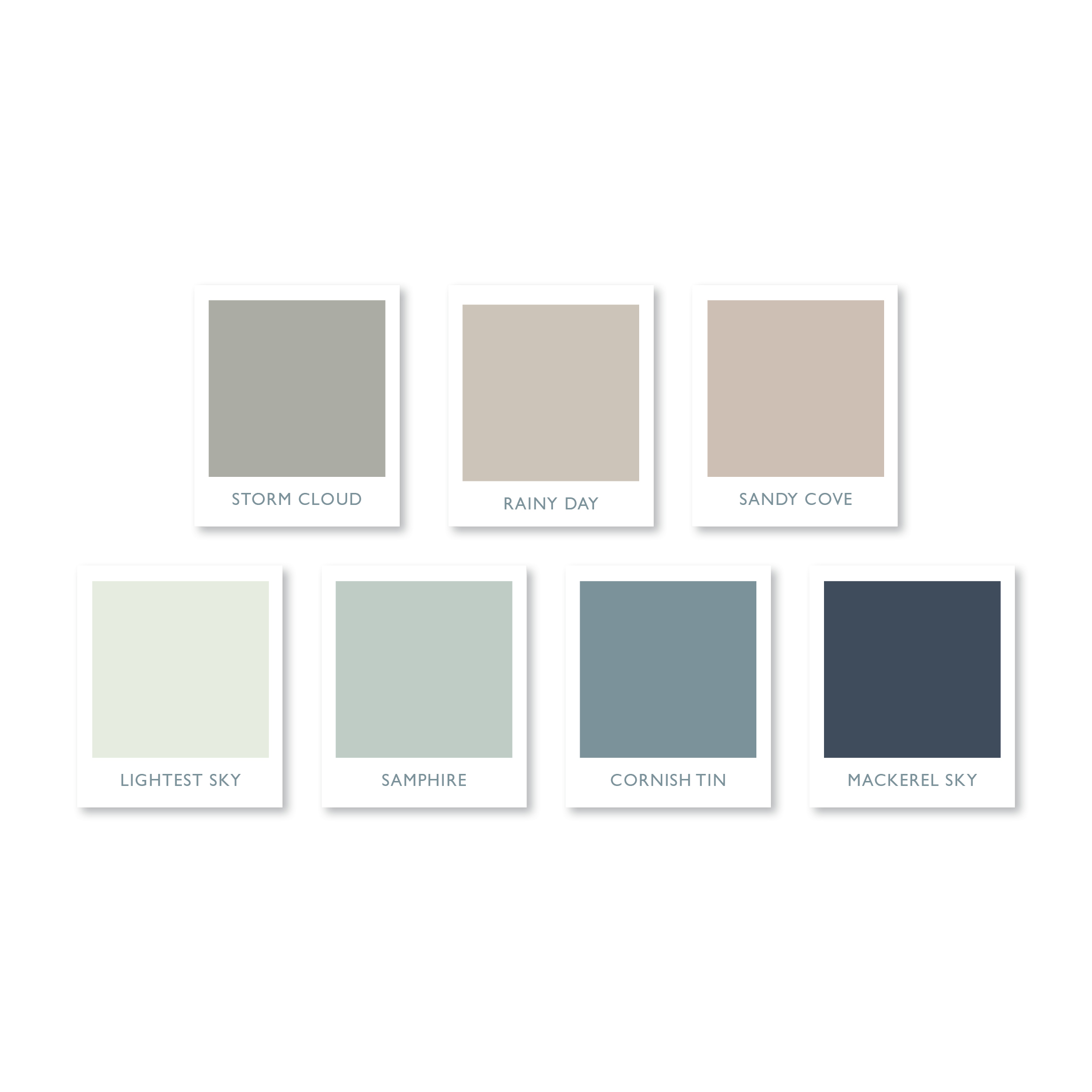
This gorgeous understated colour palette is the one I created for SAMPHIRE, a restaurant with rooms in the wilds of Cornwall. It combines soft, muted colours, inspired by the rugged Cornish landscape and the exquisite littoral light famed for centuries by artists. Call me an old romantic, but I find that naming the colours, in a way which complements my clients’ brand, helps to forge a stronger connection and brings them to life in a way that a mere Pantone reference or hex colour code just can’t rival.
It’s no secret that I love a quote! I am also very fond of a gorgeous typeface, and if it’s a handwritten one, then that’s it, I’m totally smitten!
Fragile Script, which I used for the SAMPHIRE brand evokes just the right feeling of elegance, and when paired with an understated serif typeface, Bodoni 72 Smallcaps Book, it creates a typeface marriage made in heaven.
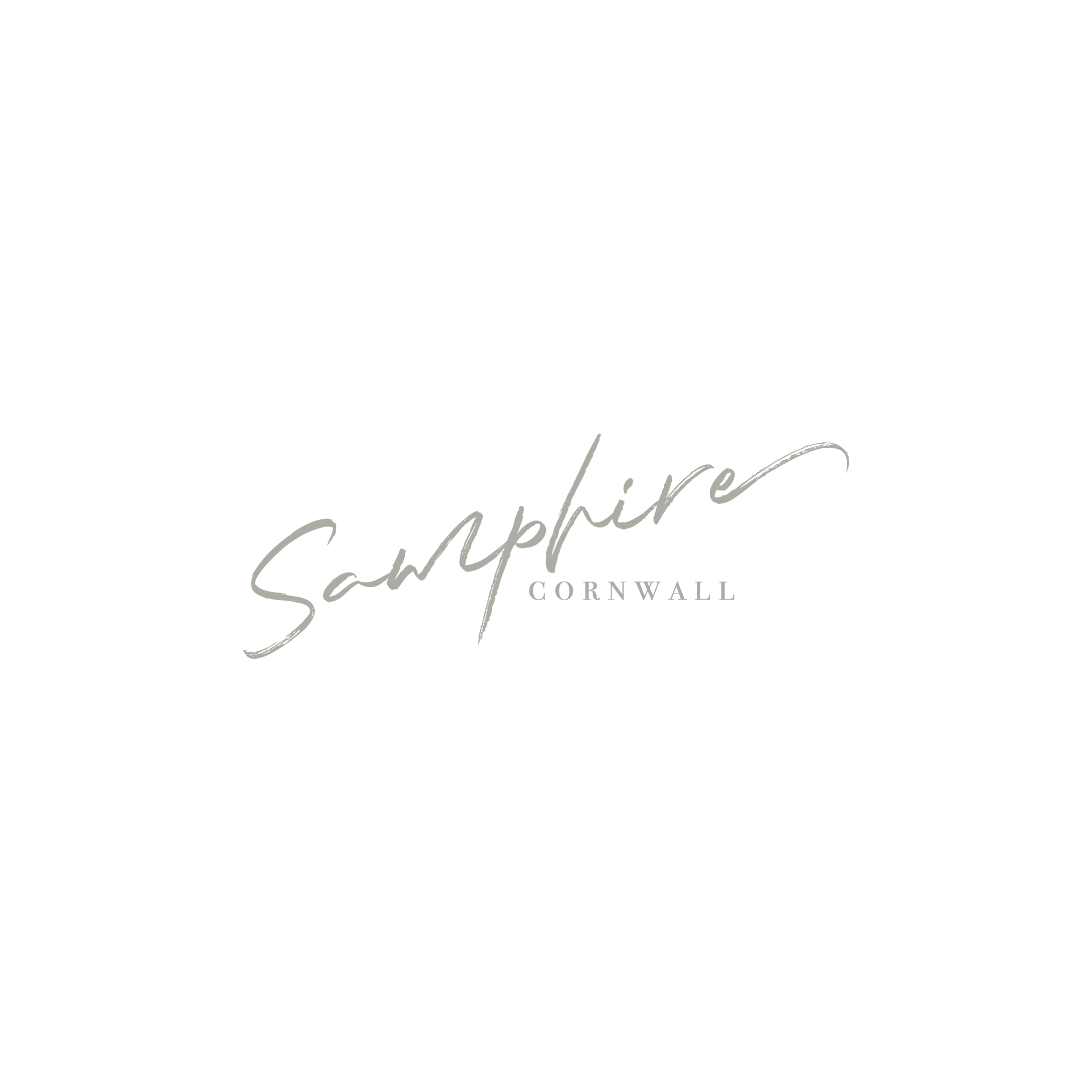
For SAMPHIRE I wanted to create a simple typographical logo with a natural, understated and exquisite feel. It reflects the connection between food and nature, which has ensured that this stunning restaurant has become a destination restaurant in the truest sense of the word.
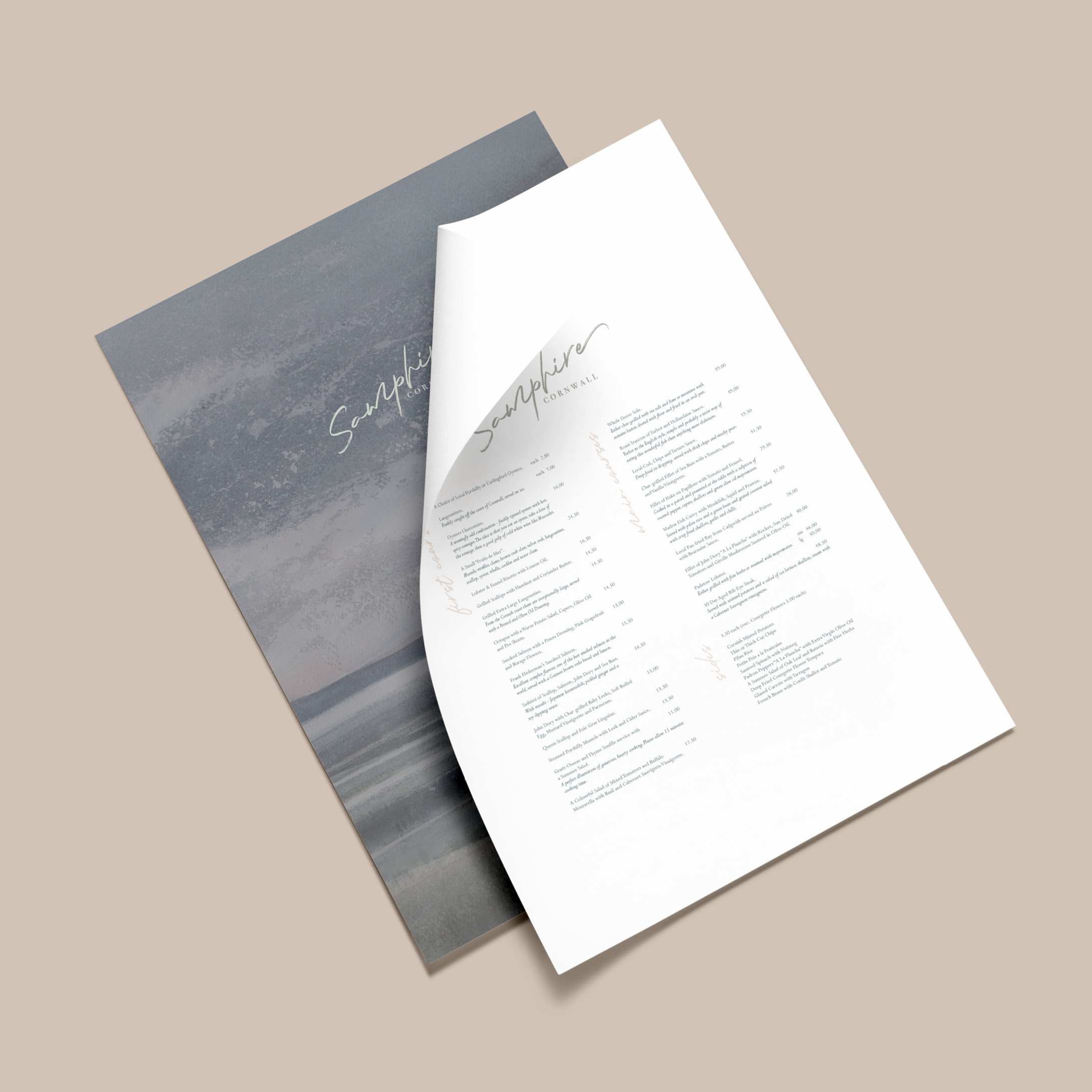
Here is the gorgeous menu I created for SAMPHIRE – one which is worthy of a Michelin star restaurant. I do love to go the extra mile for my clients by creating mockups – this means that I can really make their new brand identity to come to life.
Showcasing your new identity in action allows you to think big about your business, and can open up all sorts of possibilities, which you had only dreamt about . . .
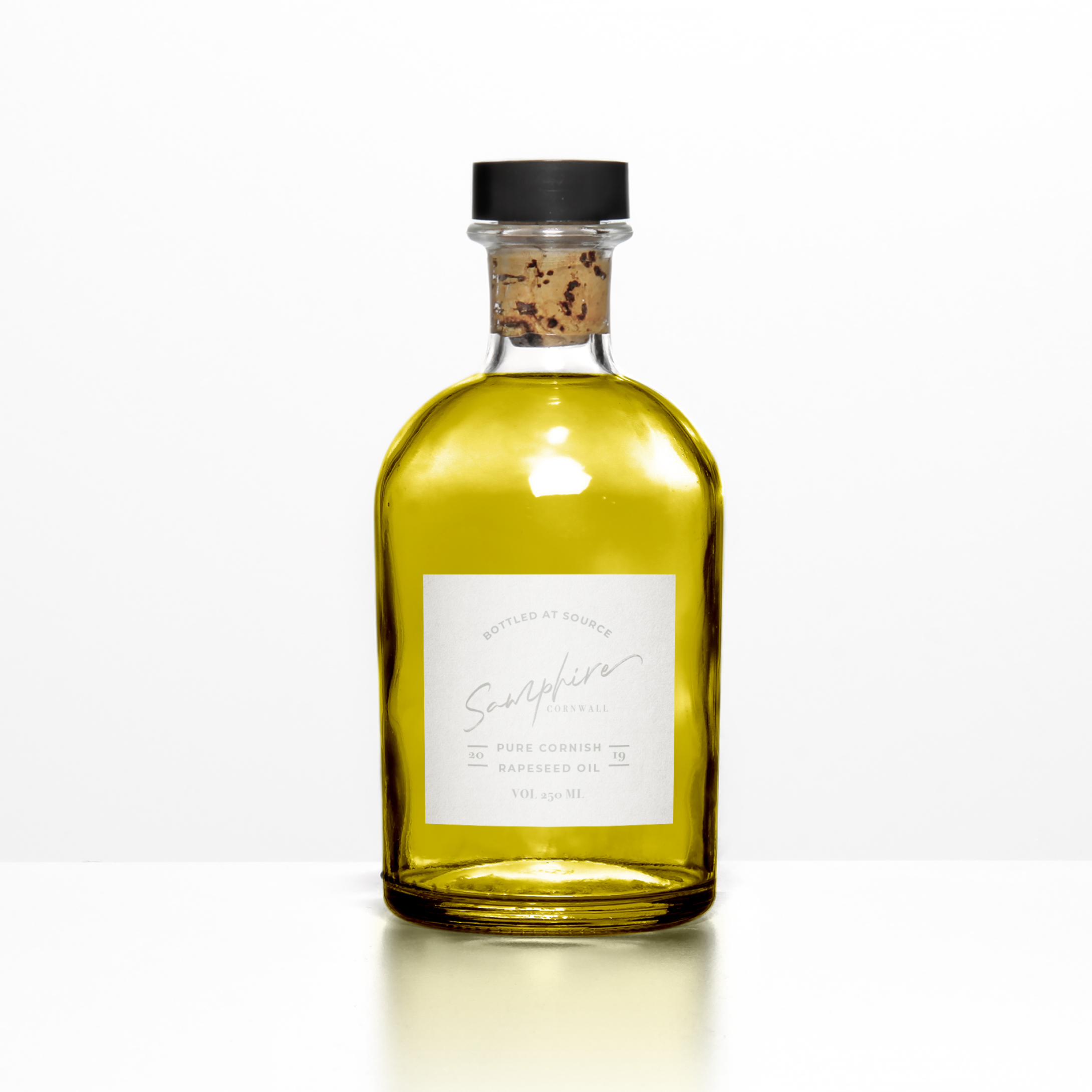
The devil is in the detail . . . This may look like an ordinary bottle of olive oil, but it is in fact a bottle of Cornish rapeseed oil!
The ethos of SAMPHIRE’s Michelin starred chef is to create simple, but exquisitely presented food, such as his signature dishes including samphire and seaweed, seasonal Cornish fish and vegetables charred on the Josper grill. Where possible, everything is sourced within a 25 mile radius of the restaurant, with the emphasis on local seasonal produce.
At the moment, Cornwall isn’t renowned for producing olive oil (although attempts have been made!), however, rapeseed is grown on the rich, fertile soils of the North Cornish coast, which meets his criteria for celebrating home grown produce beautifully.
Even after all these years, I still get really nervous when I present my work to clients. Have I fully understood their hopes and dreams? Does the mood board illustrate this with clarity? Are the colours and fonts, which I have carefully hand picked, right for where their business is heading? Have I created my best work? Will they actually like it? Gosh, it’s all just soooo stressful!
Taking part in the Elevate mentoring programme with Fiona Humberstone, has given me a fantastic opportunity to grow my creative process and have faith in my ability to design beautiful, modern brand identities. It hasn’t eased all of my fears and worries, I’ll always have those, that’s just human nature, but it has given me the confidence to know that within me I have the skill and the creativity to help elevate my clients businesses in an intentional way.