BREEN, NORWAY
Recently, I took part in ELEVATE (a six week mentoring programme for brand designers committed to excellence) with Fiona Humberstone, The Brand Stylist.
Every two weeks, Fiona released three very different, inspirational (but alas, sadly fictional!) client briefs from which we had to choose one to work on. We then had a very tight timeframe of one week in which we had to develop and deliver our initial design concepts. This work was reviewed by Fiona, who in her role as creative director, gave us constructive feedback. We then had another week in which to refine the work into a finished portfolio piece.
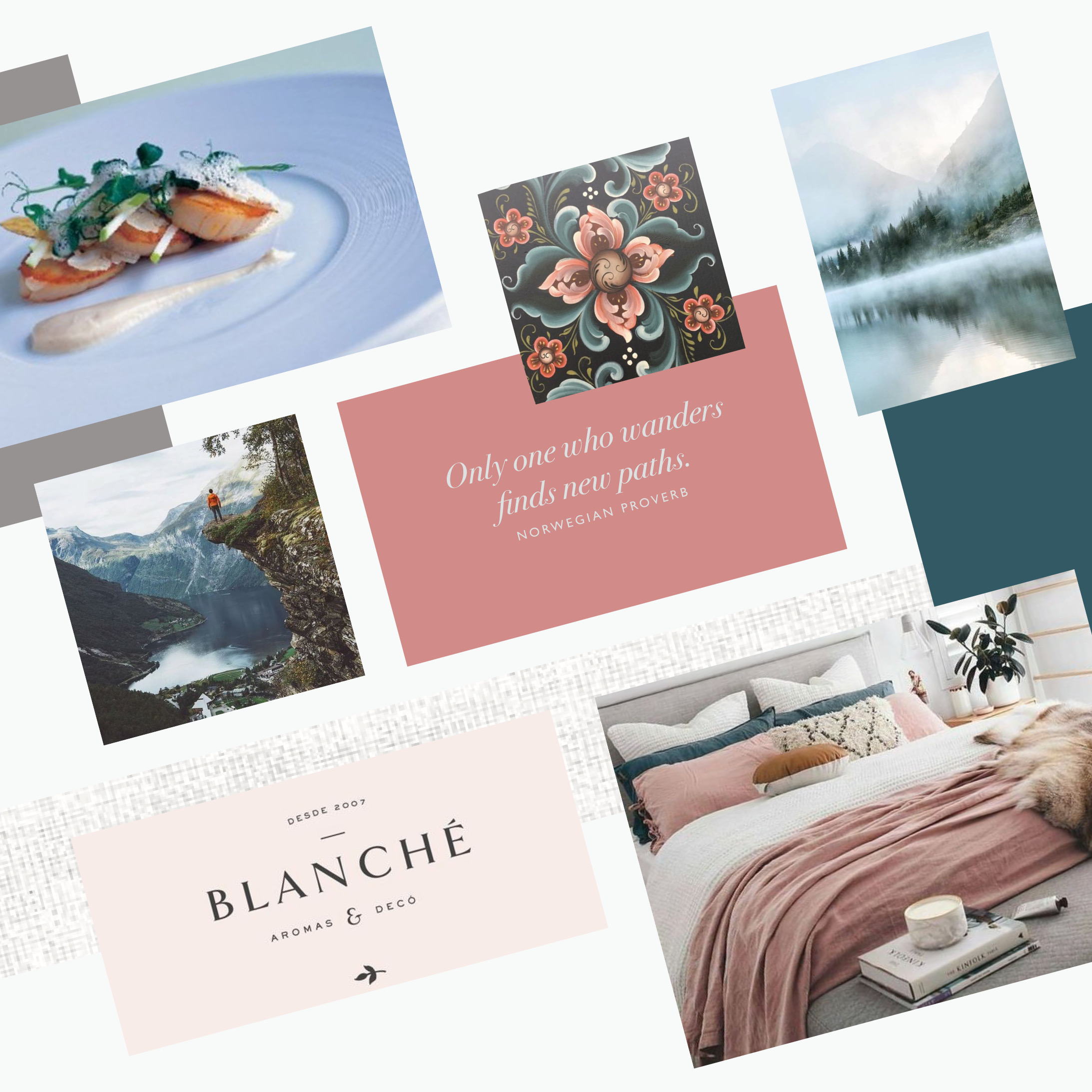
For my first project, I selected BREEN, an exciting new Norwegian boutique hotel, located at the edge of one of Norway’s most majestic fjords – the deep blue Geirangerfjord. So, after completely immersing myself in all things Norwegian, I created a concept which I was proud of. Here is the mood board which reflects the design direction I was heading in.
Sometimes, being a brand designer is a little like being a detective! You have to go through the client brief with a fine tooth comb, picking up on the vital “clues” – the essential pieces of information about your client’s business – and weeding out any red herrings which have been placed to throw you off track!
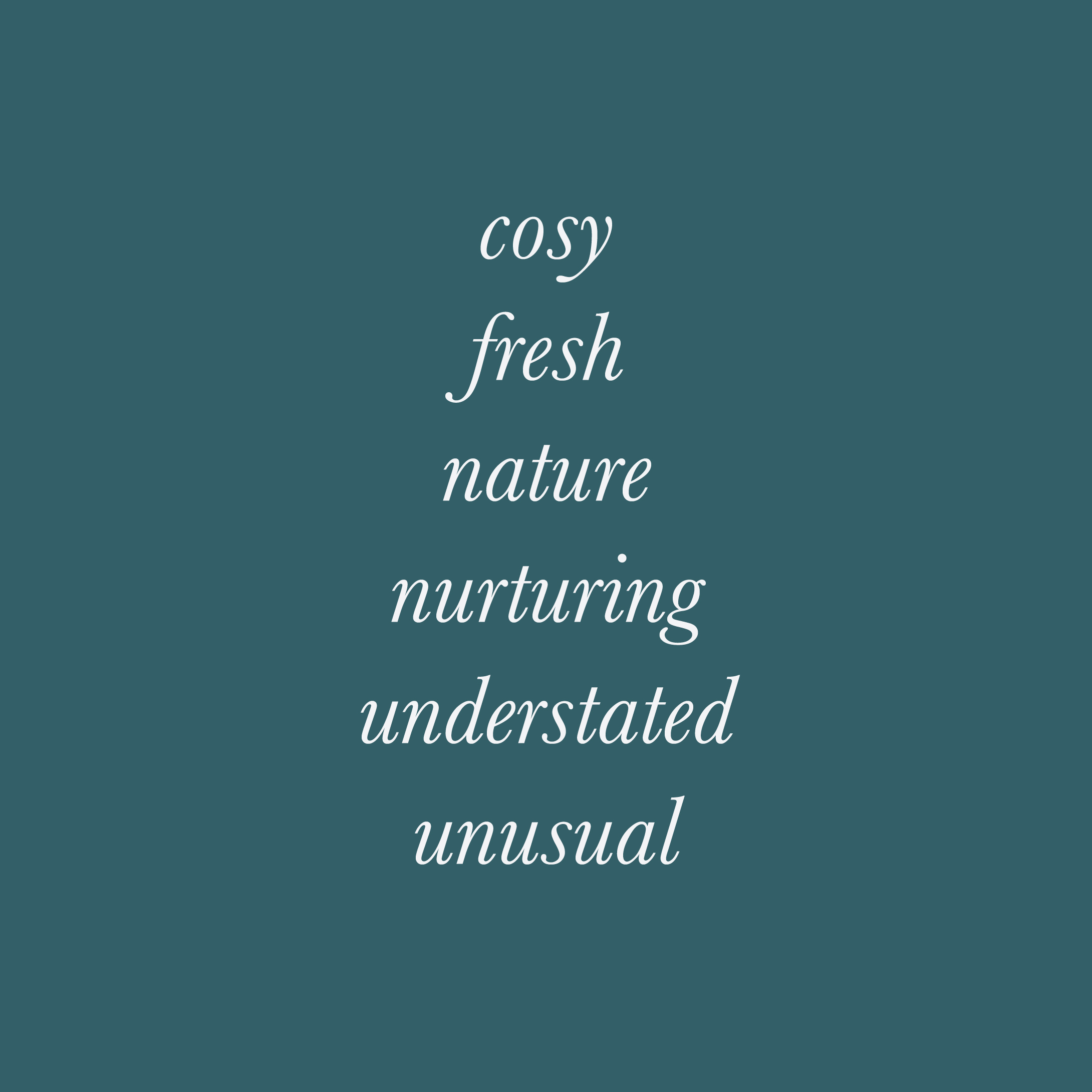
Once you’ve completed this stage you will have three to six key brand characteristics, which become the cornerstones to being able to create a brand identity with intention for your client.
Shown here are the brand characteristics for BREEN:
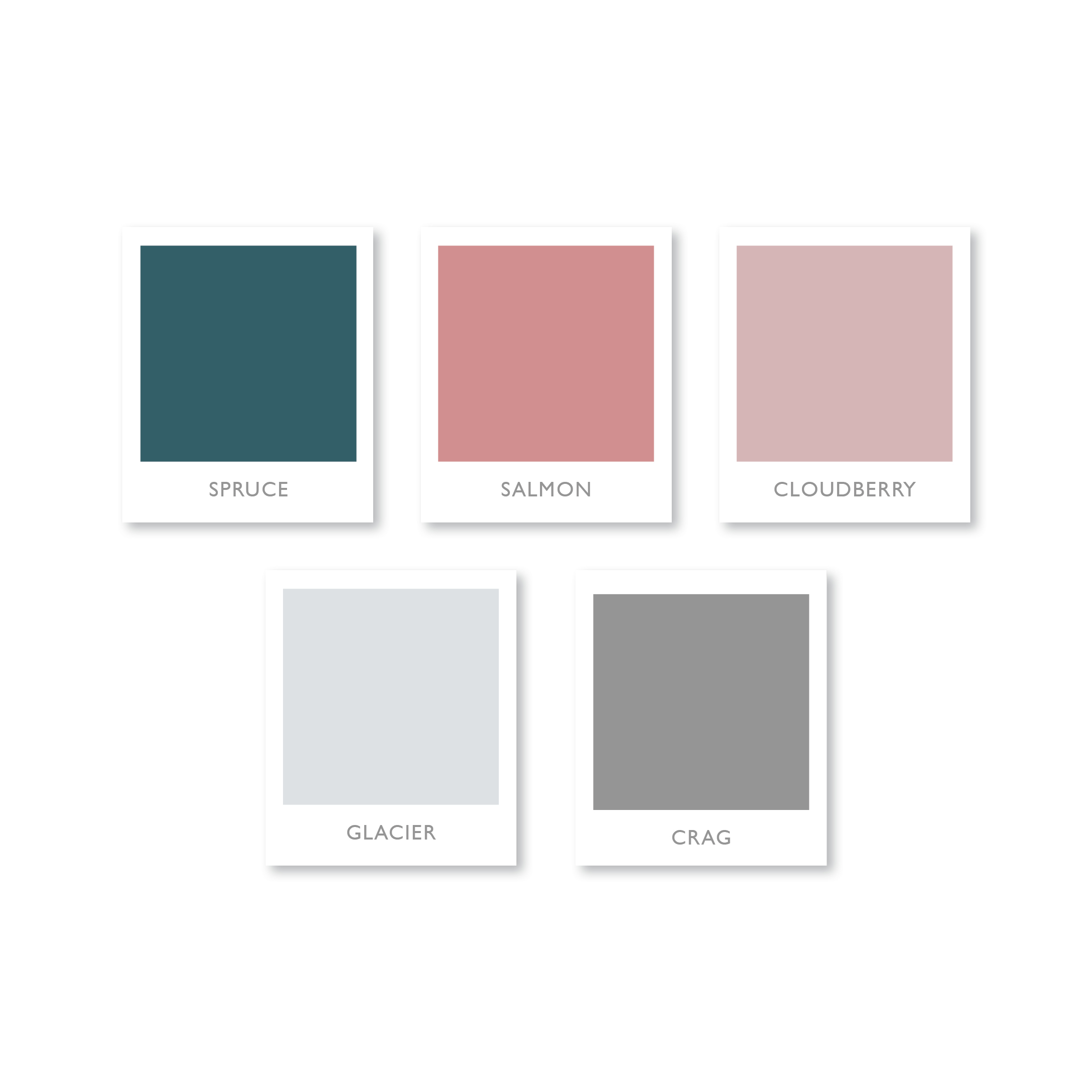
Each and every colour, has within it, the magical power to make us “feel” something.
Learning more about colour psychology in branding was a real game changer for me. It will allow me to create a more intentional colour palette for your brand, which will connect with your muses at a deeper, more subconscious level, faster than words or images ever could.
This limited colour palette is the one I created for BREEN, an exciting new Norwegian boutique hotel. It combines soft, natural colours, inspired by the lush vegetation, waterfalls, astonishing mountains and feather light mists found in the beautiful surrounds.
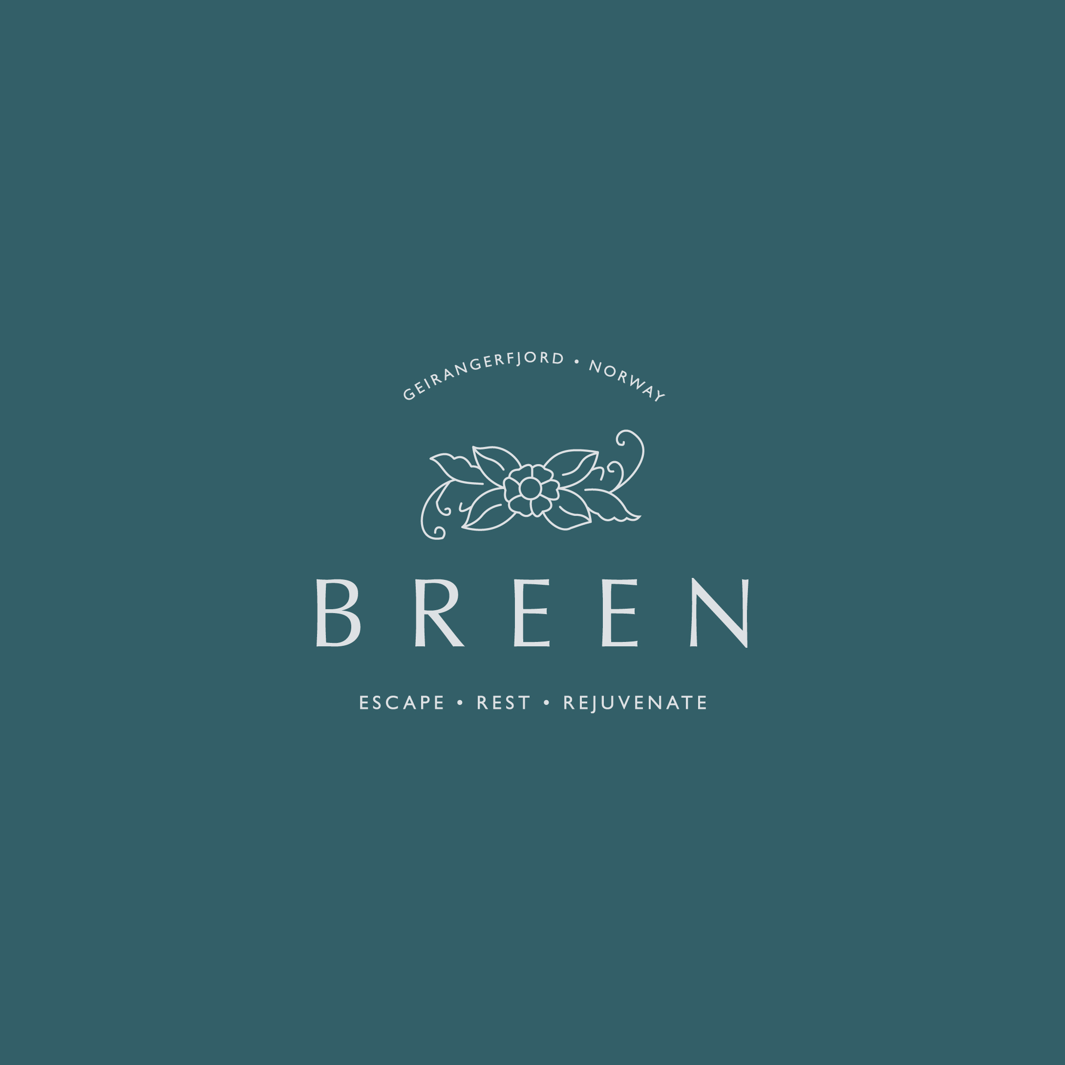
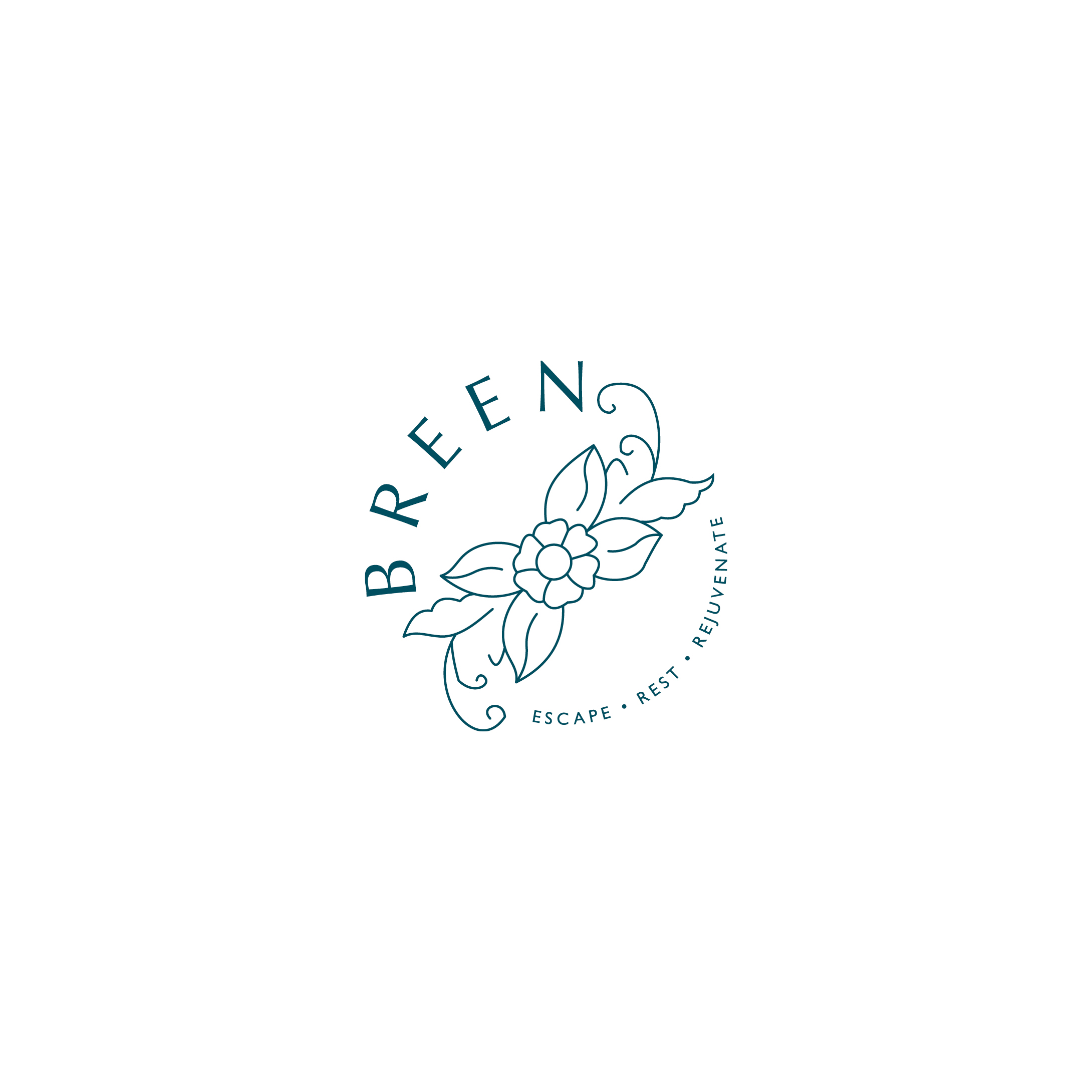
For BREEN, I wanted to create a simple logo with an understated sense of style and flair; reflecting a personal and deeply intimate hotel that feels like a rather spoiling home from home.
In order to help the hotel stand out from the competition, I’ve moved away from the stereotypical stripped back Scandi style. Instead I’ve taken inspiration from the traditional decorative craft of Rosemåling – and created a nature inspired design motif.
Paired with simple, stylish typography this gives the overall look an understated air of luxury about it, without being stark or ostentatious. It is also empathetic with the strong sense of responsibility for the location and the certified sustainable destination status.
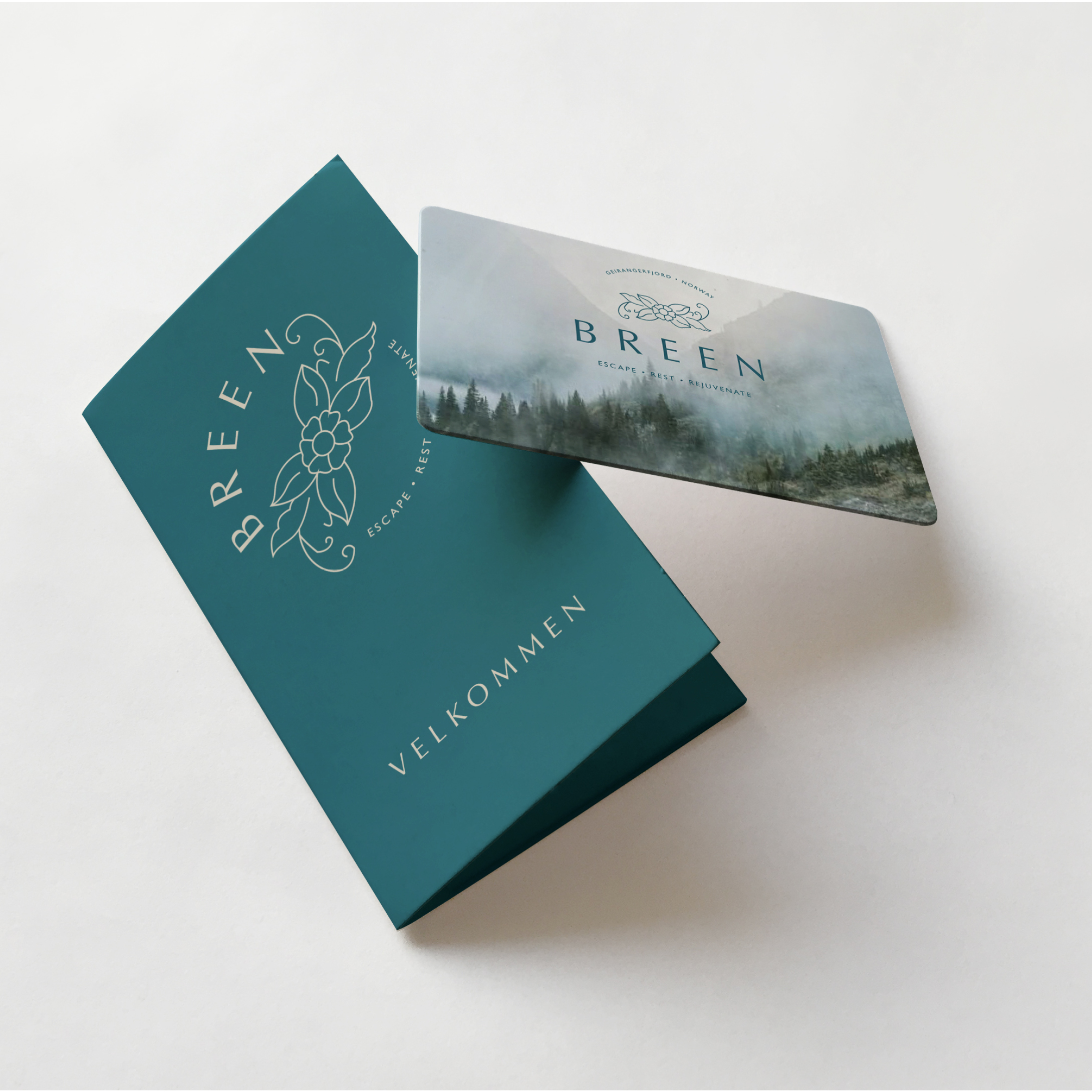
Mockups are where your new brand identity really begins to come to life. They allow you to see your new identity in action and allow you to think big about your business.
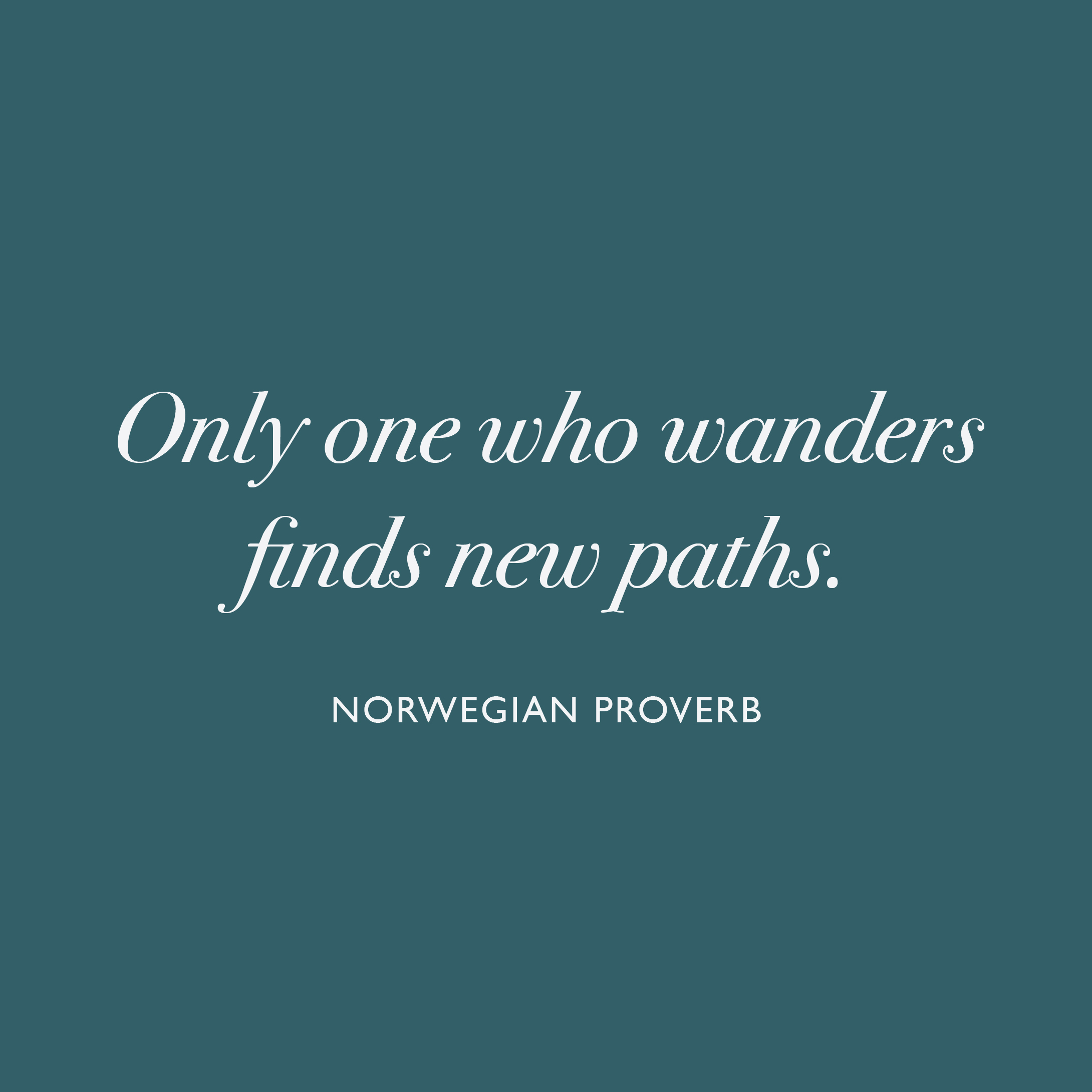
When I create a mood board I love to include a quote or saying, which is relevant to the brand I am working on. I use them to evoke a feeling, but also to showcase a beautiful typeface – in this instance Bodoni 72 Oldstyle Italic – isn’t it just gorgeous? Just look at that lower case “s”
This Norwegian proverb is not only relevant to the clientele of BREEN, but I also think it perfectly sums up my journey on ELEVATE.
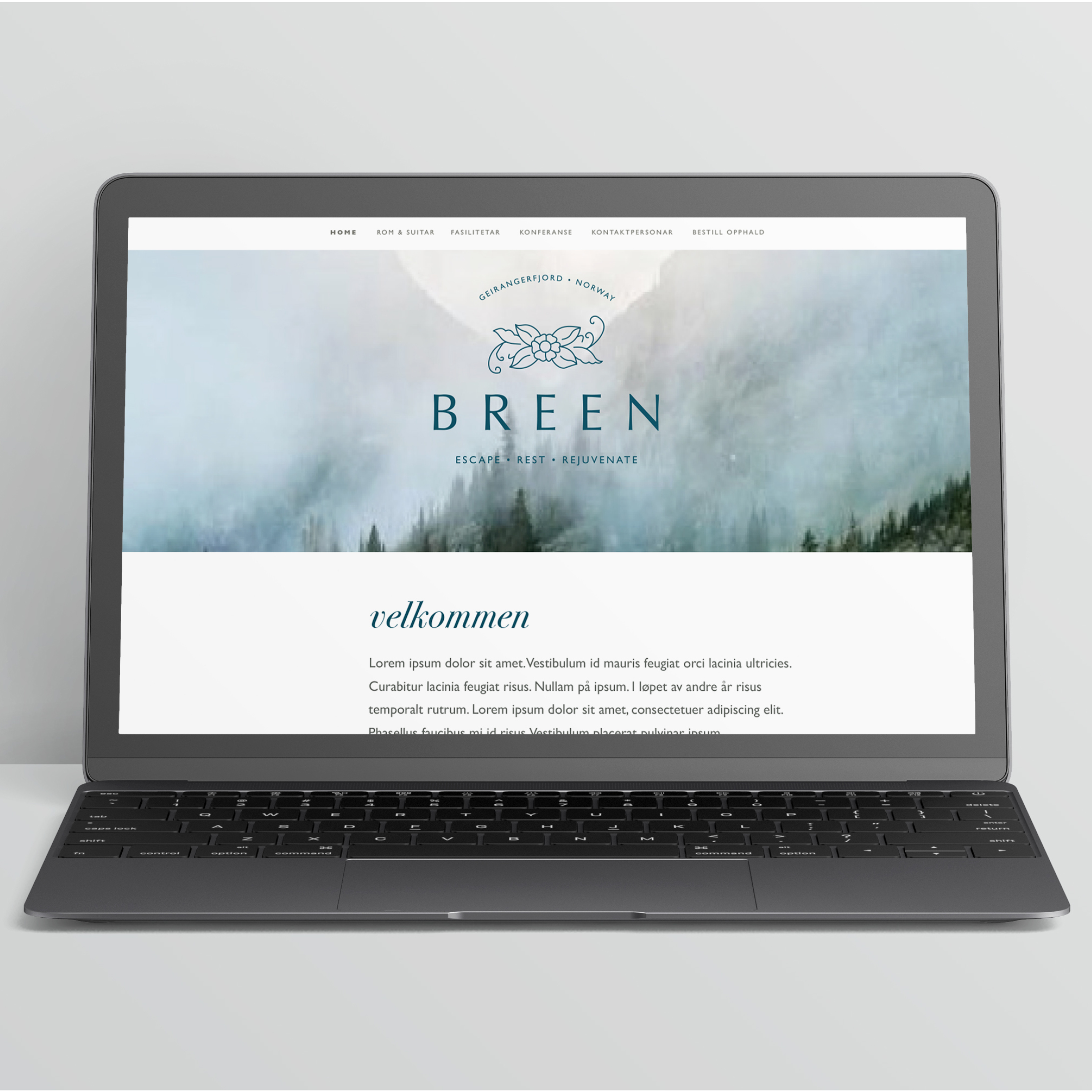
Keeping the look and feel of your brand consistent will stop your overall brand message from becoming weak and diluted. This is why it can make commercial sense to get your brand designer to work on any future design elements and brand collateral – after all they’ve invested almost as much time and effort as you have, getting to know the why’s and wherefore’s of your business, and creating a beautiful brand identity that you can be proud of. That “inside” knowledge could just prove to be invaluable for your business. This image illustrates this in a way that words simply can’t . . .
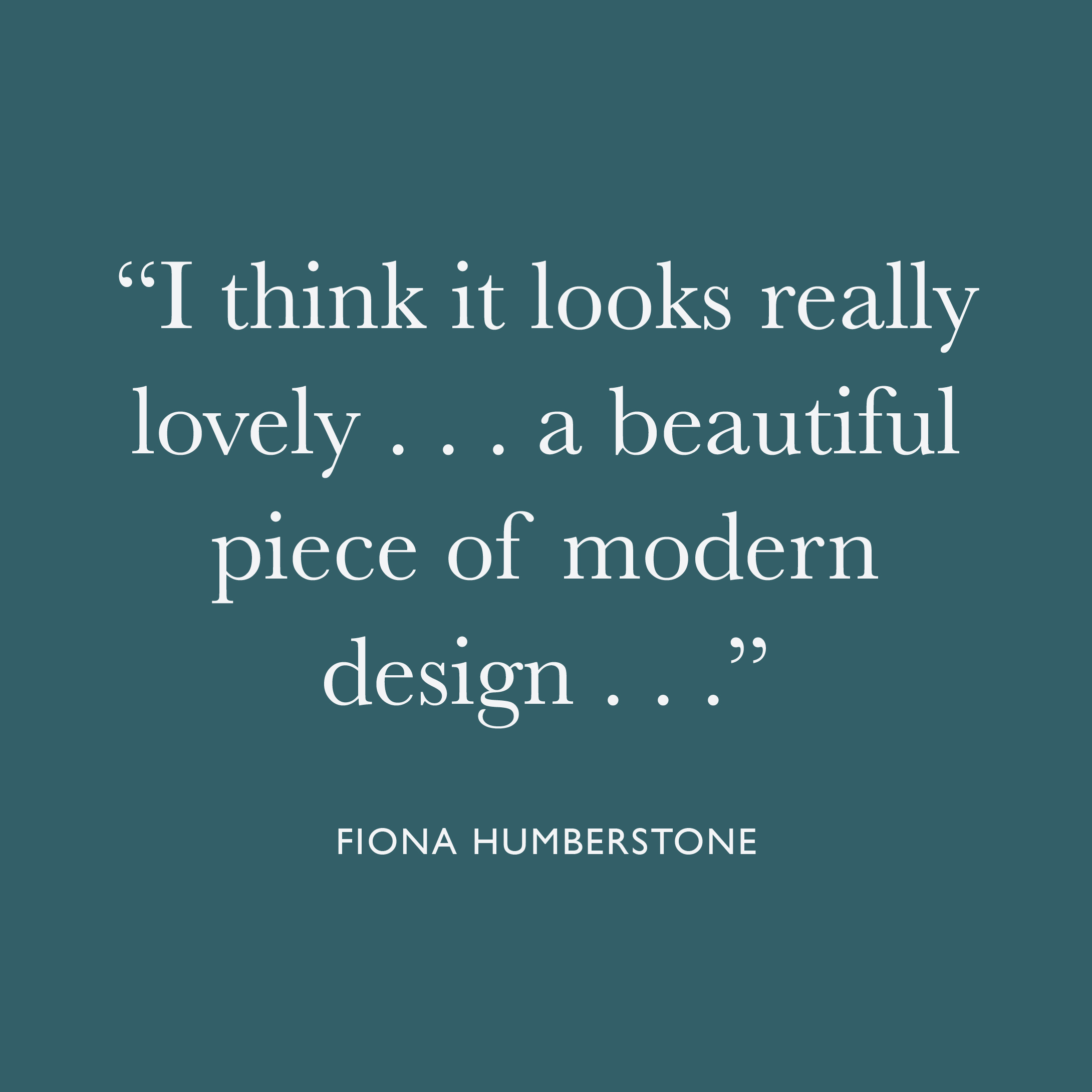
Wow, great praise indeed! For me, one of the most useful things throughout ELEVATE with Fiona, was the constructive feedback.
When you work for yourself it can sometimes be difficult to “see the wood for the trees”, so having the opportunity to have someone of Fiona’s calibre cast her expert eye over my work and give constructive feedback was truly invaluable. Her attention to detail is infinite, and having her push me just that little bit further to do my best work, was exactly what I needed in order to elevate my business, so that I can elevate yours.
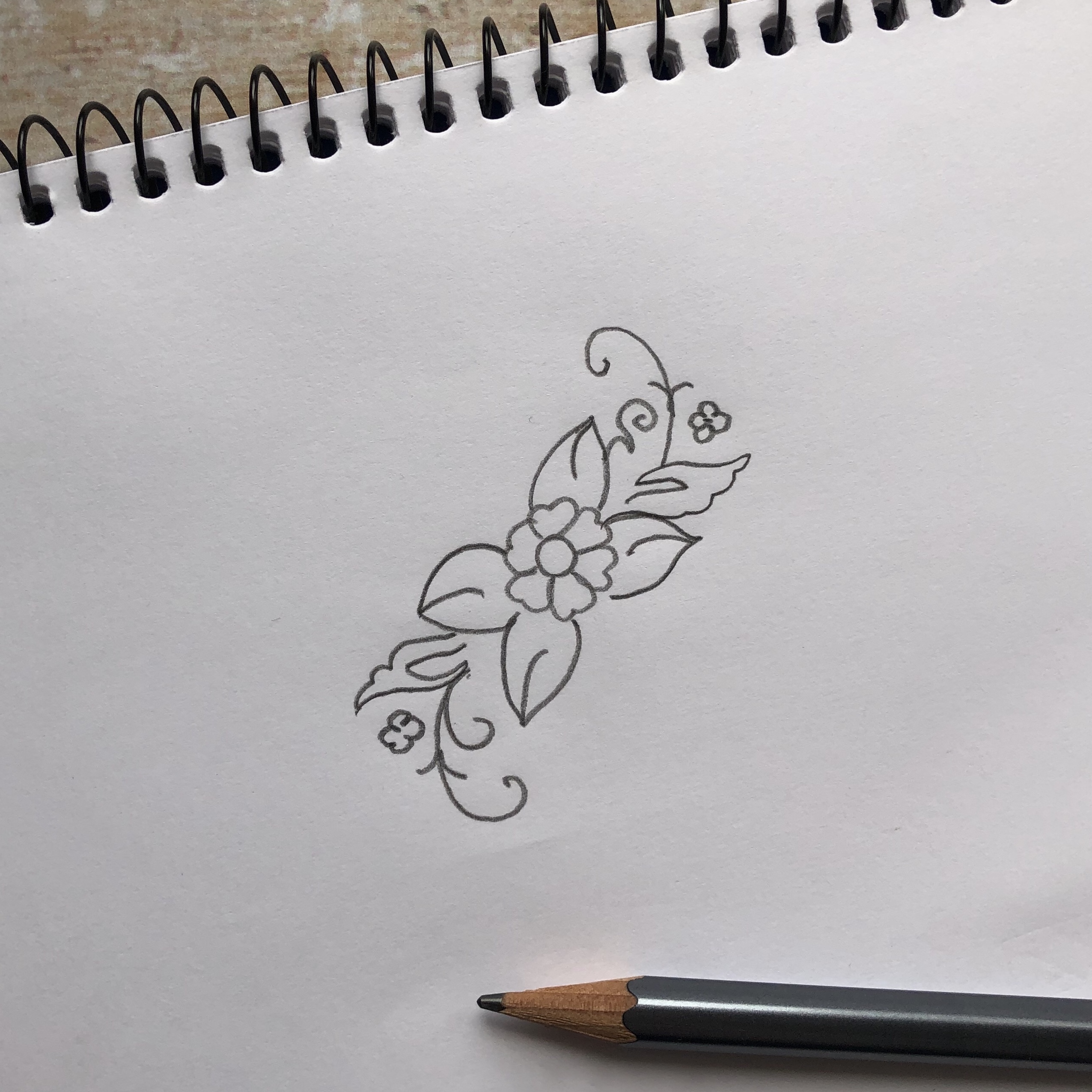
Behind every beautiful brand identity, there is a rough pencil sketch – what can I say, I’m just an “old-fashioned” kind of girl! I always begin each branding project by sketching some rough ideas with pencil and paper – this slow, hands-on approach gives me the space and time to work in an intuitive manner. At this stage it’s not about creating anything perfect, but more of a means to explore the different ideas and get them out onto paper. Once this stage has been completed, I will get on the computer and start developing my ideas into a more polished brand identity which reflects your vision.
