

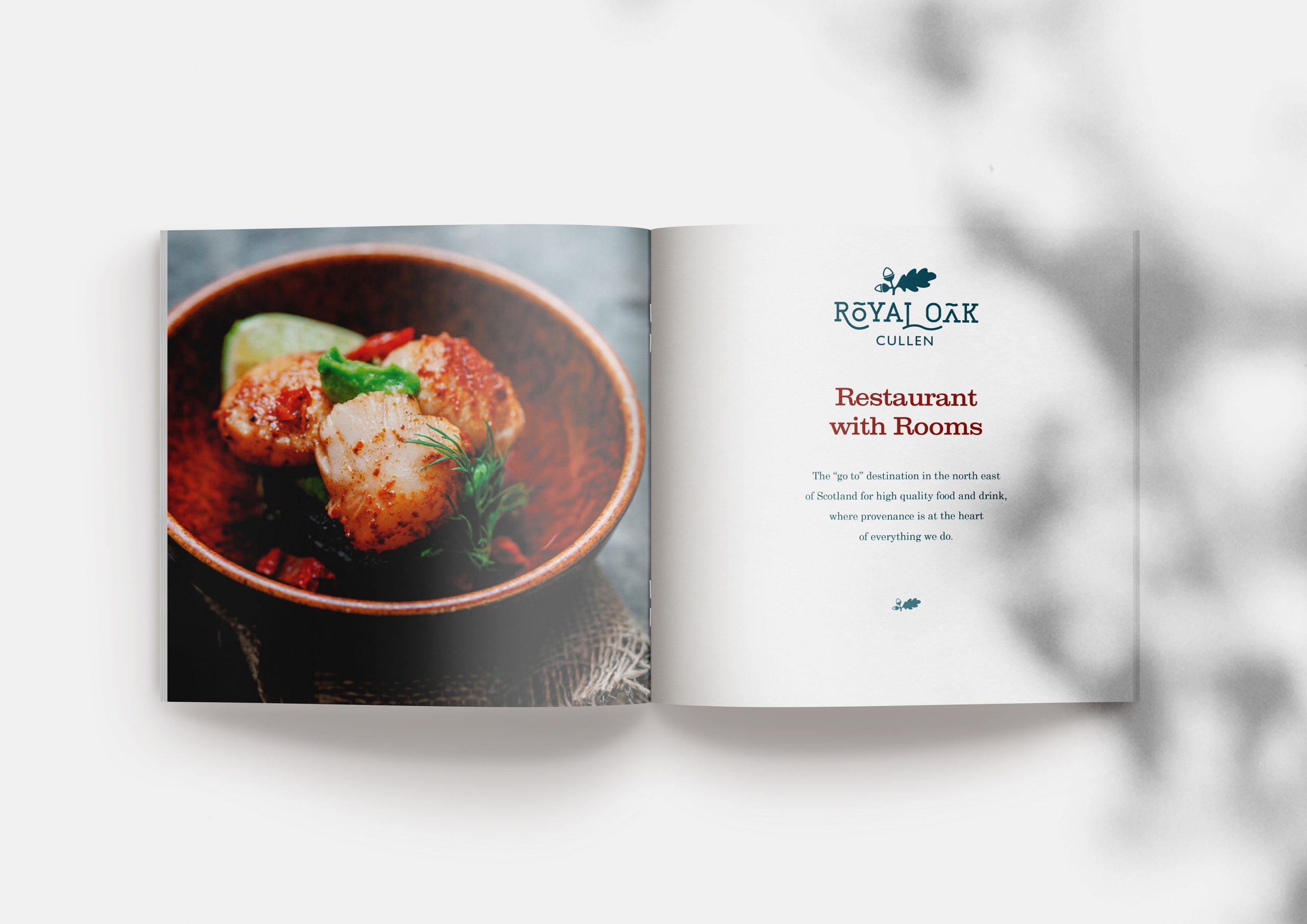
A modern, warm and friendly brand identity for a restaurant with rooms, Royal Oak, Cullen
proudly presenting . . .
“Mighty oaks from little acorns grow.”
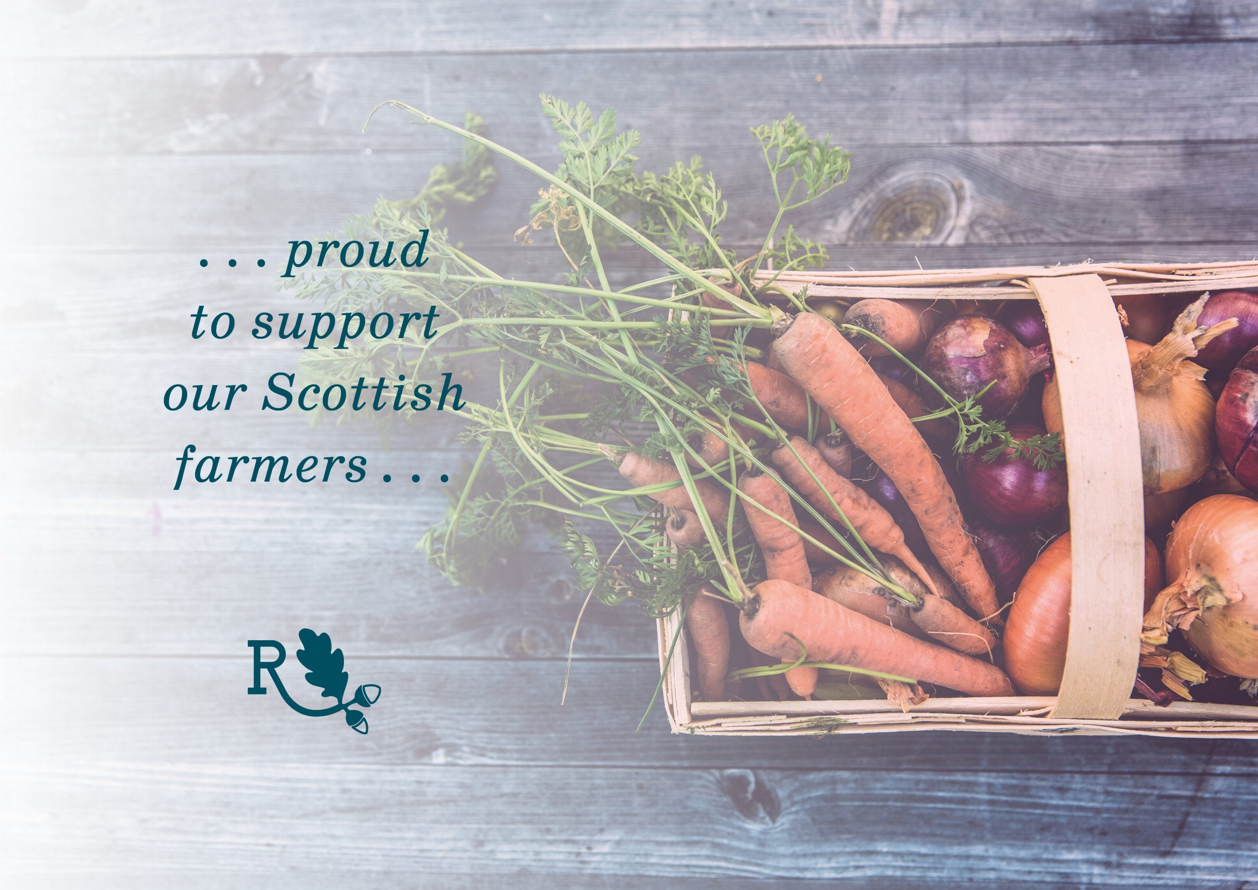
Caroline was referred to me by my lovely web designer friend, Neil Hedley. She had recently taken over the 1894 Grade C Listed building, which was the Royal Oak Hotel in Cullen. The hotel had been closed for a number of years, however, Caroline had a very clear vision about how she wanted to breathe new life into the building again as a restaurant with rooms. She wanted the Royal Oak to be known as the “go to” destination in the north east of Scotland for high quality food and drink, where provenance of the produce was at the heart of everything.
The business did not have an existing brand identity, which meant that I had a free creative rein in order to help Caroline stamp her individuality and personality on her new business.
The project began when I met with Caroline in person – after giving me a guided tour of the hotel, complete with, Art Deco style oak-lined bar area, spacious dining room, and gorgeous bedrooms – we sat down with a cuppa and Caroline told me all about her hopes and dreams for the business, and together we filled in the brand discovery questionnaire which I’d sent to her. It turned out that we actually had quite a lot in common – we’d both grown up on Scottish farms and both had a passion for food, where it comes from, and how it is produced.
After going over the answers which Caroline had given me, I began to distill down the brand characteristics, until I came up with the absolute essence of the brand, which was modern, warm and friendly. Then I curated a beautiful mood board showing the overall design direction which I felt the brand should take.
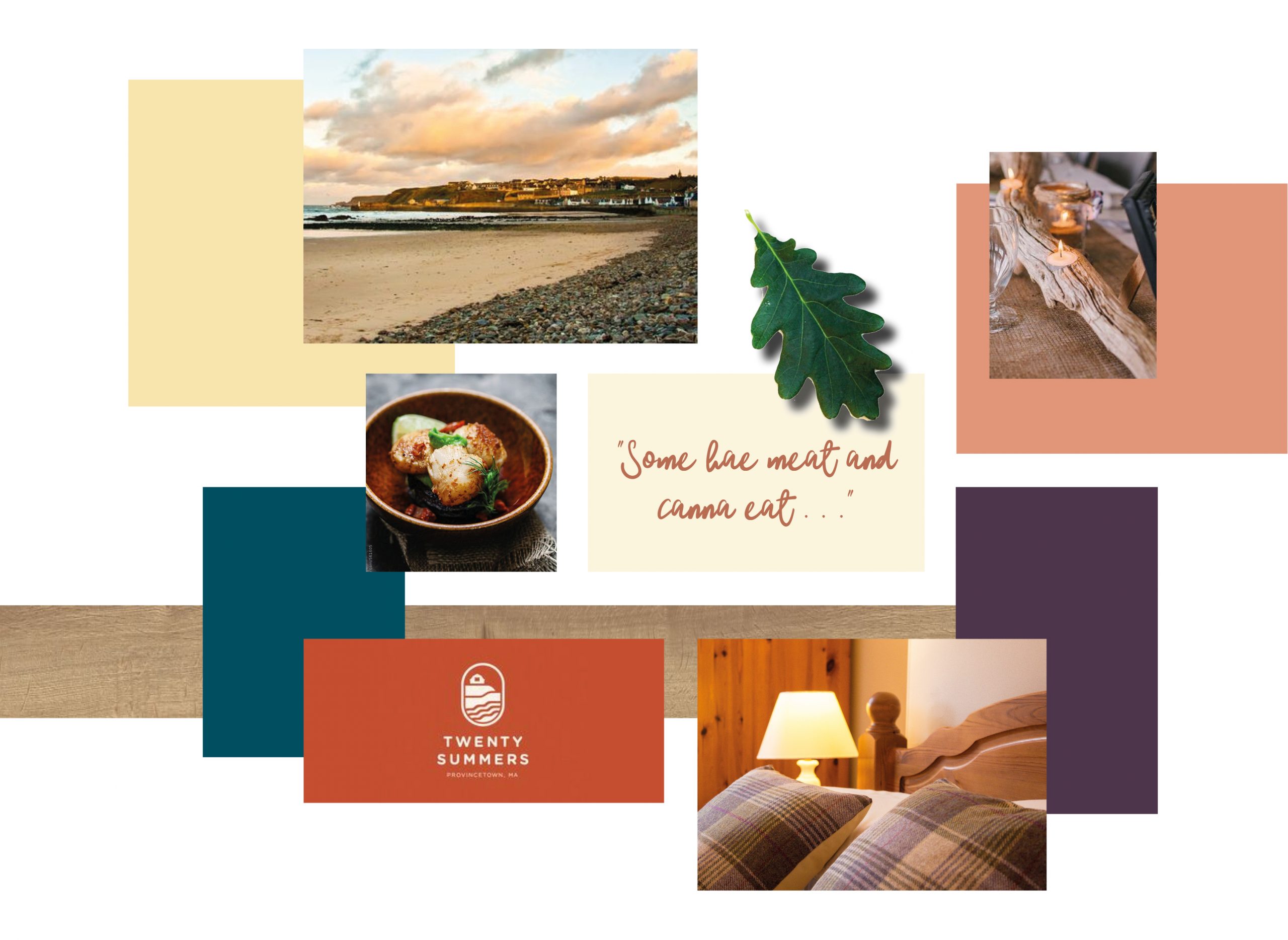
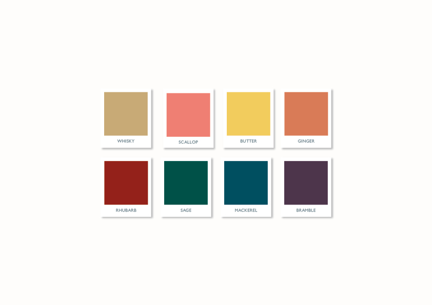
Once Caroline had approved the mood board, I began the search for the ideal typeface for the main logo – I wanted something with a bit of weight and gravitas to it, which could convey the brand essence in an intentional way. I also began to pair it with supporting fonts, which could be used for headings and body copy, and created a gorgeous colour palette which would complement the brand perfectly.
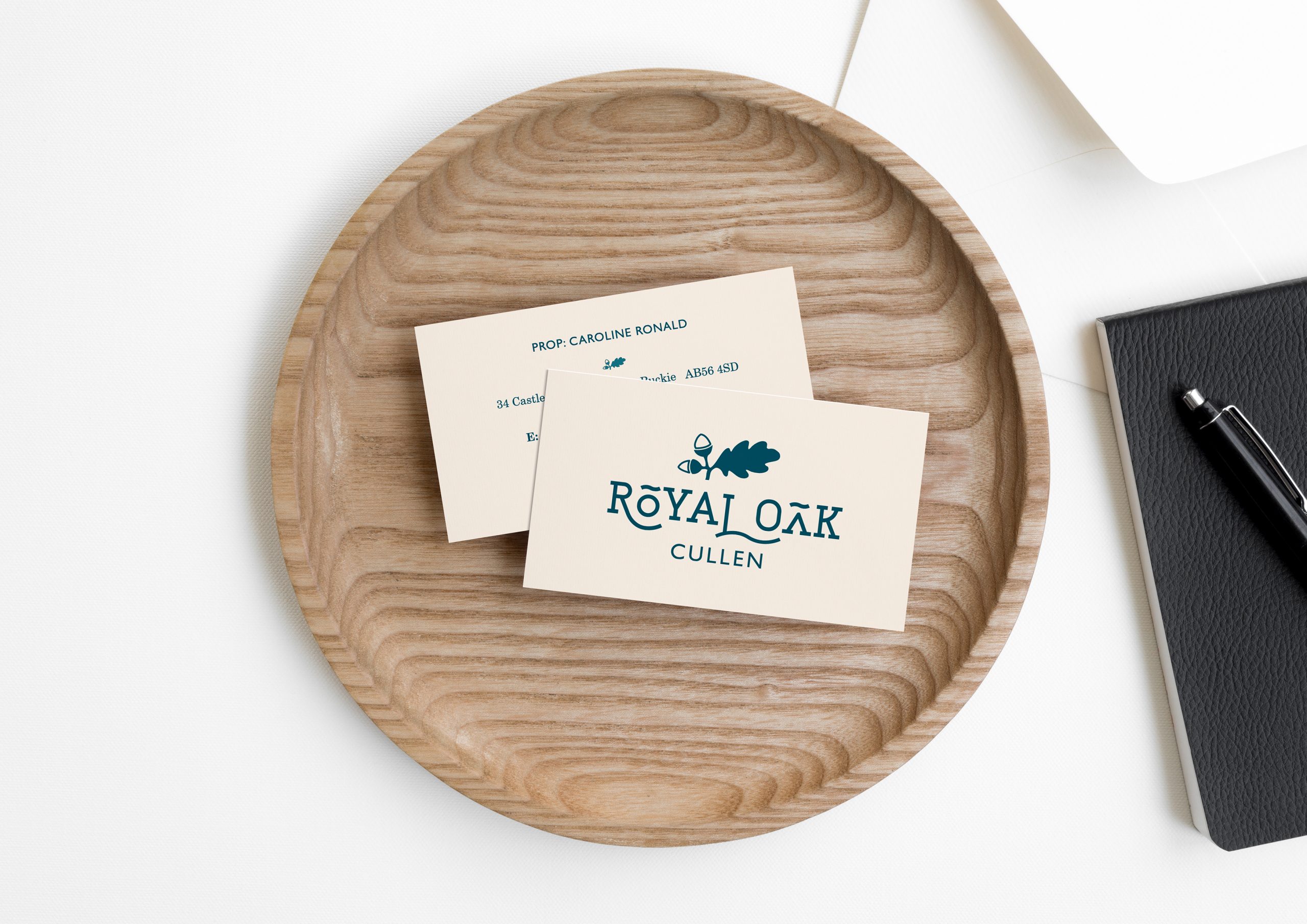
I created a hand drawn oak leaf illustration, which was then digitised and incorporated into the main logo and brand mark, as well as being utilised, as a recurring design motif, throughout the marketing material. The unusual display font which I finally selected required some customisation of the letters and kerning in order to accommodate the hand drawn oak leaf illustration, and allow for the words to be read clearly, this all adds to the overall character of the final logo.
![]()
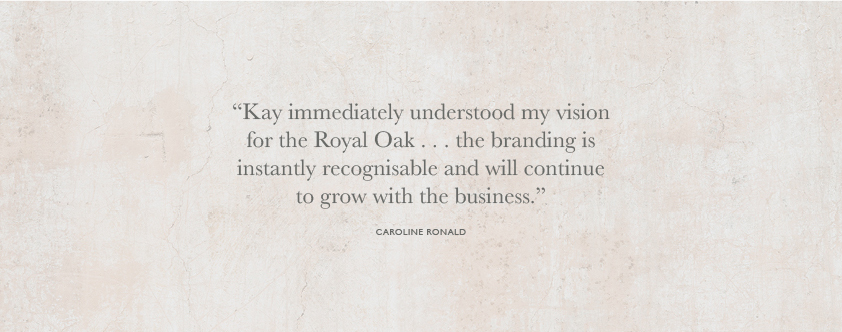
Caroline was delighted with the results, here’s what she said:
If you’re looking at branding or rebranding your business I’d love to hear from you! Please get in touch here.
