13 May 2020
CHRIS JOHNSON ART
“Simplicity is the ultimate sophistication.”
LEONARDO DA VINCI
I’ve known Chris Johnson since I moved to the Island in 2016. Although I knew of his work before I met him – I’d seen his paintings hanging in the Cala d’Or Yacht Club.
Chris produces the most gorgeous, high quality paintings and drawings from his idyllic Mallorcan country studio. He wanted a brand identity which would elevate his beautiful artistic style and attention to detail of his future heirloom artworks. He was keen to build his recognition and reputation as a professional artist on an already thriving art scene. He also wanted to produced a Media Kit document, that could be sent out to potential clients, containing all the essential information they would require to know, if they chose to commission him to create a piece of artwork.
Chris did not have an existing brand identity, so after he completed my Brand Questionnaire, I got to work helping Chris stamp his personality on his new identity. To begin with I curated a beautiful, personalise mood board showing the overall design direction – which totally blew Chris away!

For his brand identity, I had the idea of using a hand written typeface, paired with an elegant serif font – which would convey the gentle, artistic style of his work. The gorgeous, soft colour palette references the colours which Chris uses in a lot of his work. In the end, we decided to use a digital version of Chris’s very own signature – now branding just doesn’t get more unique or personal than that!


Chris was delighted with the results, here’s what he said:

If you’re thinking of branding or rebranding your business I’d love to hear from you! Please get in touch here.
29 Sep 2019

It’s been a while now since I relaunched as Tranquilo Creative, so I thought I would share the reasons why I felt the time had come to start afresh . . .
When I started Purple Creative Design back in 2007, I didn’t really have a clue what I was doing! The funding for my employment had just ended and I really couldn’t face a long commute in and out of Aberdeen everyday, to work for someone else – ah the joys of living in rural north east Scotland! So, with only one client to my name, I decided to take the plunge into the heady world of self employment.
I’d always toyed with the idea of starting my own business, and that I would call it Morado Design. It turned out that, at that time, there was another business just up the road from me, using a similar name and doing similar work – so I had to go back to the drawing board. With time not being on my side, and wanting to get started with client work, I did the “unthinkable” – I chose my business name by which domain names were available! (What on earth was I thinking?!)
Anyway, fast forward 10 years and many more clients, I began to realise that the name didn’t really mean anything to me anymore and I was beginning to feel that it was actually starting to hold me back. To be honest with you, I’d also fallen out of love with my business and the type of work I was doing. I was tired – tired of the hustle, the quick turnarounds, haggling over prices, trying to meet client demands – something had to change, and boy, did it change!
In late 2016 we moved – lock, stock and bookshelves – to the beautiful mediterranean island of Mallorca! The slower pace of island life was exactly what I needed to recharge my creative batteries. I tried lots new things, visited new places, took up old hobbies again and met lots of new people – essentially, I made time to find the me that I am now.
That’s when the realisation hit me – what I was missing in my creative work was a hands-on element – the very part which I loved so much when I was a young designer just starting out. I needed to create a business which would complement my new lifestyle, as well as give me the creative space necessary to do my best work. However, rebranding was so much more than just changing my logo – I’d also realised that my existing business name and identity no longer fitted with my hopes and aspirations for my business in the future.

I’d been aware of Fiona Humberstone (The Brand Stylist) for a while – having just read through her excellent How To Style Your Brand book, and had wanted to attend one of her Colour Psychology Workshops in London, but the timings and logistics just didn’t work for me. Then, serendipitously, she announced she was going to launch her Brand Brilliance Creative Retreat (coinciding with the launch of her superb Brand Brilliance book), here in Mallorca! Not only that, but it was going to be in the town 10 minutes up the road from me – well, of course, I booked straight away – needless to say, it was a real game changer for me!
However, trying to come up with a new name was proving difficult – that was until I completed The Brand Stylist Naming Masterclass online, this gave me the tools and tips I needed in order to choose a name which encompassed what I wanted to do, reflected who I wanted to be, attract the type of clients I wanted and, which also reflected the overall feel I wanted for the business.
Tranquilo is one of my absolutely favourite Spanish words – it means calm, quiet, tranquil, serene, peaceful – and I think it fits beautifully with where my business is now headed – trying to create a bit of calm in this crazy, high speed life.

By taking everything I’ve learned, and applying the principles of colour psychology, I have been able to create an intentional brand for my business, and carefully selected colours, typography, illustrations, texture and photography which alludes to the calm, aspirational, quality of my work, as well as referencing my traditional design training and my many years of experience.
OK, so it’s taken a wee bit longer than anticipated, but I’ve now finally relaunched my business as Tranquilo Creative. There is still some work to do as part of the rebrand, but the biggest things are done so I can now start to enjoy it and focus on what I love; designing brand identities for other lifestyle business owners.
I hope you like the new branding as much as I do.
29 Aug 2019
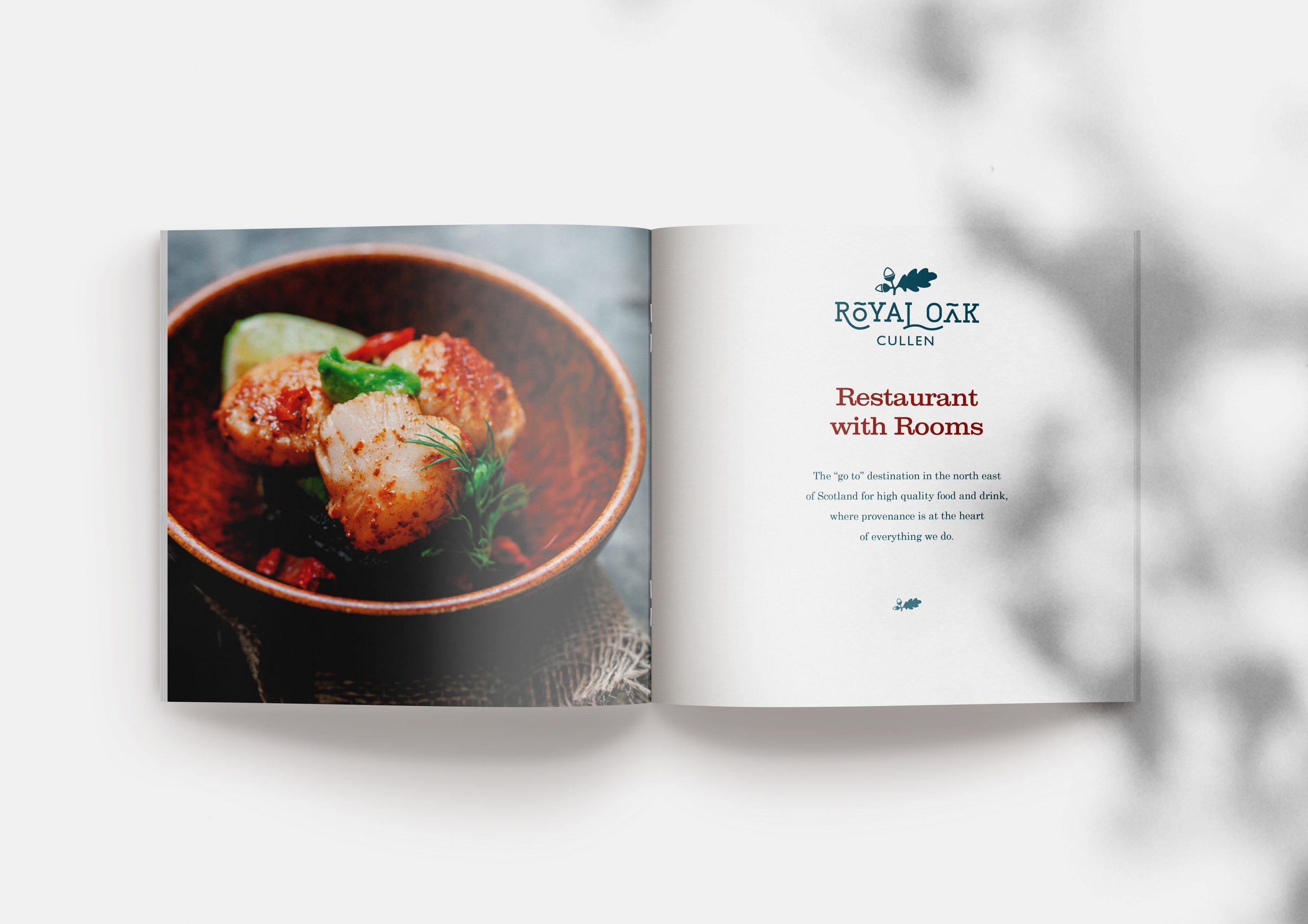
ROYAL OAK, CULLEN
“Mighty oaks from little acorns grow.”
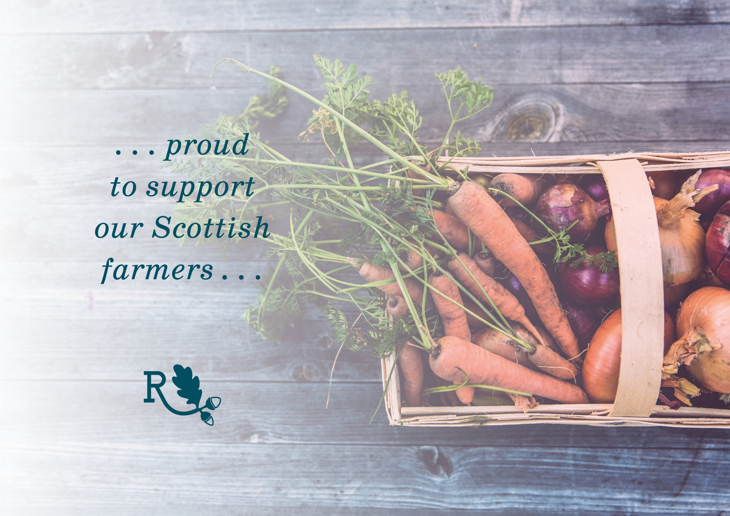
Caroline was referred to me by my lovely web designer friend, Neil Hedley. She had recently taken over the 1894 Grade C Listed building, which was the Royal Oak Hotel in Cullen. The hotel had been closed for a number of years, however, Caroline had a very clear vision about how she wanted to breathe new life into the building again as a restaurant with rooms. She wanted the Royal Oak to be known as the “go to” destination in the north east of Scotland for high quality food and drink, where provenance of the produce was at the heart of everything.
The business did not have an existing brand identity, which meant that I had a free creative rein in order to help Caroline stamp her individuality and personality on her new business.
The project began when I met with Caroline in person – after giving me a guided tour of the hotel, complete with, Art Deco style oak-lined bar area, spacious dining room, and gorgeous bedrooms – we sat down with a cuppa and Caroline told me all about her hopes and dreams for the business, and together we filled in the brand discovery questionnaire which I’d sent to her. It turned out that we actually had quite a lot in common – we’d both grown up on Scottish farms and both had a passion for food, where it comes from, and how it is produced.
After going over the answers which Caroline had given me, I began to distill down the brand characteristics, until I came up with the absolute essence of the brand, which was modern, warm and friendly. Then I curated a beautiful mood board showing the overall design direction which I felt the brand should take.
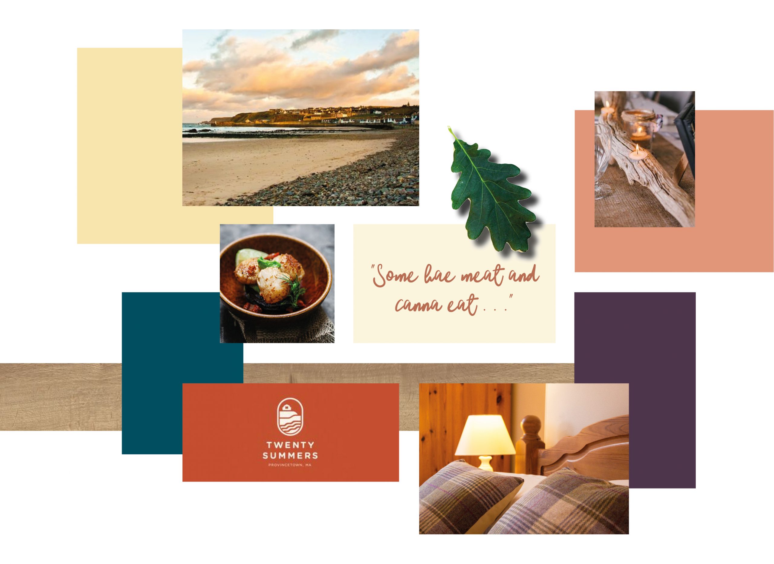
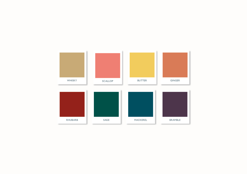
Once Caroline had approved the mood board, I began the search for the ideal typeface for the main logo – I wanted something with a bit of weight and gravitas to it, which could convey the brand essence in an intentional way. I also began to pair it with supporting fonts, which could be used for headings and body copy, and created a gorgeous colour palette which would complement the brand perfectly.
I created a hand drawn oak leaf illustration, which was then digitised and incorporated into the main logo and brand mark, as well as being utilised, as a recurring design motif, throughout the marketing material. The unusual display font which I finally selected required some customisation of the letters and kerning in order to accommodate the hand drawn oak leaf illustration, and allow for the words to be read clearly, this all adds to the overall character of the final logo.

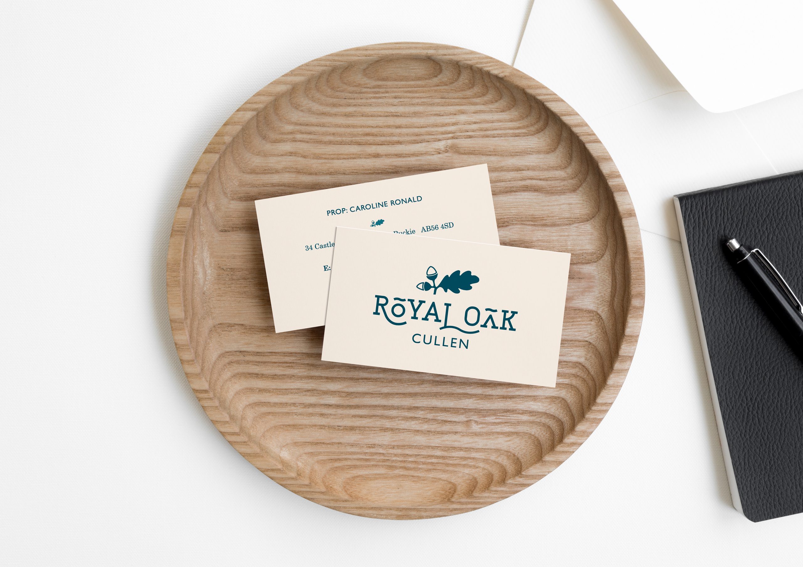
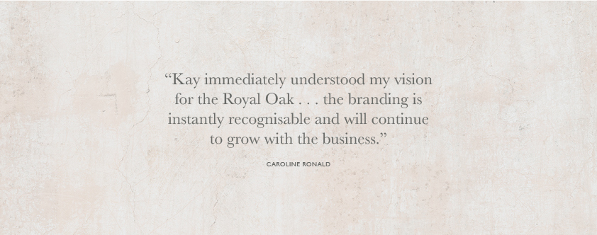
Caroline was delighted with the results, here’s what she said:
If you’re looking at branding or rebranding your business I’d love to hear from you! Please get in touch here.
Recent Comments