15 Jan 2024
ELISHA PICKLES PHOTOGRAPHY
“. . . collect moments, not things . . .”
Elisha approached me after we’d completed the Me & Orla The InstaRetreat course together. She really loved my work and after the initial Zoom call, she decided that I was the perfect designer to create a beautiful brand identity for her new photography business. Elisha’s main interest is in people – she loves to create images with a human element – ones which tell a real story. Having gained a reputation amongst her photographer friends of being able to capture intimate details particularly well. Elisha’s light, clean images have a clear narrative – joy, connection and story – she manages to beautifully capture those emotive moments, allowing the viewer to feel as if they’ve borne witness to a particular moment in time. Her photography style is very timeless, evocative and beautiful, which is reflected throughout her image gallery. Her natural, candid images have an air of authenticity about them. As a fledgling business, Elisha wanted her branding to come across as professional, yet approachable, something she wants to carry through her entire client experience from her website to the photo shoot to the delivery of the final images. She also needed a brand identity which would not only attract her ideal clients, but could grow with her business over the coming years.  For Elisha’s brand I took inspiration from her beautiful images and her love of being near the coast. The soft, muted colours are evocative of a late English summer: the gentle soft dove greys of water-worn beach pebbles, the whispery blues of early morning skies, the dusty greens found in the myriad of dune grasses and the deep teal, reminiscent of the dark depths of the sea. The traditional serif font nods to heritage and adds an air of elegance and aspiration, while the sans serif font adds a touch of modern luxury.


 In order to give Elisha maximum flexibility with her new brand identity, I also created some alternatives which could be used through a variety of different physical and virtual publications and platforms.


 Elisha was delighted with the final results and her business is currently going from strength to strength! If you’re thinking of branding or rebranding your business I’d love to hear from you! Please get in touch here
17 Jul 2020
MALLORCA REFLECTIONS
“Dare to live the life you’ve always wanted . . .”
Adrian approached me after he had seen the work I did as part of the Elevate with the Brand Stylist mentoring programme on Instagram. He really loved my work and decided that I was the perfect designer to create a new brand identity for his blog – Mallorca Reflections – a lifestyle blog aimed at travellers, settlers and expats alike.
Owner, Adrian Petersen had worked hard to create a blog which features insights, information and impressions regarding food and wine, hotels and travel, as well as life on Mallorca. It also includes features from other local trusted bloggers and businesses. Over the years, the current branding message had gotten a little muddied and Adrian wanted a new brand identity which “reflected” the high quality, professional and well-respected source of information that his blog has become.

For Adrian’s brand I took inspiration from the Island itself; reflecting its’ dramatic and distinctive Mediterranean personality.
The cool, intense, bright and clear colours, are evocative of a sunny summer spent on this glorious island: the intense dark of the night sky, the deep blues of the warm water, the turquoise of sea over a sandy beach and highlights of yellow and orange taking inspiration from the many fruit farms, all offset with the cool grey tones of the Mallorcan pearl.
The serif font which I’ve used, beautifully combines thick and thin strokes, which provide the perfect contrast, creating a simple, yet distinctive brand identity.


Adrian was delighted with the results, here’s what he said:

If you’re thinking of branding or rebranding your business I’d love to hear from you! Please get in touch here
21 May 2020
Wow, these really are strange times, aren’t they? Here in Spain we’re now well into our second month of lockdown, and if you’re anything like me, you’ll have been on a total emotional roller coaster of feelings over the last few weeks. We’re all having to adjust to the new “normal” of working from home, as well as getting to grips with new technology like Zoom, and on top of all that, we still have to juggle home life too!
Your business might not be going in the direction which you had originally planned for 2020, but that doesn’t mean you can’t still be working towards building the best brand for your business for when things get back to normal. I get that you may be feeling unsure or lost – I really do, I’ve gone throughout exactly the same things too – but by giving yourself something tangible to focus on you can really help your business flourish in the long run.

I’ve been speaking to some of my customers and there are a few things which keep coming up in conversation, especially about what they are finding challenging with regards to their branding at this time – the top three are:
• They feel unsure about posting, promoting and selling their services / products at this time.
Well, I definitely think that you should absolutely keep posting, promoting and sell your business! OK, so you might not be able to do the actual work at the moment, but by continuing to appear consistently in front of your customers, you will maintain customer loyalty. If you just disappear completely, chances are that they might begin to forget about you, and they might have seen one of your competitors instead – and this could be a real threat to your business. If you don’t post little and often, think about how much harder you’re going to have to work when things do go back to normal? At least if you keep appearing, you will be in a position to hit the ground running from the get go when this is all over.
• They don’t have the skills, or the artistic talent necessary, to be able to create a compelling and cohesive brand.
Just because it’s your business, it doesn’t mean that you have to do absolutely everything yourself. There just aren’t enough hours in the day! Sometimes, the most cost effective solution to your problem is to delegate – by getting an experienced designer like me in to create your brand identity and marketing materials, can actually save you so much time and money. It also leaves you free to do the things which you do best, like running your business!
• They don’t believe having a clear brand identity is that important to the success of their business.
Well, let me tell you – it is sooooo important!
How your brand looks and feels to your customers is key to the success of your business. Imagine for a moment you are running a high-end boutique hotel, the interiors look like they’ve come straight out of Elle Interiors magazine. You have a Michelin star chef running your award-winning restaurant kitchen and a day spa offering the very latest in spa treatments. However, you want to attract a new market – you think your hotel would be the most perfect venue for intimate and exclusive weddings, and to promote that you are going to hold a PR event.
So, you hop onto your computer and you knock up a “quick” flyer to advertise the event – a bit of clip art here . . . a gaudy colour or five there . . . and, *shudders* a bit of Brush Script font, just to finish it all off! It’s taken you absolutely hours to do – you’re not entirely happy with it – but you think, I’ve wasted enough time so it will have to do!
But think about it for a moment – do you really think that this is the right brand image to attract a high end market? So, instead of saving you money, your quick homemade flyer may actually be losing you valuable business! If you want to attract a certain market, then absolutely all of your branding must be targeted to that market.

If you’ve also had thoughts and feelings similar to these, then I’ve got something which may just be help you out. I’m offering a select few of you the chance to gain some real brand clarity about your business with a free Brand Audit – where we will analyse all of your existing brand visuals, social media and website to see if they are performing in a compelling and cohesive way, which is right for your business.
As well as giving you an overview of your existing branding, a Brand Audit will also give you some actionable hints and tips – some of which you might be able to put in place right away, at no or little cost – and also identify those longer term projects which could improve your business in the future by attracting more of your ideal customers.
Now, if that sounds like something you might be interested in, then please contact me to arrange that Brand Audit*. It may be free, but it’s something that your business cannot afford to miss out on!
*Offer ends 30 June 2020
13 May 2020
VILLA FLORES, TUSCANY
For my third, and final ELEVATE with Fiona Humberstone project, I selected an Italian retreat, VILLA FLORES, (or VILLA FIGLINE VALDARNO as Fiona had named it!) Located high on a Tuscan hillside, this 18 roomed agroturismo, is 15 minutes from Florence, amidst an award-winning vineyard, olive grove and productive kitchen garden.
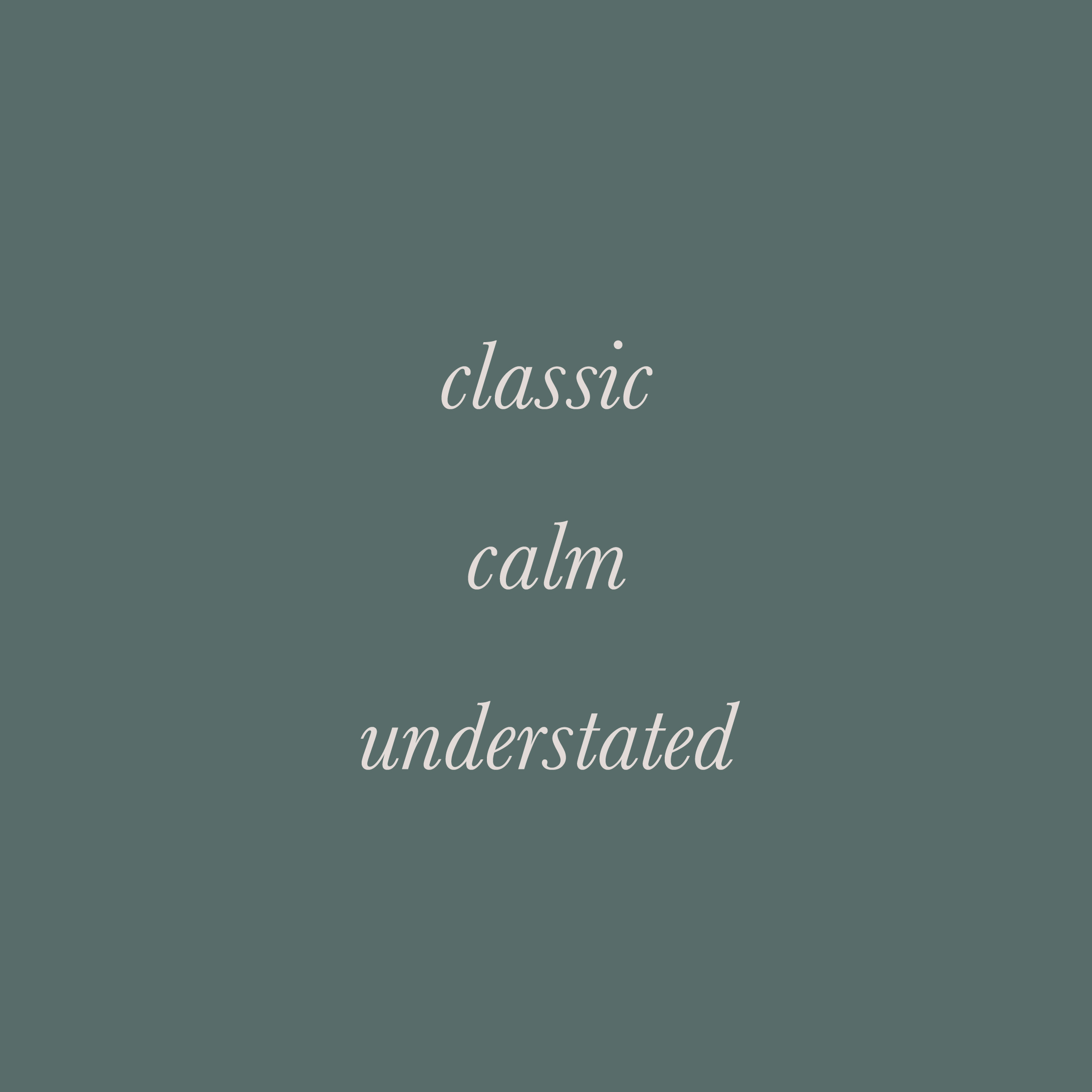
The stunning Italianate villa is currently decorated in the very dark, heavy local vernacular style. The new owners have an incredible vision for the restoration of the house, garden and estate, and by breathing new light into the building, they hope to attract a new type of guest. Their classic, calm and understated style will be reflected throughout the house, garden and pool area.
Tuscany, and Florence in particular, is renowned for great food, wine, art, music and opera – passions which the owners are keen to share with their guests. As well as offering a calm, restorative retreat, they also plan to include painting workshops, opera retreats and a spa offering specialist treatments. There will also be an on-site restaurant which will showcase the very best produce that the estate has to offer.
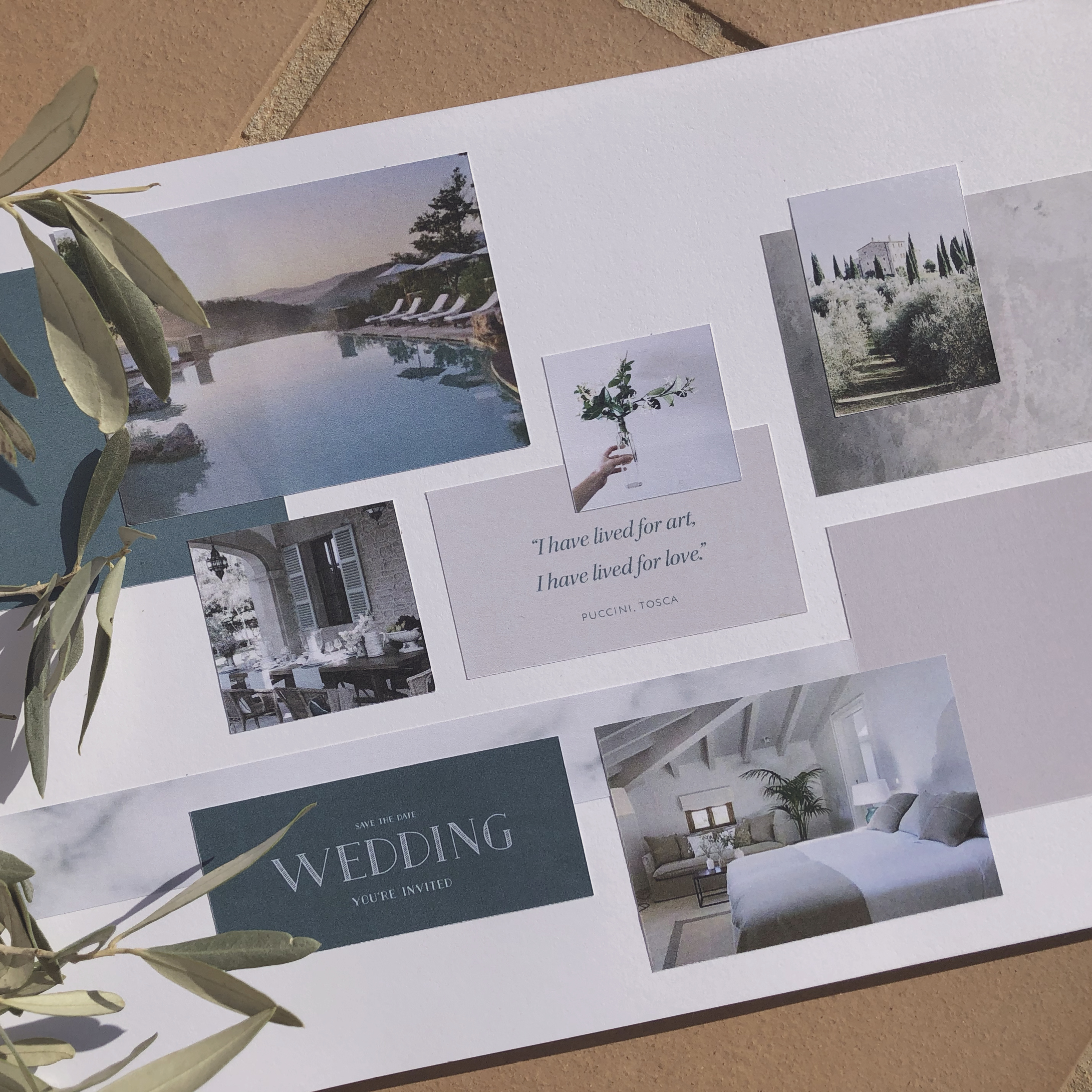
Wow, don’t you just want to go and book a retreat there right now? This brief spoke to me on so many levels – I mean, food, wine, art, music and opera – honestly, what’s not to like?! After some extensive research on the area, the culture, and the local flora and fauna, I created a concept which I loved. I will share more as time goes on, but for now, here is the mood board reflecting the design direction.
Can you define the essence of your brand? If you can distill the essence of your brand down to three brand characteristics, you will have the perfect starting point to create an intentional brand identity which you can be proud of.
Shown here are the brand characteristics for VILLA FLORES.
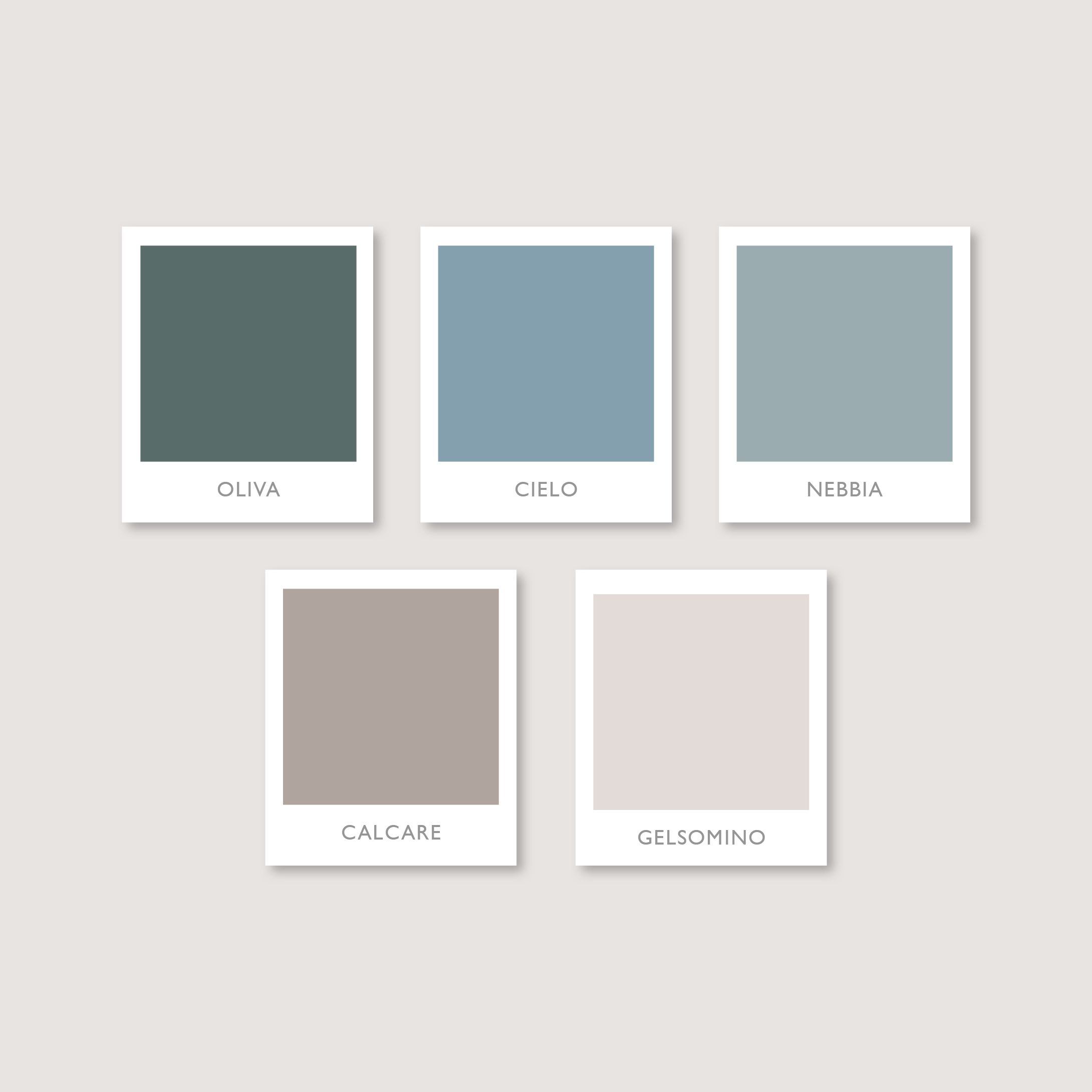
Oh my, I am so in love with this colour palette! This stunning colour palette is the one I created for VILLA FLORES. These soft, faded colours, are evocative of a summer spent under the Tuscan sun: the soft sandstone of the buildings, whispery blues of early morning skies, pale cream of the sweet scented jasmine and dusty greens found in the olive groves.
VILLA FLORES truly is the epitome of classic, calm and understated style.
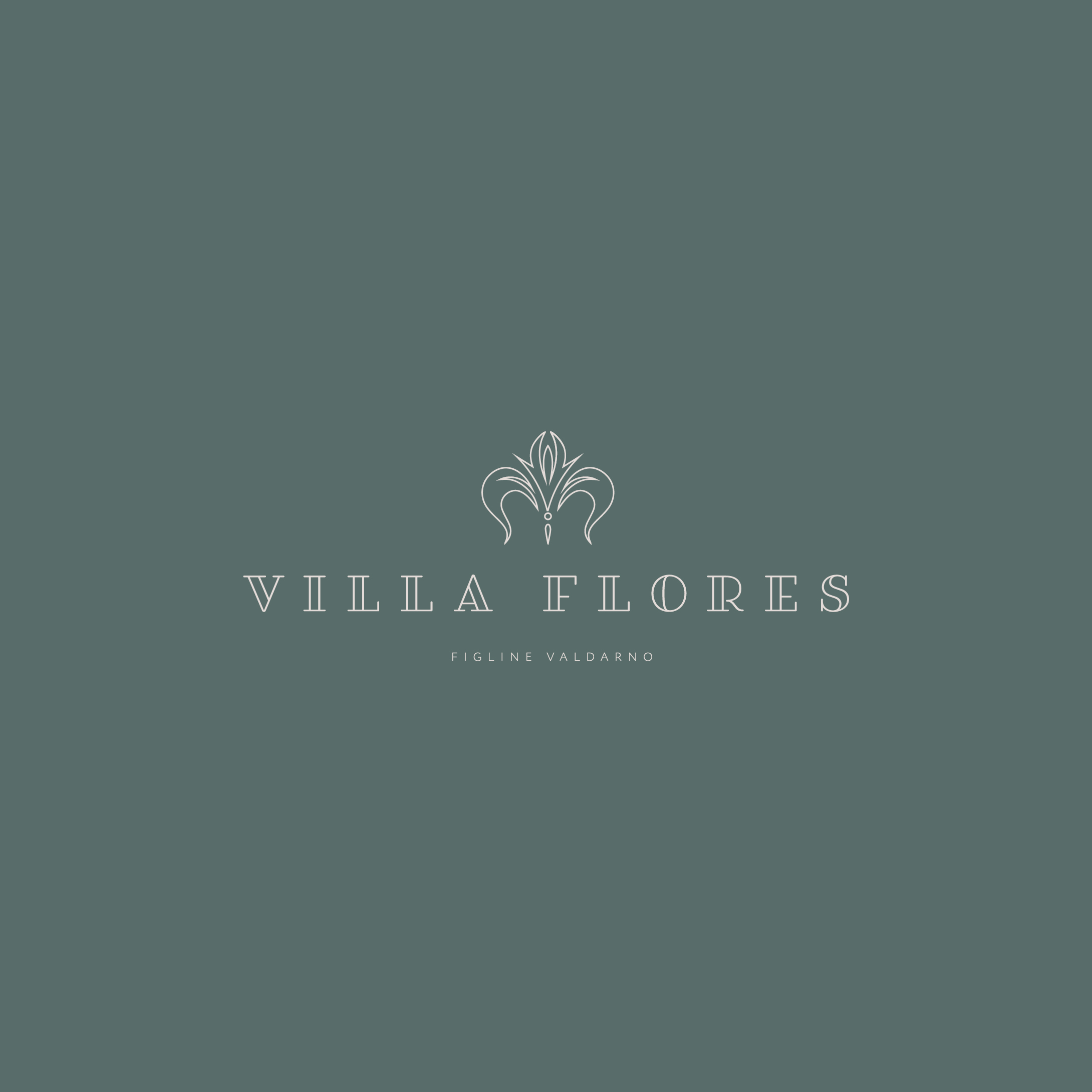
I took inspiration from the classic Italianate architecture found in the area; referencing the famous Iris Fiorentina. The “giglio”, as it is known locally, is a decorative emblem which can be found on fireplaces and floor tiles throughout the Villa, as well as on the crest of the Flores family.
The serif fonts are a nod to the historical stone carved inscriptions and signs found in local towns and villages all over Tuscany.
The classic, timeless style of the brand identity which I created, echoes the vision that the owners have for VILLA FLORES. It adds to the sense of history of the Villa, but at the same time it has a light, modern influence.
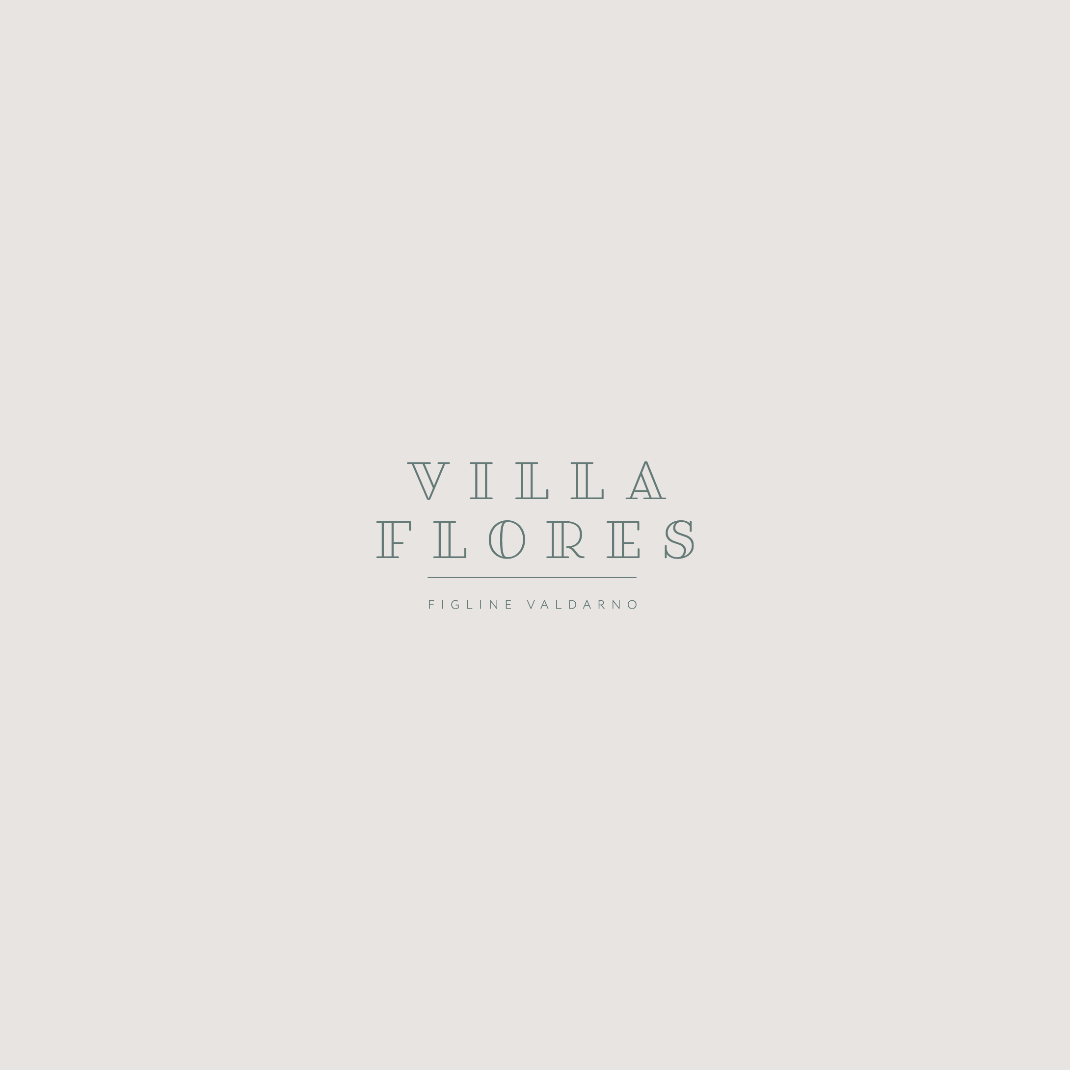
Sometimes, simplicity is enough. As well as the primary brand identity, I also created a secondary brand mark for VILLA FLORES. It showcases how stunning typography and layout, along with exquisite letter spacing can be used to convey the classic, yet understated style in a pared back way, but one which still perfectly reflects the brand message.
These days your brand identity has to work across many media types and platforms – everything from printed marketing collateral to online profiles. How you make your brand identity work on your social media profile for instance, can be a little tricky. One way to overcome this is with a gorgeous monogram or brand mark, such as the one I created for VILLA FLORES.
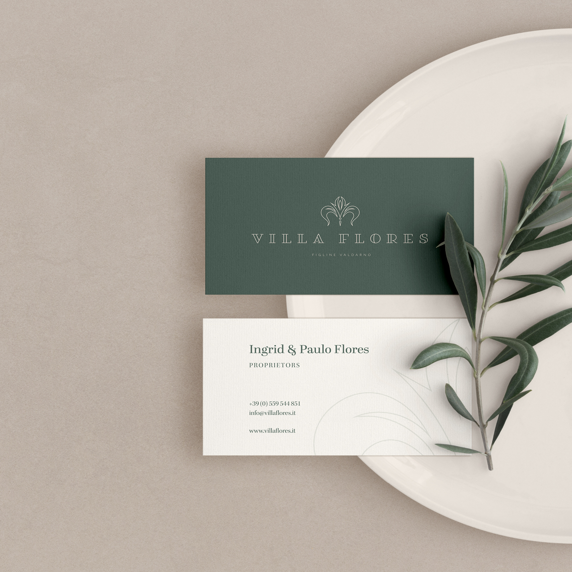
Creating brand mockups really brings a brand to life, especially if those mockups are so “on brand” for your client. I think you’ll agree, that this one from fits the VILLA FLORES brand so perfectly, it could have been custom made, just for them.
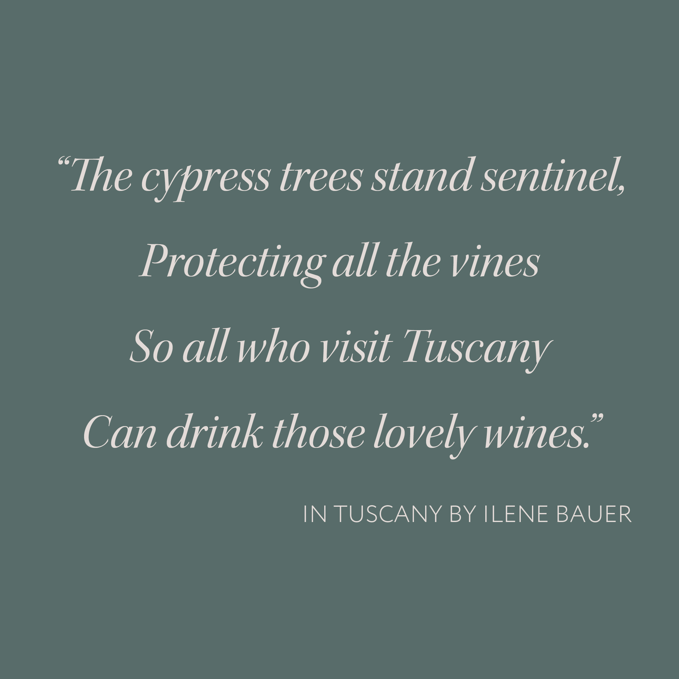
A fabulous quote deserves a fabulous typeface! And, I hope you will agree, that the gorgeous Kepler Italic really is a fabulous typeface! It is a modern re-interpretation of a traditional 18th century typeface – and, as such, it lends just the right touch of elegance and refinement, that suits VILLA FLORES to a “T”. I loved this quote as soon as I found it – for me it really evokes the very essence of Tuscany. You can almost hear the wind rustling gently through the cypress trees, as they stand, high on the hillside protecting the precious jewels, which are slowly ripening and sweetening, in the midday sun on the pale limestone slopes below.
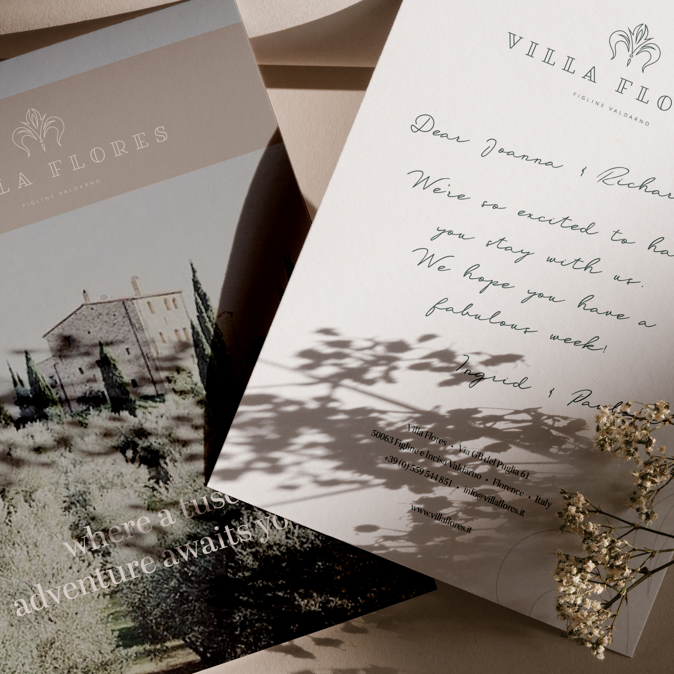
In order to bring your brand to life, I like to go the extra mile and create a mockup of a piece of marketing collateral especially for you. Something so simple as creating a gorgeous personalised postcard (like this one I designed for VILLA FLORES) which you can send to your guests prior to their stay, not only adds that little special touch, but it also enchants your clients and elevates your business in their eyes.
13 May 2020
SAMPHIRE, CORNWALL
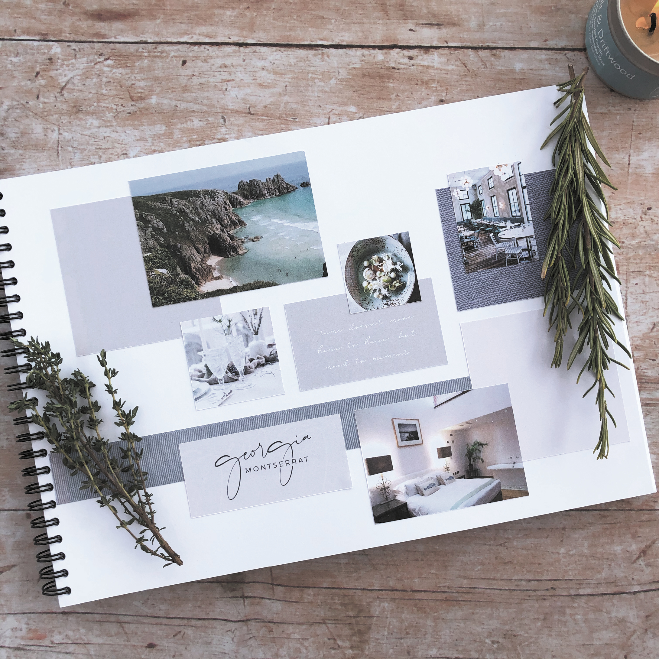
For my second ELEVATE with Fiona Humberstone project, I selected SAMPHIRE, a restaurant with rooms located in the wilds of Cornwall. I totally fell in love with Cornwall after just one visit – I loved the romance of the wild, rugged scenery, the gorgeous coastal colours and also the connection between food and nature which is so prevalent there. This brief really spoke to me – for me there was absolutely no other choice! So, after completely immersing myself in all things Cornish (and foody!), I created a concept which I was proud of. Here is the mood board which reflects the design direction I was heading in.
So, let the detective work commence! A good client brief will provide your designer with background information about your business, the direction you would like to take it in, and what it is that sets you apart from your competitors. The trick to being an intentional designer however, is being able to detect which bits of information are essential to determining the impact that your brand needs to create. Like any good detective story, there are likely to be twists and turns in the plot line, but with time and my expertise, I can help guide your brand in the right direction.
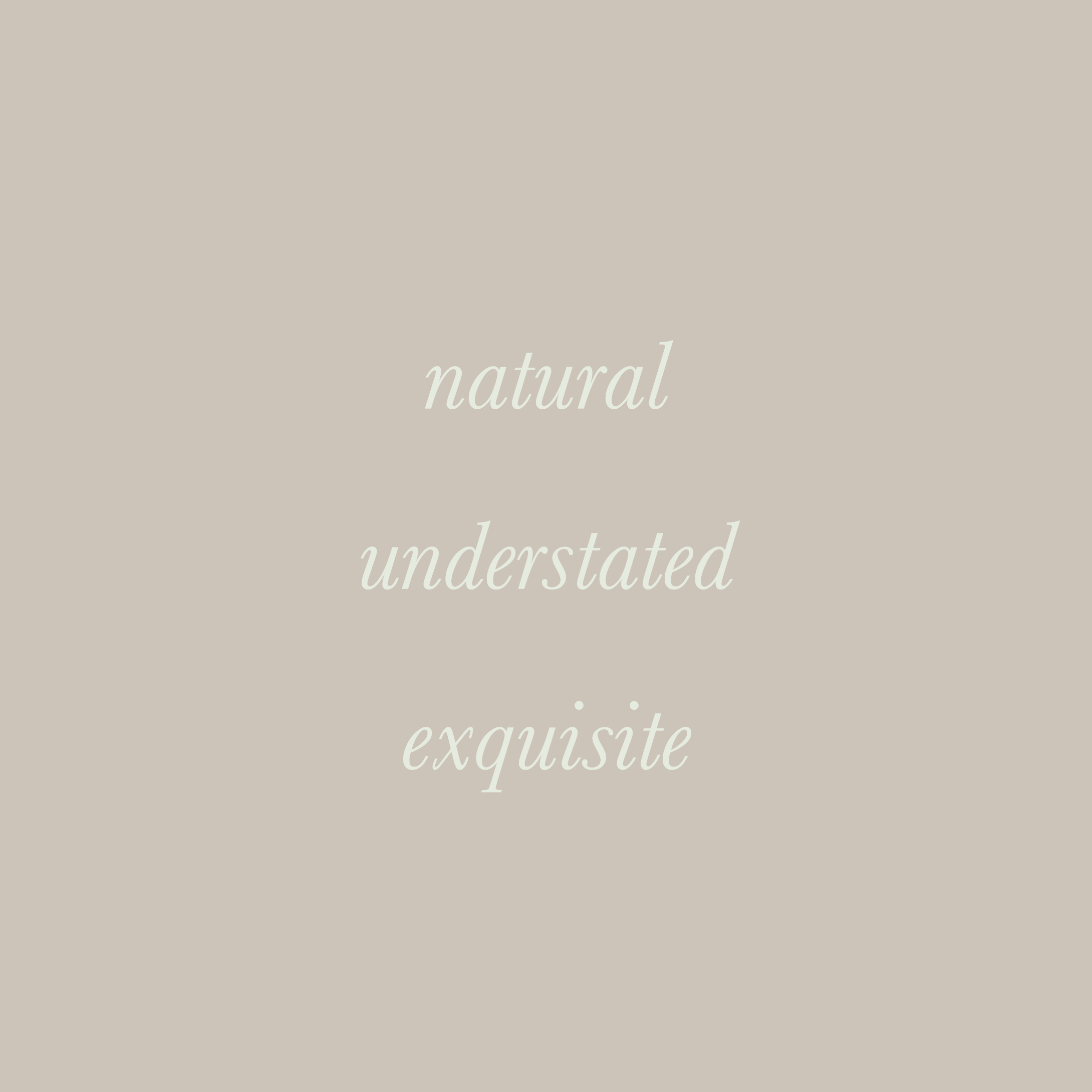
The key to it all is being able to distill the essence of your brand down to three brand characteristics, these will then become the starting point of creating an intentional brand identity which you can be proud of.
Shown here are the brand characteristics for SAMPHIRE.
We learnt more about the magic that colour psychology can bring to our work and how it allows us to create more intentional brand colour palettes for our clients projects.
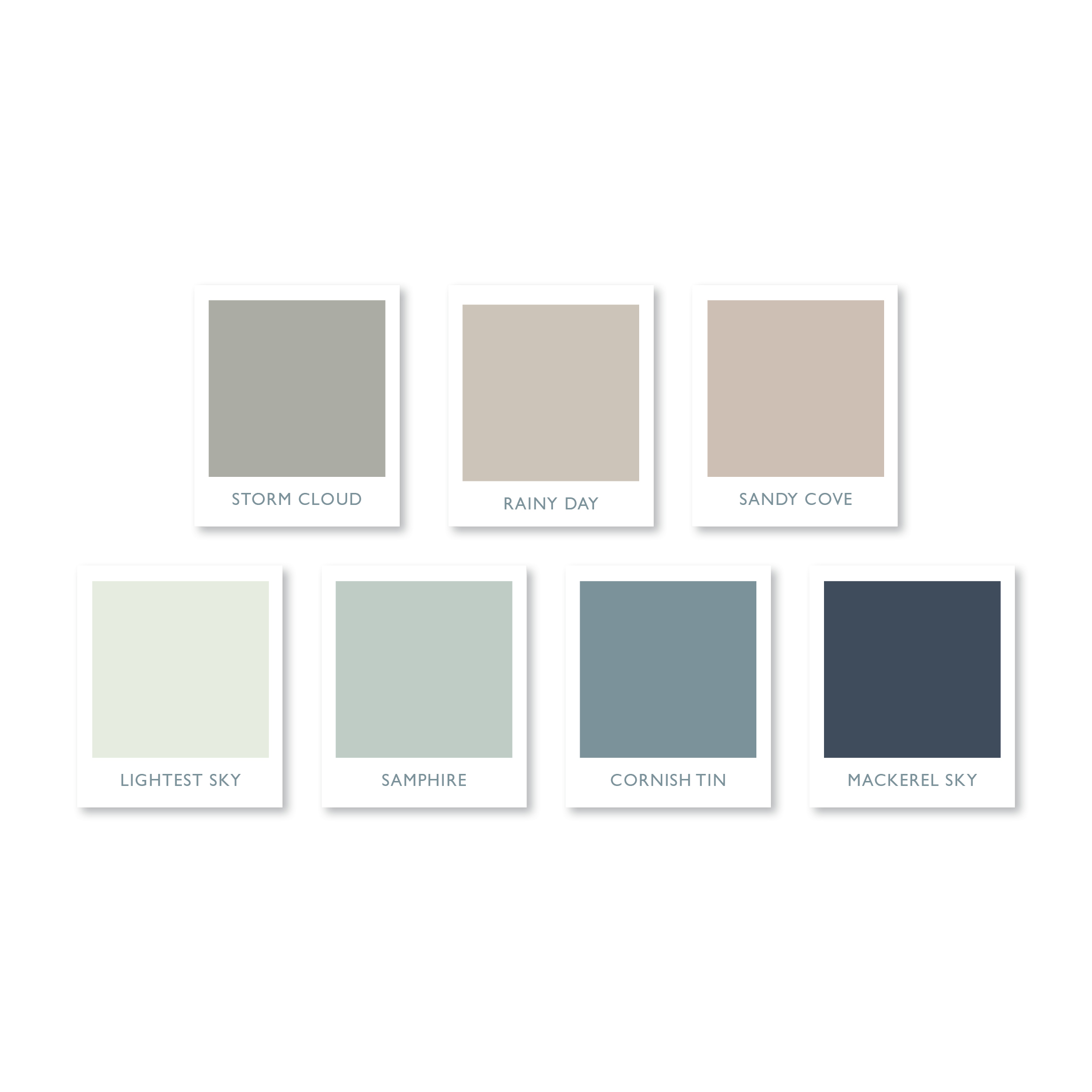
This gorgeous understated colour palette is the one I created for SAMPHIRE, a restaurant with rooms in the wilds of Cornwall. It combines soft, muted colours, inspired by the rugged Cornish landscape and the exquisite littoral light famed for centuries by artists. Call me an old romantic, but I find that naming the colours, in a way which complements my clients’ brand, helps to forge a stronger connection and brings them to life in a way that a mere Pantone reference or hex colour code just can’t rival.
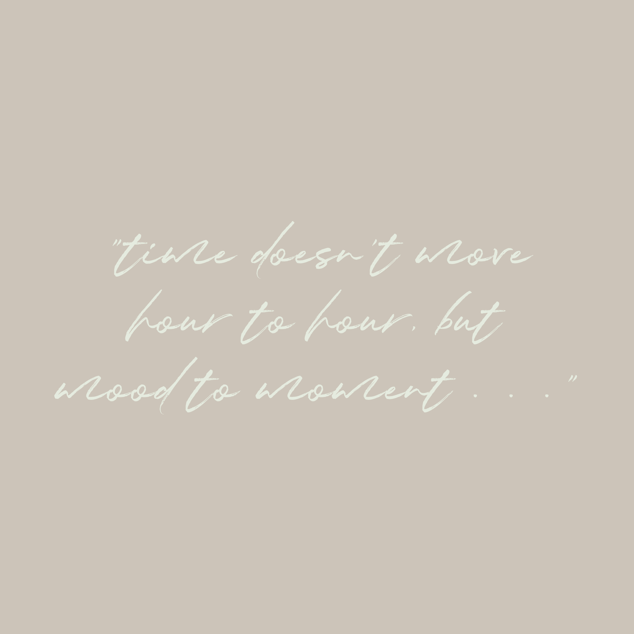
It’s no secret that I love a quote! I am also very fond of a gorgeous typeface, and if it’s a handwritten one, then that’s it, I’m totally smitten!
Fragile Script, which I used for the SAMPHIRE brand evokes just the right feeling of elegance, and when paired with an understated serif typeface, Bodoni 72 Smallcaps Book, it creates a typeface marriage made in heaven.
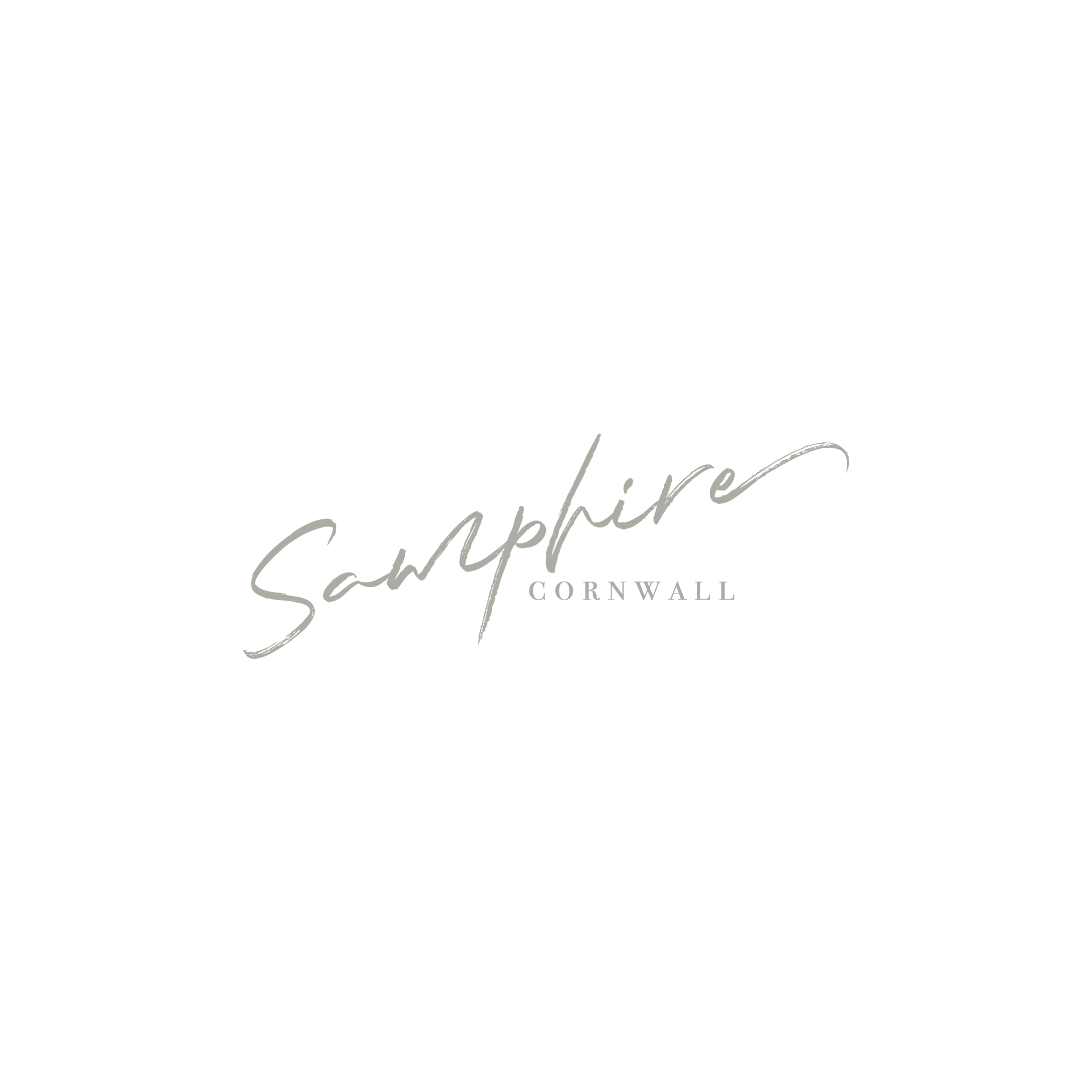
For SAMPHIRE I wanted to create a simple typographical logo with a natural, understated and exquisite feel. It reflects the connection between food and nature, which has ensured that this stunning restaurant has become a destination restaurant in the truest sense of the word.
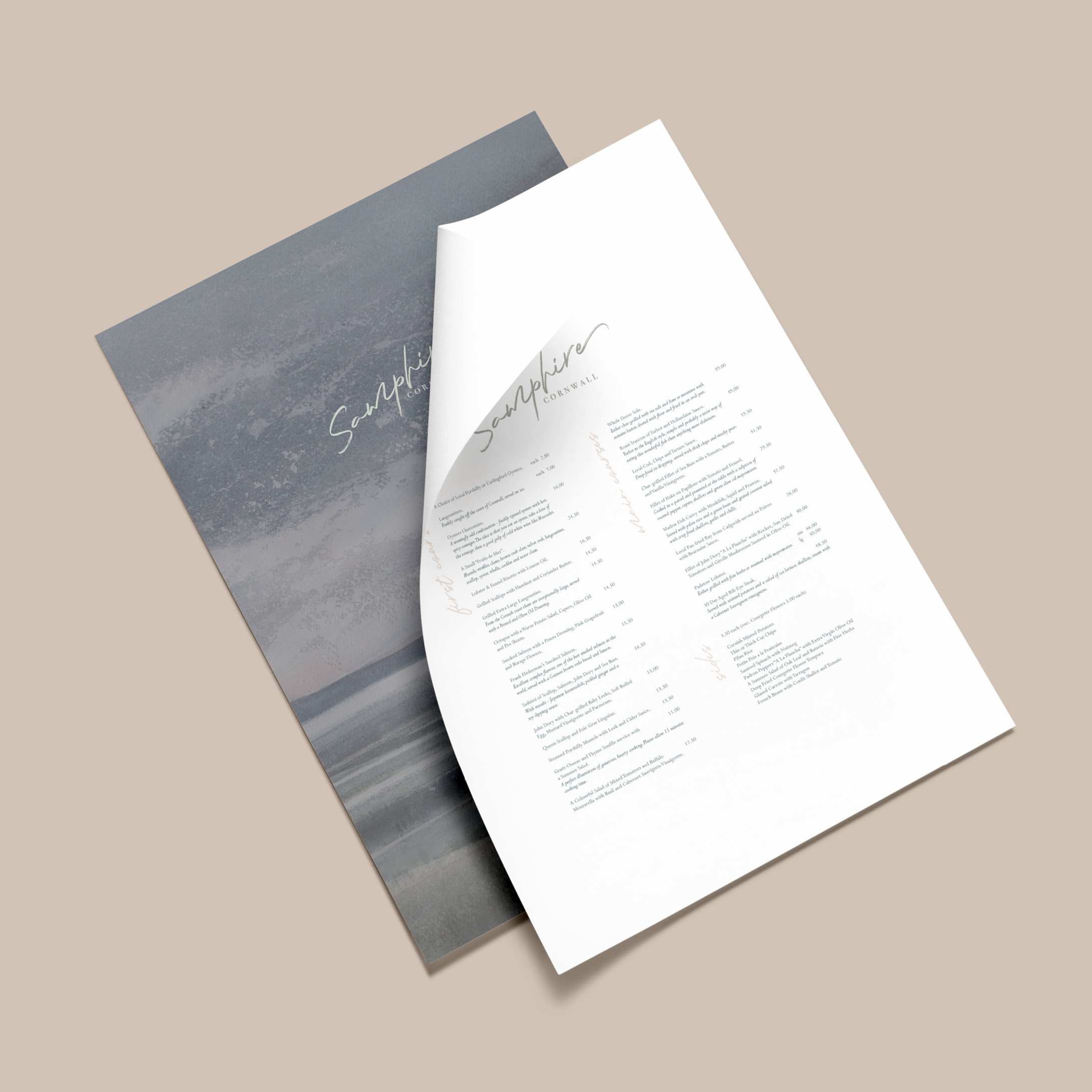
Here is the gorgeous menu I created for SAMPHIRE – one which is worthy of a Michelin star restaurant. I do love to go the extra mile for my clients by creating mockups – this means that I can really make their new brand identity to come to life.
Showcasing your new identity in action allows you to think big about your business, and can open up all sorts of possibilities, which you had only dreamt about . . .
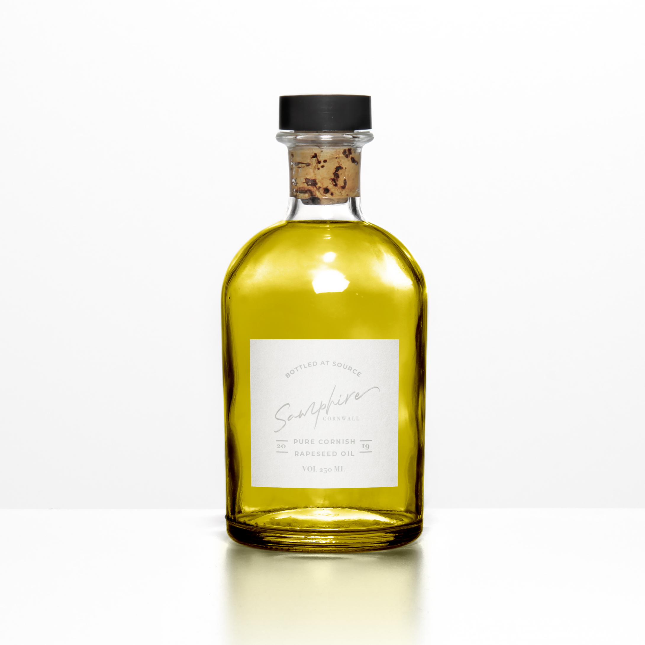
The devil is in the detail . . . This may look like an ordinary bottle of olive oil, but it is in fact a bottle of Cornish rapeseed oil!
The ethos of SAMPHIRE’s Michelin starred chef is to create simple, but exquisitely presented food, such as his signature dishes including samphire and seaweed, seasonal Cornish fish and vegetables charred on the Josper grill. Where possible, everything is sourced within a 25 mile radius of the restaurant, with the emphasis on local seasonal produce.
At the moment, Cornwall isn’t renowned for producing olive oil (although attempts have been made!), however, rapeseed is grown on the rich, fertile soils of the North Cornish coast, which meets his criteria for celebrating home grown produce beautifully.
Even after all these years, I still get really nervous when I present my work to clients. Have I fully understood their hopes and dreams? Does the mood board illustrate this with clarity? Are the colours and fonts, which I have carefully hand picked, right for where their business is heading? Have I created my best work? Will they actually like it? Gosh, it’s all just soooo stressful!
Taking part in the Elevate mentoring programme with Fiona Humberstone, has given me a fantastic opportunity to grow my creative process and have faith in my ability to design beautiful, modern brand identities. It hasn’t eased all of my fears and worries, I’ll always have those, that’s just human nature, but it has given me the confidence to know that within me I have the skill and the creativity to help elevate my clients businesses in an intentional way.
13 May 2020
BREEN, NORWAY
Recently, I took part in ELEVATE (a six week mentoring programme for brand designers committed to excellence) with Fiona Humberstone, The Brand Stylist.
Every two weeks, Fiona released three very different, inspirational (but alas, sadly fictional!) client briefs from which we had to choose one to work on. We then had a very tight timeframe of one week in which we had to develop and deliver our initial design concepts. This work was reviewed by Fiona, who in her role as creative director, gave us constructive feedback. We then had another week in which to refine the work into a finished portfolio piece.
For my first project, I selected BREEN, an exciting new Norwegian boutique hotel, located at the edge of one of Norway’s most majestic fjords – the deep blue Geirangerfjord. So, after completely immersing myself in all things Norwegian, I created a concept which I was proud of. Here is the mood board which reflects the design direction I was heading in.
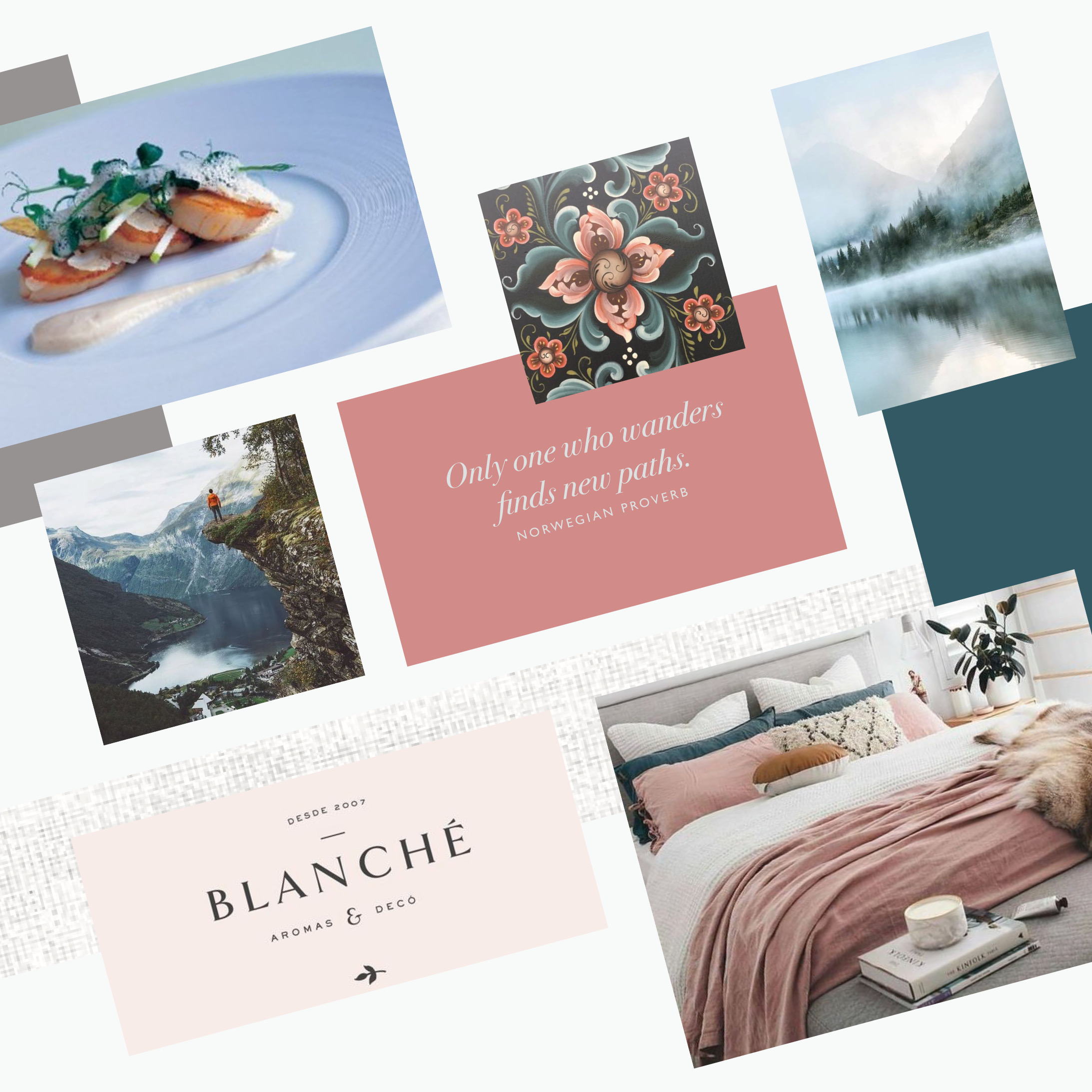
Sometimes, being a brand designer is a little like being a detective! You have to go through the client brief with a fine tooth comb, picking up on the vital “clues” – the essential pieces of information about your client’s business – and weeding out any red herrings which have been placed to throw you off track!
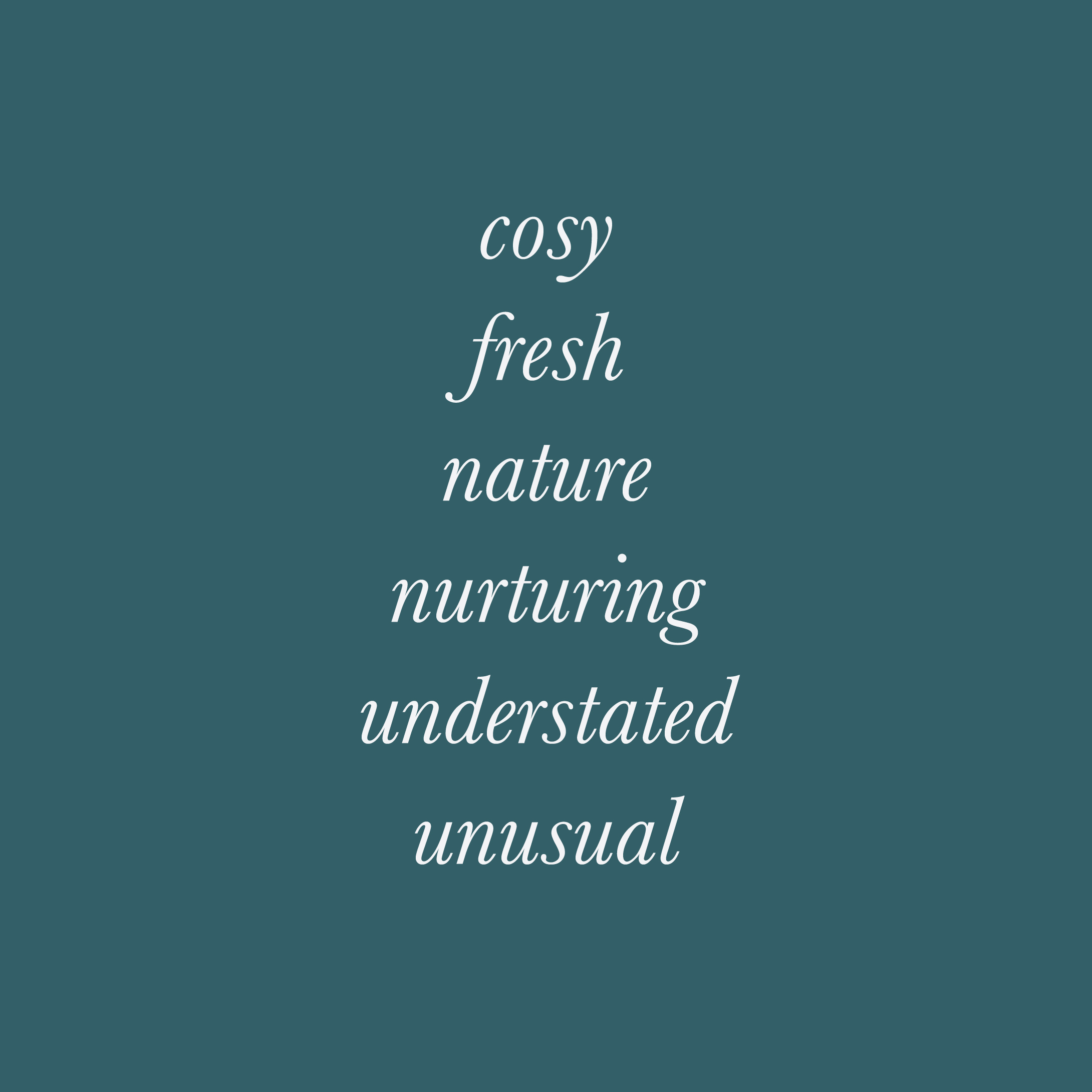
Once you’ve completed this stage you will have three to six key brand characteristics, which become the cornerstones to being able to create a brand identity with intention for your client.
Shown here are the brand characteristics for BREEN:
Each and every colour, has within it, the magical power to make us “feel” something.
Learning more about colour psychology in branding was a real game changer for me. It will allow me to create a more intentional colour palette for your brand, which will connect with your muses at a deeper, more subconscious level, faster than words or images ever could.
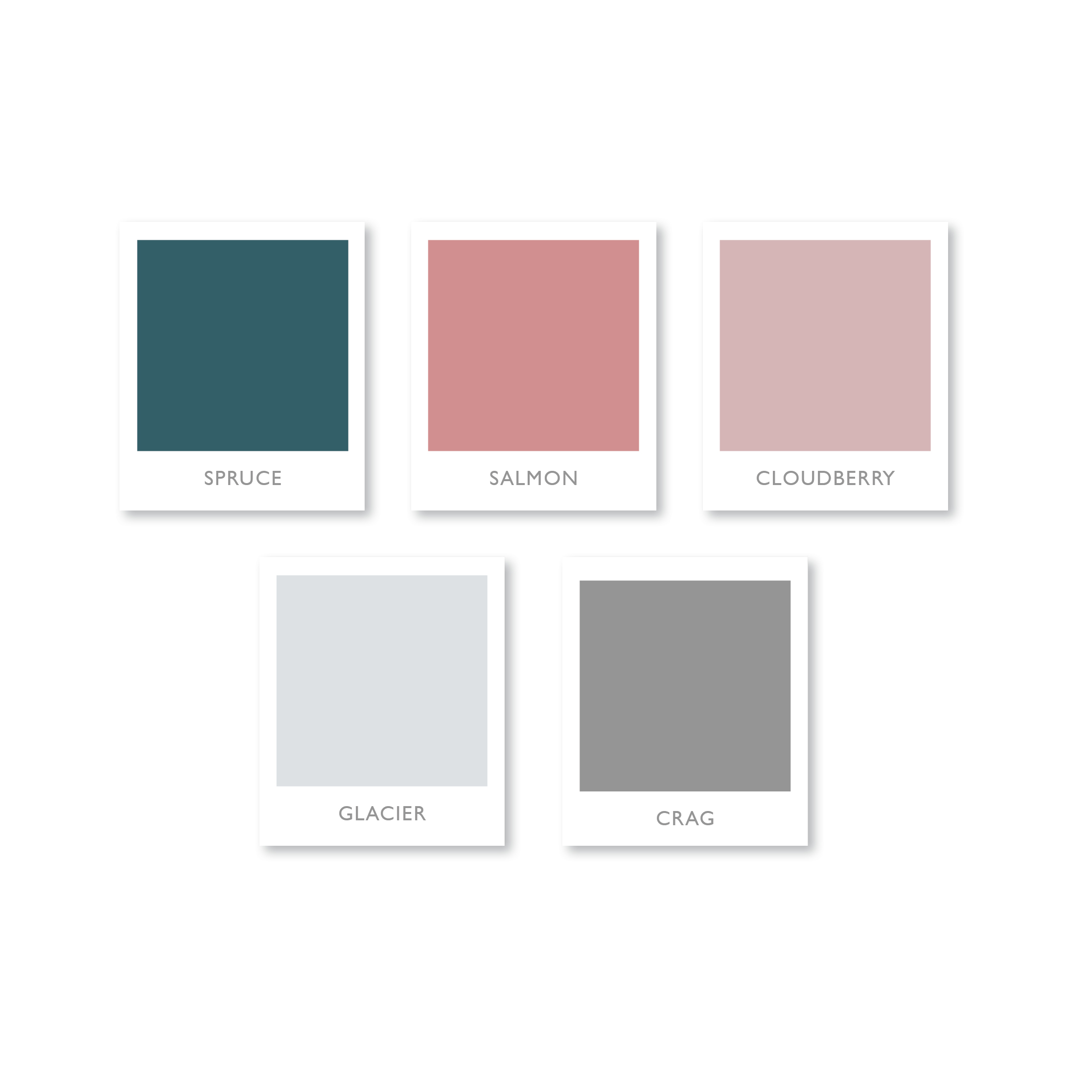
This limited colour palette is the one I created for BREEN, an exciting new Norwegian boutique hotel. It combines soft, natural colours, inspired by the lush vegetation, waterfalls, astonishing mountains and feather light mists found in the beautiful surrounds.
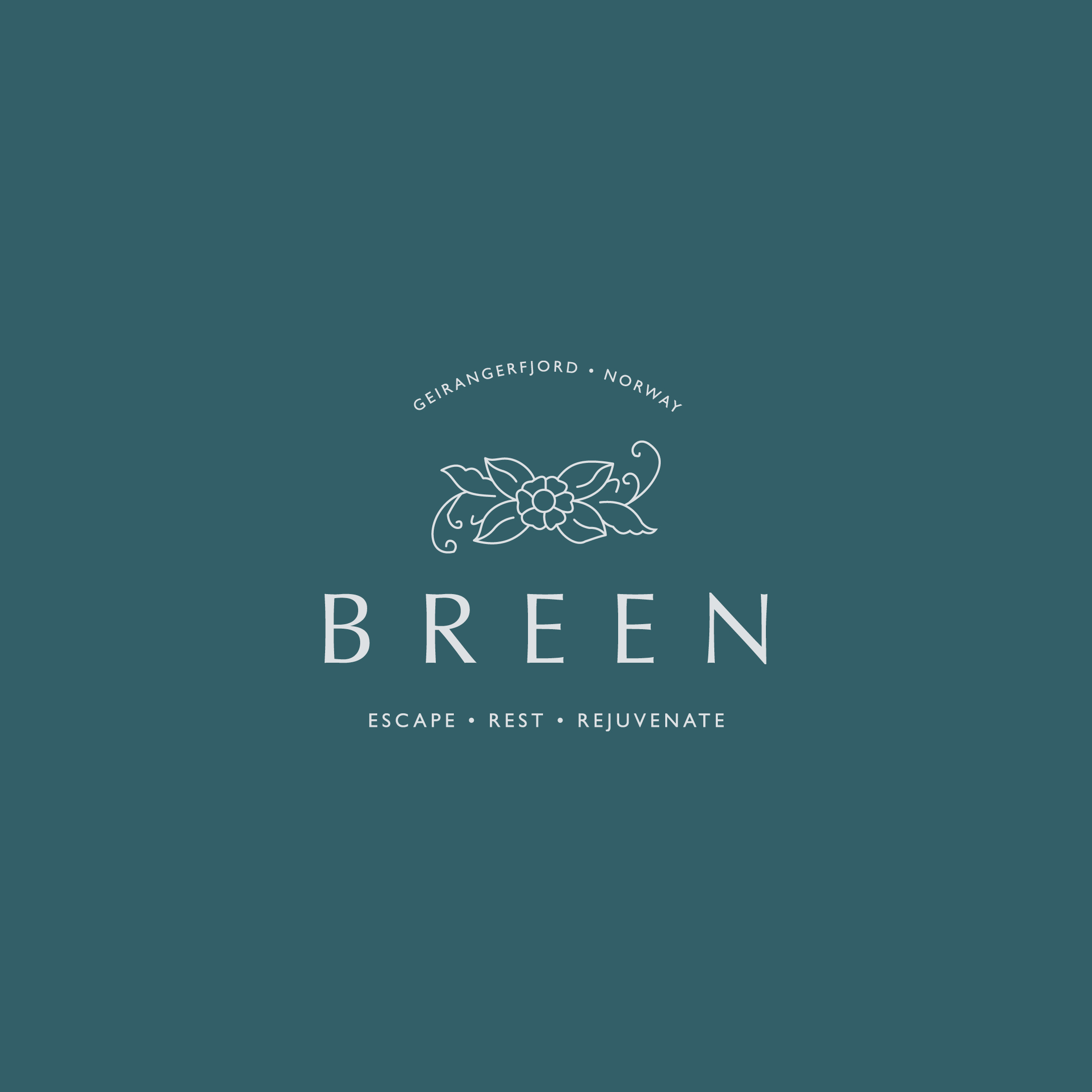
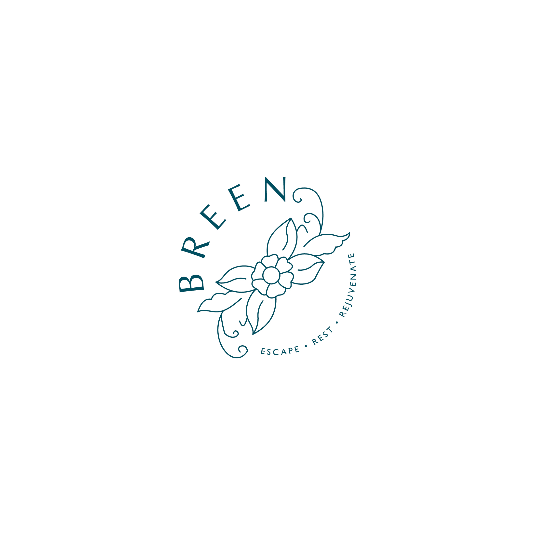
For BREEN, I wanted to create a simple logo with an understated sense of style and flair; reflecting a personal and deeply intimate hotel that feels like a rather spoiling home from home.
In order to help the hotel stand out from the competition, I’ve moved away from the stereotypical stripped back Scandi style. Instead I’ve taken inspiration from the traditional decorative craft of Rosemåling – and created a nature inspired design motif.
Paired with simple, stylish typography this gives the overall look an understated air of luxury about it, without being stark or ostentatious. It is also empathetic with the strong sense of responsibility for the location and the certified sustainable destination status.
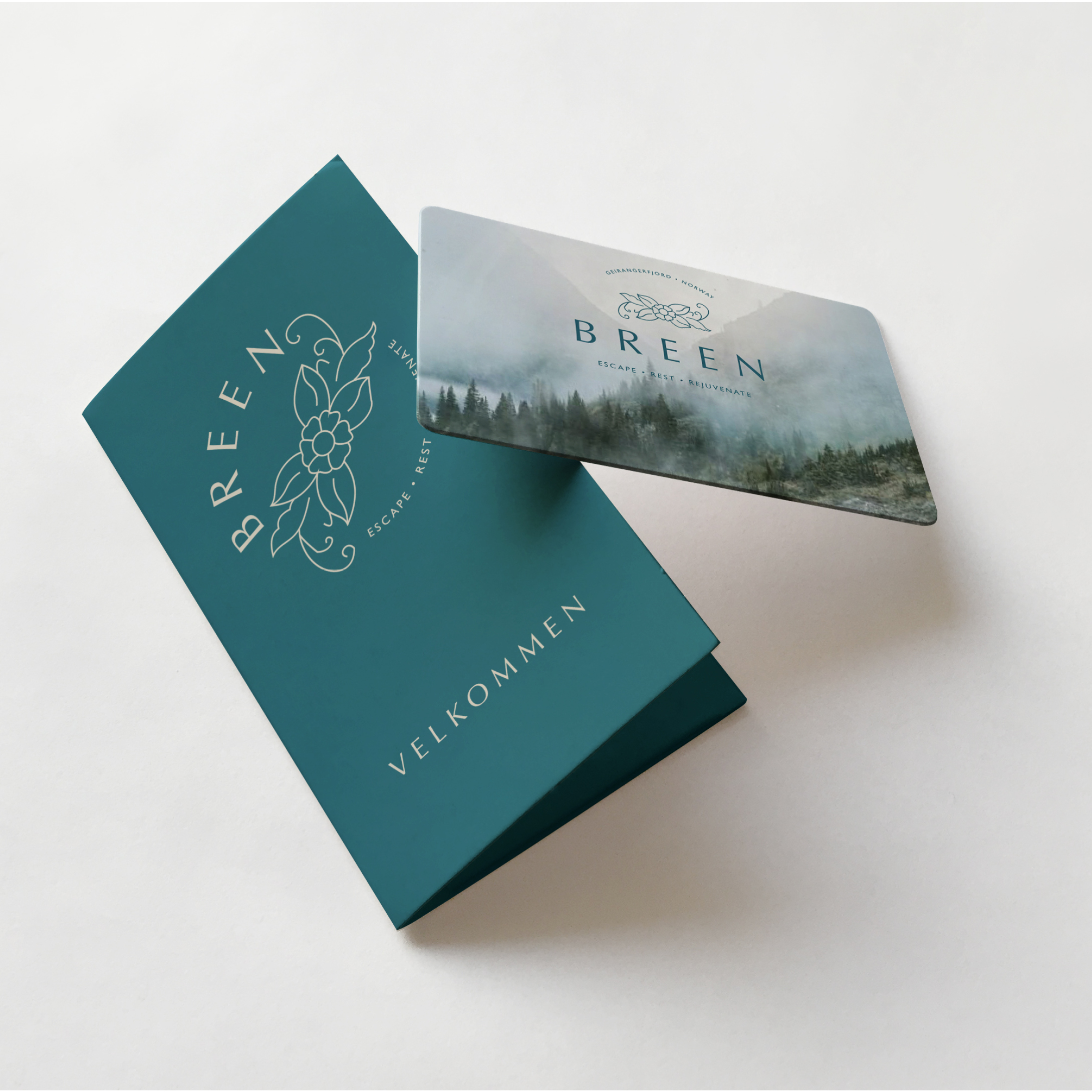
Mockups are where your new brand identity really begins to come to life. They allow you to see your new identity in action and allow you to think big about your business.
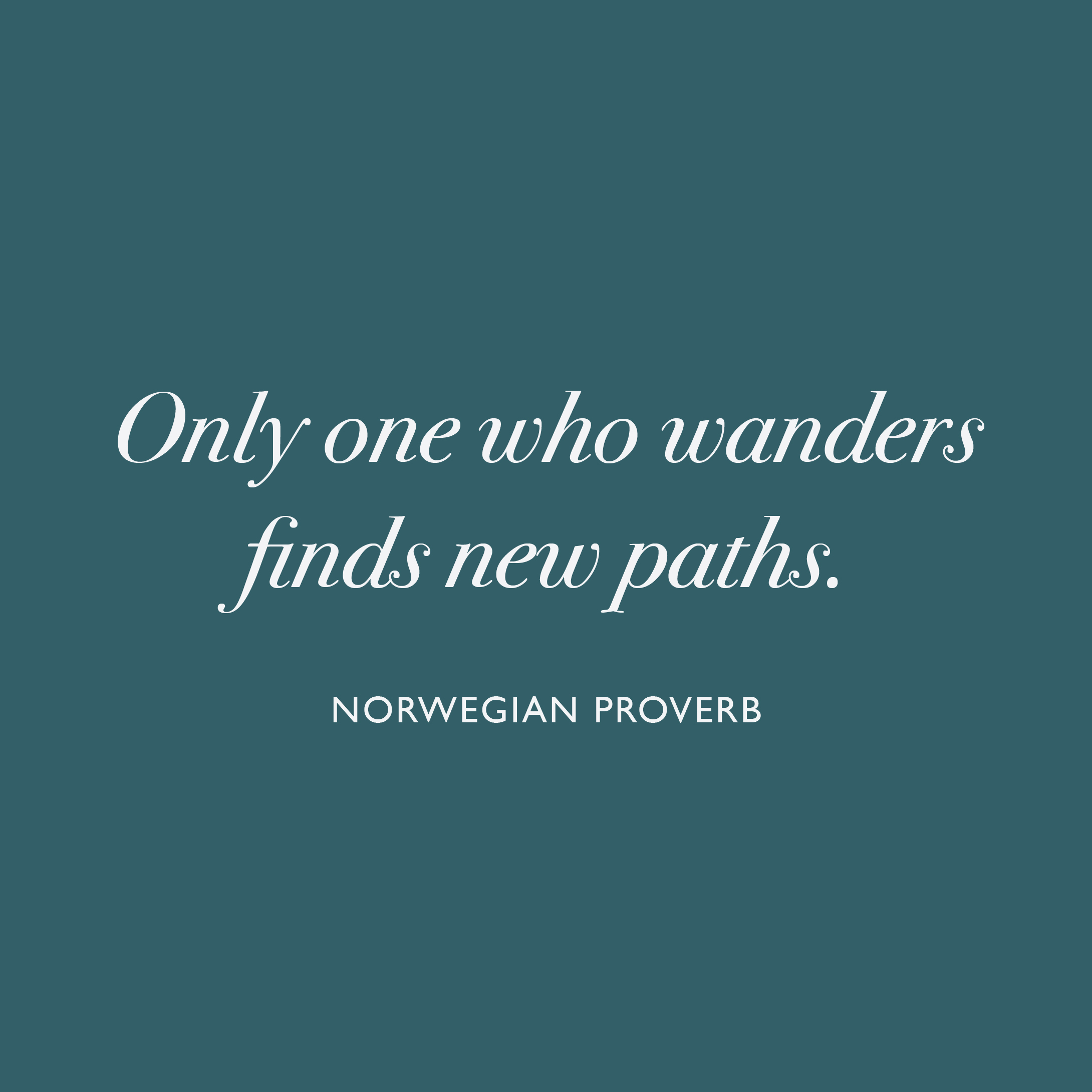
When I create a mood board I love to include a quote or saying, which is relevant to the brand I am working on. I use them to evoke a feeling, but also to showcase a beautiful typeface – in this instance Bodoni 72 Oldstyle Italic – isn’t it just gorgeous? Just look at that lower case “s”
This Norwegian proverb is not only relevant to the clientele of BREEN, but I also think it perfectly sums up my journey on ELEVATE.
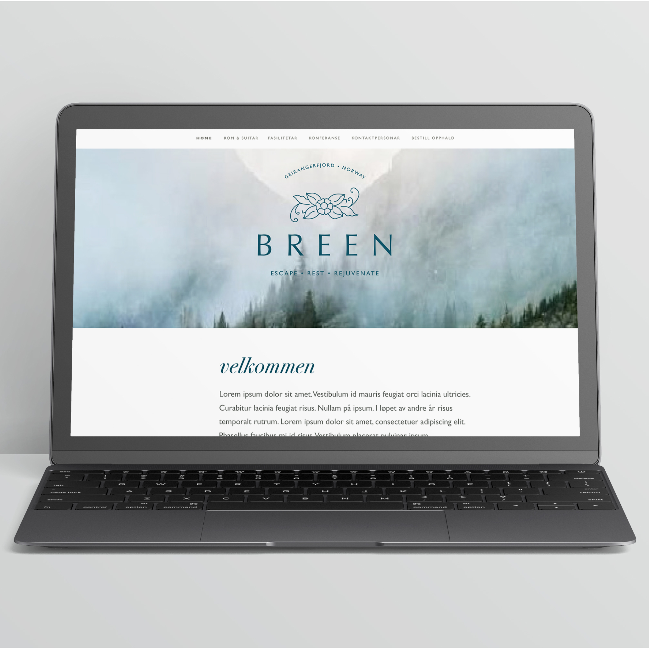
Keeping the look and feel of your brand consistent will stop your overall brand message from becoming weak and diluted. This is why it can make commercial sense to get your brand designer to work on any future design elements and brand collateral – after all they’ve invested almost as much time and effort as you have, getting to know the why’s and wherefore’s of your business, and creating a beautiful brand identity that you can be proud of. That “inside” knowledge could just prove to be invaluable for your business. This image illustrates this in a way that words simply can’t . . .
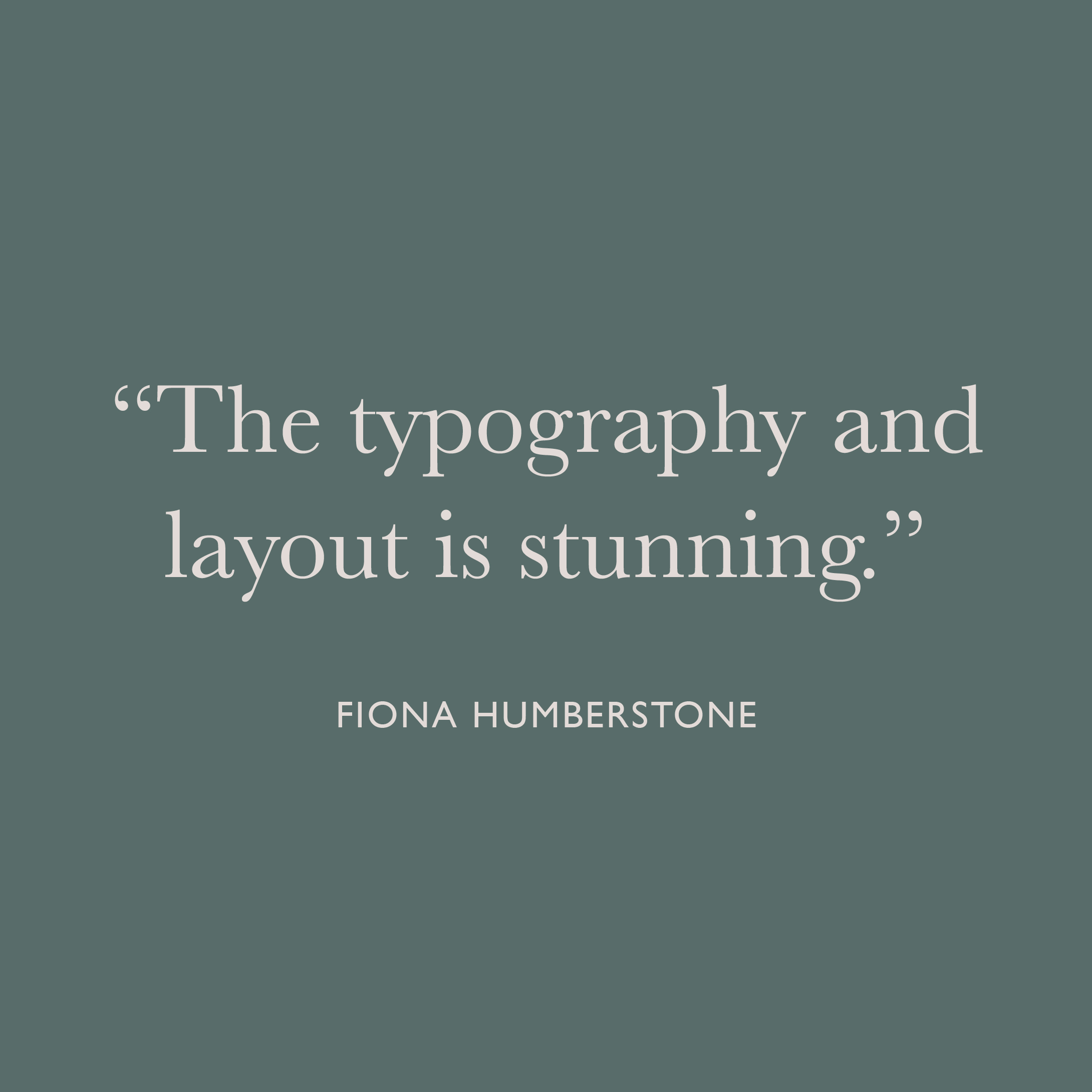
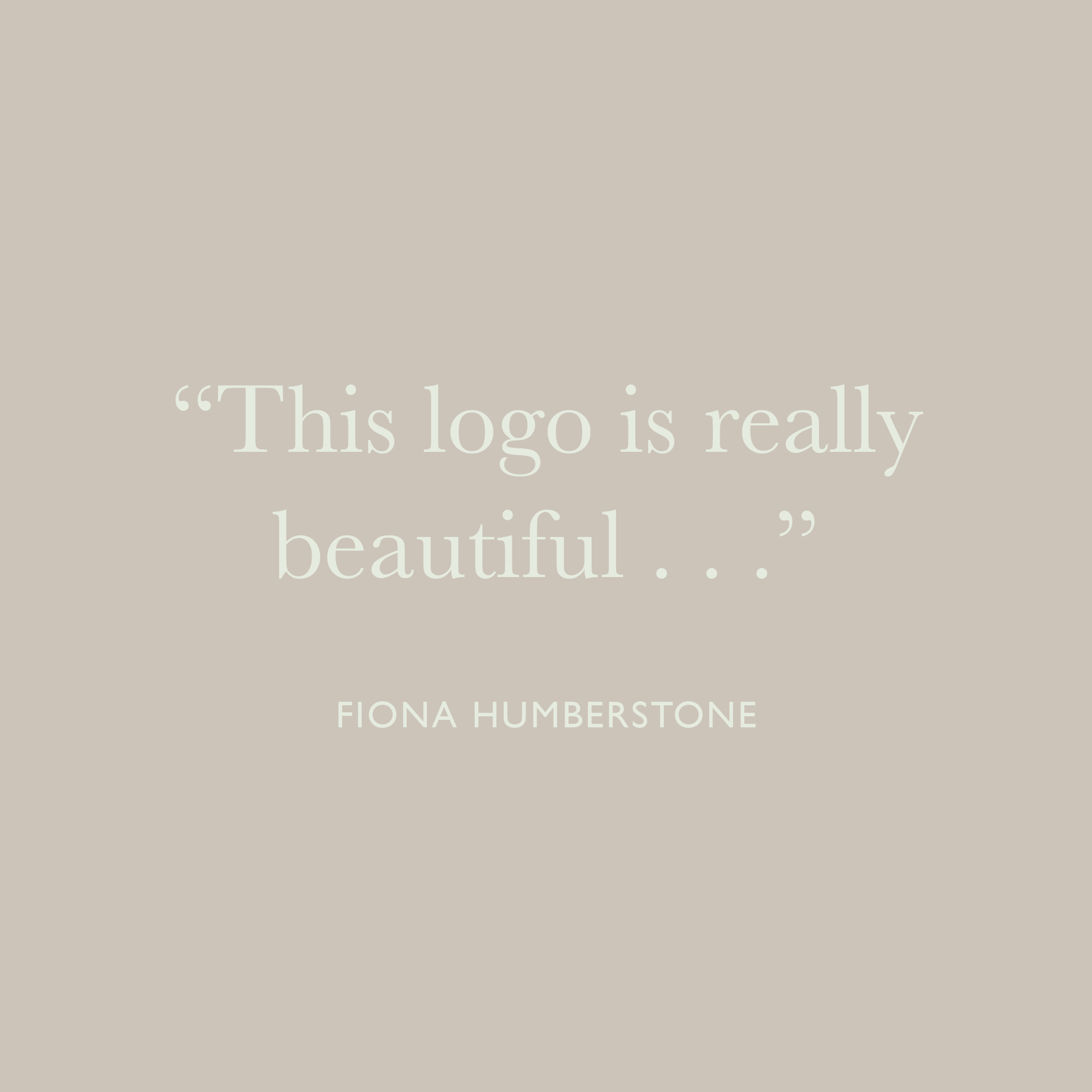
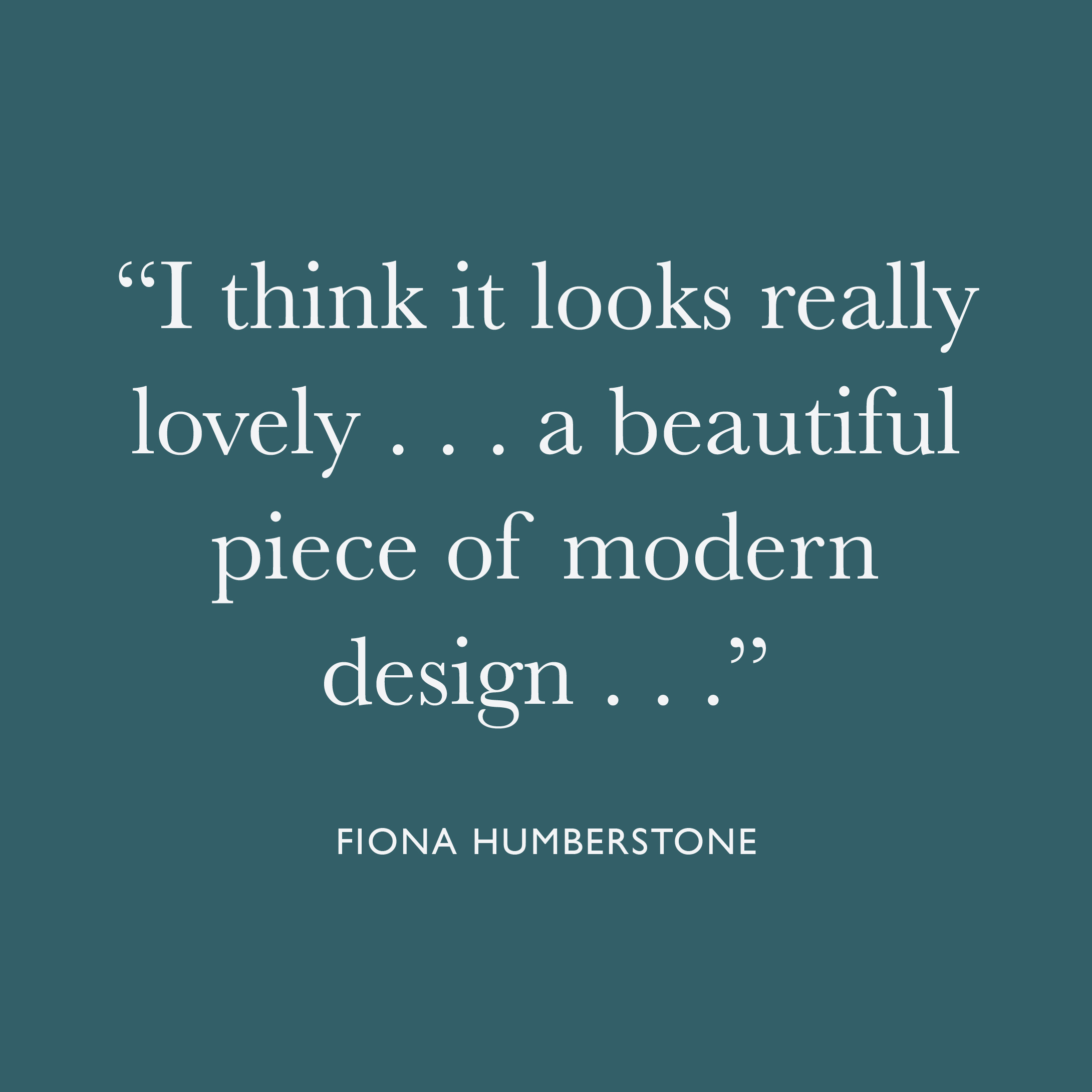
Wow, great praise indeed! For me, one of the most useful things throughout ELEVATE with Fiona, was the constructive feedback.
When you work for yourself it can sometimes be difficult to “see the wood for the trees”, so having the opportunity to have someone of Fiona’s calibre cast her expert eye over my work and give constructive feedback was truly invaluable. Her attention to detail is infinite, and having her push me just that little bit further to do my best work, was exactly what I needed in order to elevate my business, so that I can elevate yours.
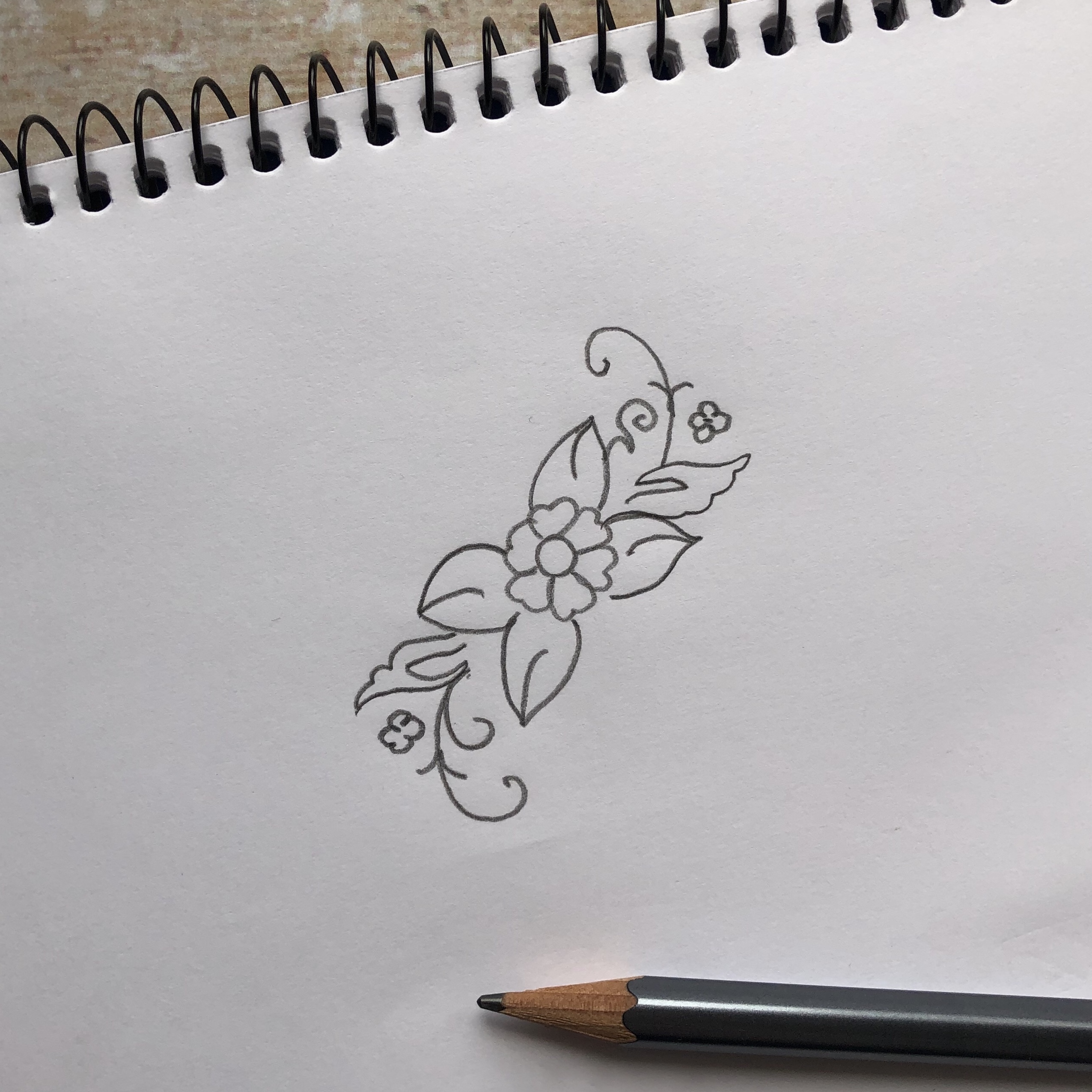
Behind every beautiful brand identity, there is a rough pencil sketch – what can I say, I’m just an “old-fashioned” kind of girl! I always begin each branding project by sketching some rough ideas with pencil and paper – this slow, hands-on approach gives me the space and time to work in an intuitive manner. At this stage it’s not about creating anything perfect, but more of a means to explore the different ideas and get them out onto paper. Once this stage has been completed, I will get on the computer and start developing my ideas into a more polished brand identity which reflects your vision.
 For Elisha’s brand I took inspiration from her beautiful images and her love of being near the coast. The soft, muted colours are evocative of a late English summer: the gentle soft dove greys of water-worn beach pebbles, the whispery blues of early morning skies, the dusty greens found in the myriad of dune grasses and the deep teal, reminiscent of the dark depths of the sea. The traditional serif font nods to heritage and adds an air of elegance and aspiration, while the sans serif font adds a touch of modern luxury.


 In order to give Elisha maximum flexibility with her new brand identity, I also created some alternatives which could be used through a variety of different physical and virtual publications and platforms.


 Elisha was delighted with the final results and her business is currently going from strength to strength! If you’re thinking of branding or rebranding your business I’d love to hear from you! Please get in touch here


Recent Comments