13 May 2020
SAMPHIRE, CORNWALL
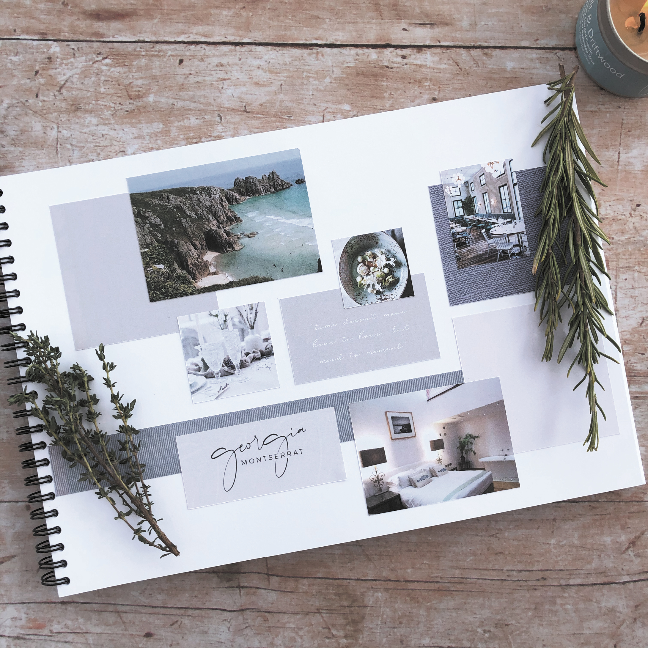
For my second ELEVATE with Fiona Humberstone project, I selected SAMPHIRE, a restaurant with rooms located in the wilds of Cornwall. I totally fell in love with Cornwall after just one visit – I loved the romance of the wild, rugged scenery, the gorgeous coastal colours and also the connection between food and nature which is so prevalent there. This brief really spoke to me – for me there was absolutely no other choice! So, after completely immersing myself in all things Cornish (and foody!), I created a concept which I was proud of. Here is the mood board which reflects the design direction I was heading in.
So, let the detective work commence! A good client brief will provide your designer with background information about your business, the direction you would like to take it in, and what it is that sets you apart from your competitors. The trick to being an intentional designer however, is being able to detect which bits of information are essential to determining the impact that your brand needs to create. Like any good detective story, there are likely to be twists and turns in the plot line, but with time and my expertise, I can help guide your brand in the right direction.
The key to it all is being able to distill the essence of your brand down to three brand characteristics, these will then become the starting point of creating an intentional brand identity which you can be proud of.
Shown here are the brand characteristics for SAMPHIRE.
We learnt more about the magic that colour psychology can bring to our work and how it allows us to create more intentional brand colour palettes for our clients projects.
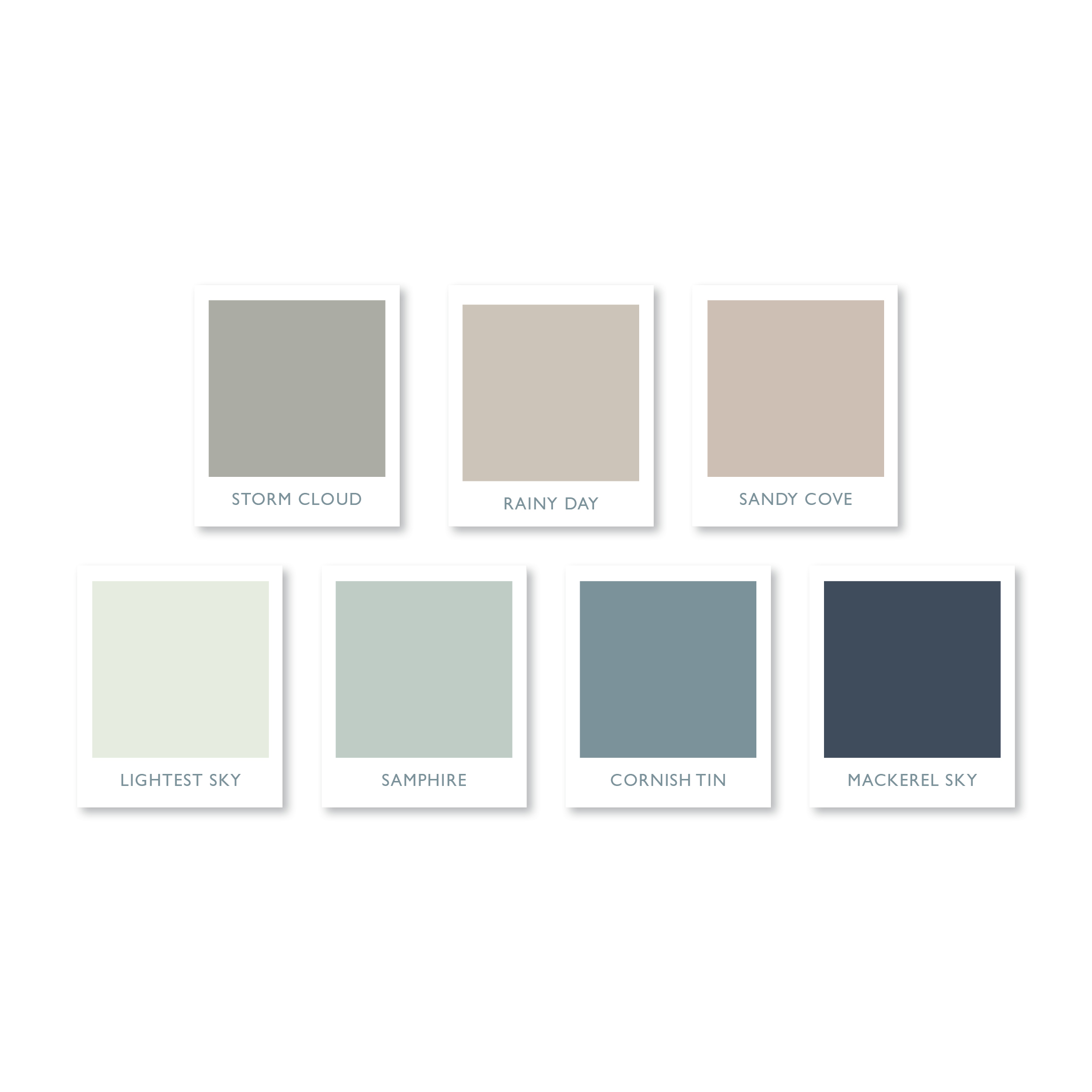
This gorgeous understated colour palette is the one I created for SAMPHIRE, a restaurant with rooms in the wilds of Cornwall. It combines soft, muted colours, inspired by the rugged Cornish landscape and the exquisite littoral light famed for centuries by artists. Call me an old romantic, but I find that naming the colours, in a way which complements my clients’ brand, helps to forge a stronger connection and brings them to life in a way that a mere Pantone reference or hex colour code just can’t rival.
It’s no secret that I love a quote! I am also very fond of a gorgeous typeface, and if it’s a handwritten one, then that’s it, I’m totally smitten!
Fragile Script, which I used for the SAMPHIRE brand evokes just the right feeling of elegance, and when paired with an understated serif typeface, Bodoni 72 Smallcaps Book, it creates a typeface marriage made in heaven.
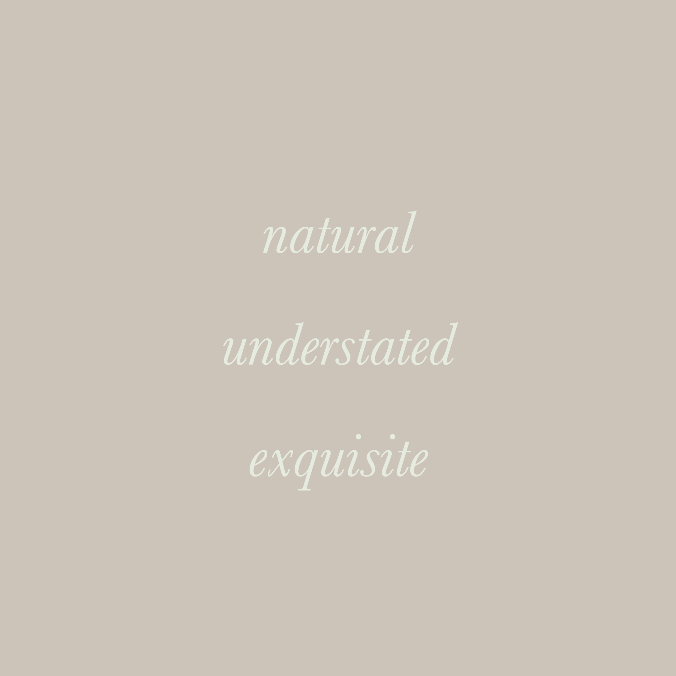
For SAMPHIRE I wanted to create a simple typographical logo with a natural, understated and exquisite feel. It reflects the connection between food and nature, which has ensured that this stunning restaurant has become a destination restaurant in the truest sense of the word.
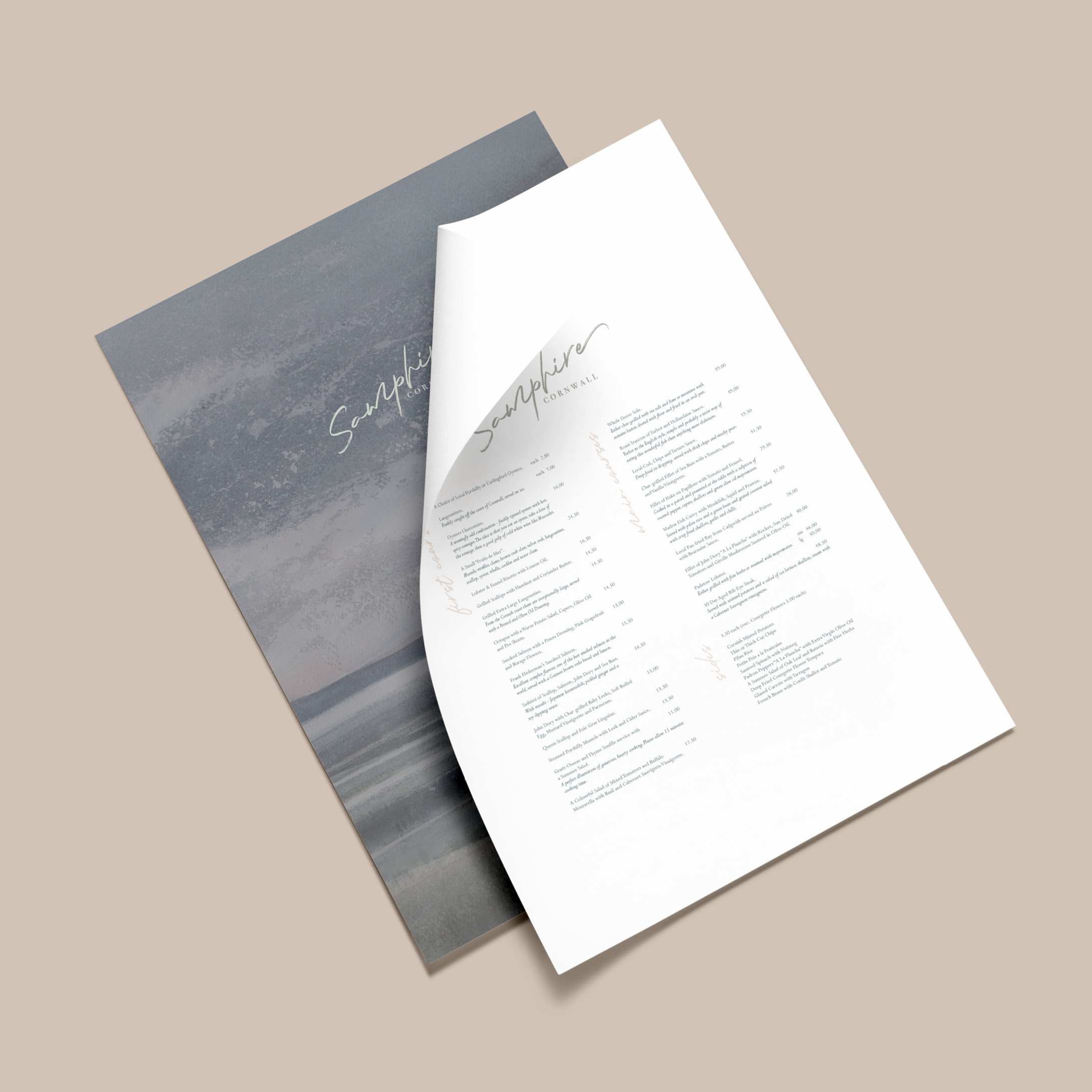
Here is the gorgeous menu I created for SAMPHIRE – one which is worthy of a Michelin star restaurant. I do love to go the extra mile for my clients by creating mockups – this means that I can really make their new brand identity to come to life.
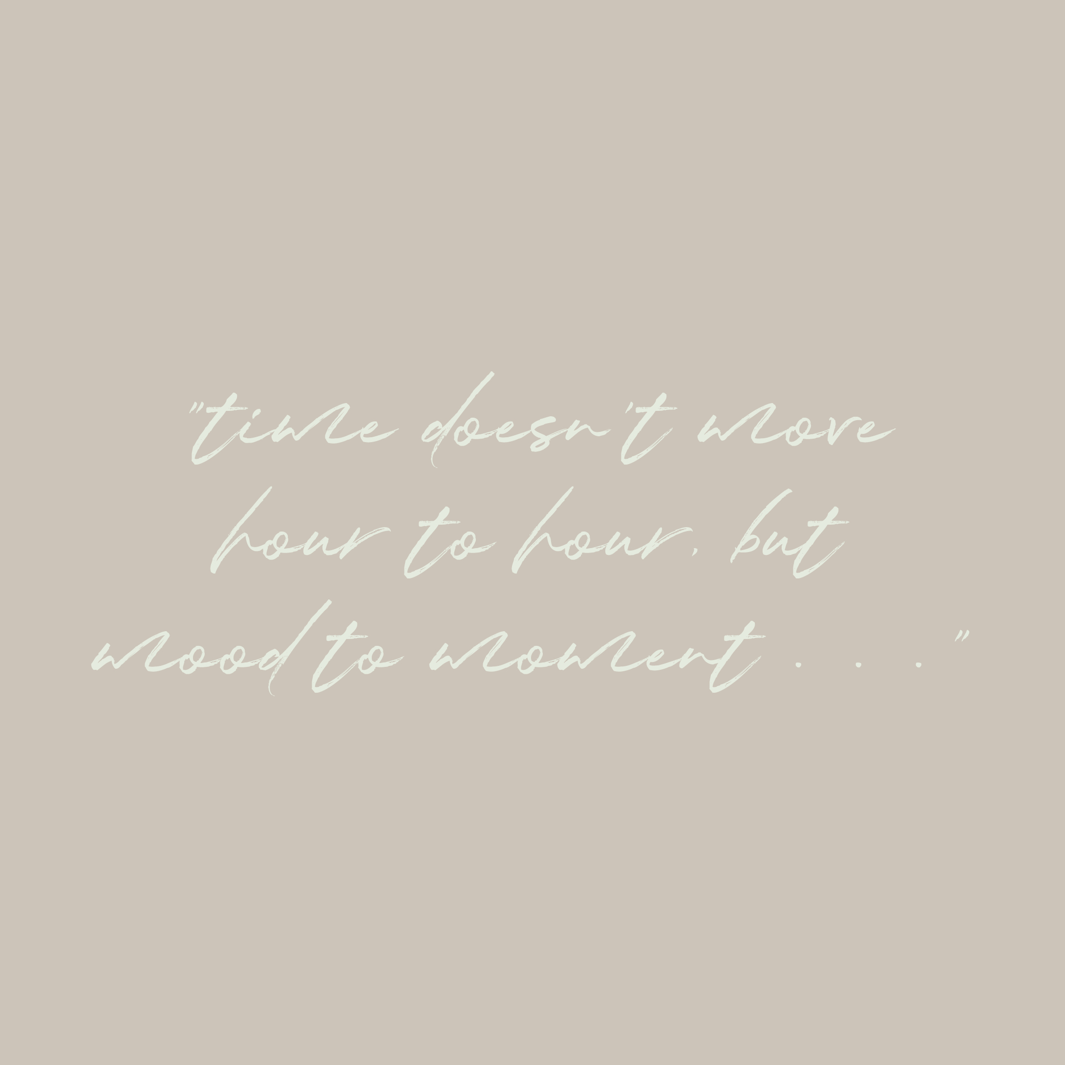
Showcasing your new identity in action allows you to think big about your business, and can open up all sorts of possibilities, which you had only dreamt about . . .
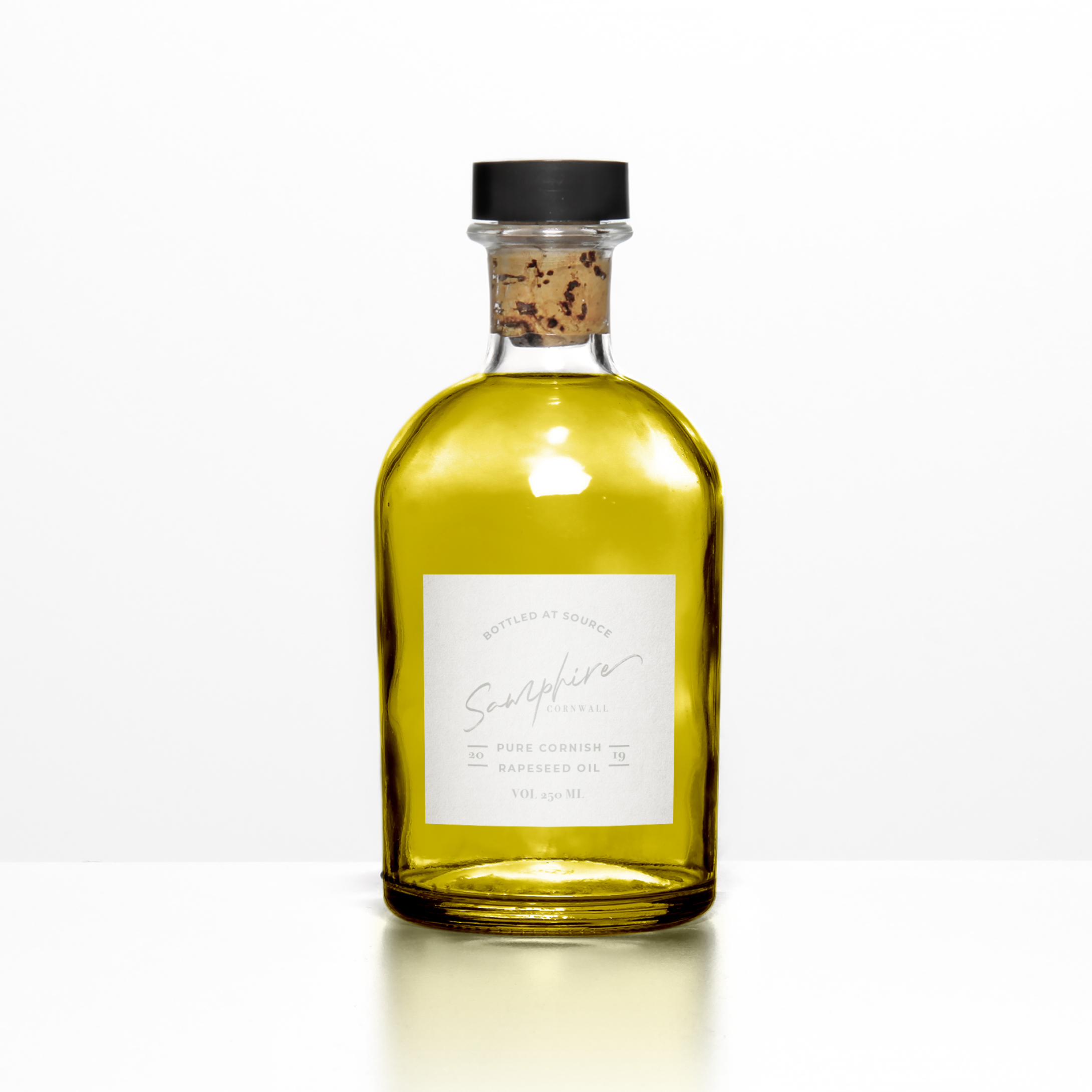
The devil is in the detail . . . This may look like an ordinary bottle of olive oil, but it is in fact a bottle of Cornish rapeseed oil!
The ethos of SAMPHIRE’s Michelin starred chef is to create simple, but exquisitely presented food, such as his signature dishes including samphire and seaweed, seasonal Cornish fish and vegetables charred on the Josper grill. Where possible, everything is sourced within a 25 mile radius of the restaurant, with the emphasis on local seasonal produce.
At the moment, Cornwall isn’t renowned for producing olive oil (although attempts have been made!), however, rapeseed is grown on the rich, fertile soils of the North Cornish coast, which meets his criteria for celebrating home grown produce beautifully.
Even after all these years, I still get really nervous when I present my work to clients. Have I fully understood their hopes and dreams? Does the mood board illustrate this with clarity? Are the colours and fonts, which I have carefully hand picked, right for where their business is heading? Have I created my best work? Will they actually like it? Gosh, it’s all just soooo stressful!
Taking part in the Elevate mentoring programme with Fiona Humberstone, has given me a fantastic opportunity to grow my creative process and have faith in my ability to design beautiful, modern brand identities. It hasn’t eased all of my fears and worries, I’ll always have those, that’s just human nature, but it has given me the confidence to know that within me I have the skill and the creativity to help elevate my clients businesses in an intentional way.
13 May 2020
BREEN, NORWAY
Recently, I took part in ELEVATE (a six week mentoring programme for brand designers committed to excellence) with Fiona Humberstone, The Brand Stylist.
Every two weeks, Fiona released three very different, inspirational (but alas, sadly fictional!) client briefs from which we had to choose one to work on. We then had a very tight timeframe of one week in which we had to develop and deliver our initial design concepts. This work was reviewed by Fiona, who in her role as creative director, gave us constructive feedback. We then had another week in which to refine the work into a finished portfolio piece.
For my first project, I selected BREEN, an exciting new Norwegian boutique hotel, located at the edge of one of Norway’s most majestic fjords – the deep blue Geirangerfjord. So, after completely immersing myself in all things Norwegian, I created a concept which I was proud of. Here is the mood board which reflects the design direction I was heading in.

Sometimes, being a brand designer is a little like being a detective! You have to go through the client brief with a fine tooth comb, picking up on the vital “clues” – the essential pieces of information about your client’s business – and weeding out any red herrings which have been placed to throw you off track!
Once you’ve completed this stage you will have three to six key brand characteristics, which become the cornerstones to being able to create a brand identity with intention for your client.
Shown here are the brand characteristics for BREEN:

Each and every colour, has within it, the magical power to make us “feel” something.
Learning more about colour psychology in branding was a real game changer for me. It will allow me to create a more intentional colour palette for your brand, which will connect with your muses at a deeper, more subconscious level, faster than words or images ever could.
This limited colour palette is the one I created for BREEN, an exciting new Norwegian boutique hotel. It combines soft, natural colours, inspired by the lush vegetation, waterfalls, astonishing mountains and feather light mists found in the beautiful surrounds.

For BREEN, I wanted to create a simple logo with an understated sense of style and flair; reflecting a personal and deeply intimate hotel that feels like a rather spoiling home from home.
In order to help the hotel stand out from the competition, I’ve moved away from the stereotypical stripped back Scandi style. Instead I’ve taken inspiration from the traditional decorative craft of Rosemåling – and created a nature inspired design motif.
Paired with simple, stylish typography this gives the overall look an understated air of luxury about it, without being stark or ostentatious. It is also empathetic with the strong sense of responsibility for the location and the certified sustainable destination status.


Mockups are where your new brand identity really begins to come to life. They allow you to see your new identity in action and allow you to think big about your business.

When I create a mood board I love to include a quote or saying, which is relevant to the brand I am working on. I use them to evoke a feeling, but also to showcase a beautiful typeface – in this instance Bodoni 72 Oldstyle Italic – isn’t it just gorgeous? Just look at that lower case “s”
This Norwegian proverb is not only relevant to the clientele of BREEN, but I also think it perfectly sums up my journey on ELEVATE.

Keeping the look and feel of your brand consistent will stop your overall brand message from becoming weak and diluted. This is why it can make commercial sense to get your brand designer to work on any future design elements and brand collateral – after all they’ve invested almost as much time and effort as you have, getting to know the why’s and wherefore’s of your business, and creating a beautiful brand identity that you can be proud of. That “inside” knowledge could just prove to be invaluable for your business. This image illustrates this in a way that words simply can’t . . .

Wow, great praise indeed! For me, one of the most useful things throughout ELEVATE with Fiona, was the constructive feedback.
When you work for yourself it can sometimes be difficult to “see the wood for the trees”, so having the opportunity to have someone of Fiona’s calibre cast her expert eye over my work and give constructive feedback was truly invaluable. Her attention to detail is infinite, and having her push me just that little bit further to do my best work, was exactly what I needed in order to elevate my business, so that I can elevate yours.

Behind every beautiful brand identity, there is a rough pencil sketch – what can I say, I’m just an “old-fashioned” kind of girl! I always begin each branding project by sketching some rough ideas with pencil and paper – this slow, hands-on approach gives me the space and time to work in an intuitive manner. At this stage it’s not about creating anything perfect, but more of a means to explore the different ideas and get them out onto paper. Once this stage has been completed, I will get on the computer and start developing my ideas into a more polished brand identity which reflects your vision.

13 May 2020
As a creative entrepreneur, I am always working to improve my offering for my clients. So, at the end of last year, when Fiona Humberstone (aka The Brand Stylist) created Elevate – a mentoring programme for Brand Designers committed to excellence – I jumped at the chance. Fiona is such an inspiring brand consultant, best-selling author, and also a truly visionary entrepreneur, so getting the rare opportunity to work with someone of her calibre was a no brainer!

The premise of the programme was that over a six week period, Fiona acted as Creative Director and provided us with a carefully curated selection of nine visionary and inspirational design briefs from which to choose from, these would result in us creating three, perfectly honed portfolio pieces. We were given two weeks for each project, with two rounds of feedback from Fiona, in order to help us to elevate our processes, boost our creativity and enable us to produce more intentional, beautifully crafted work. Sounds simple, yes?
Well, let me tell you, it was intense and challenging, but thoroughly rewarding! Fiona truly is an exacting critique, and throughout the process we really had to dig deep, draw on our inner resources and respond with both perspective and professionalism. I learnt so much about myself, both as a person and as a designer. Already, I have seen the impact on my work – I can now more confidently take each and every one of my clients’ briefs and ensure that every element of the the brand identity has been designed with clarity, thoughtfulness and meaning, ensuring each client that they get the care and attention that they fully deserve.

Throughout the programme, I created three brand identities:
BREEN – An exciting new Norwegian boutique hotel, located at the edge of one of Norway’s most majestic fjords.
SAMPHIRE – A restaurant with rooms located in the wilds of Cornwall.
VILLA FLORES – An Italian retreat, located high on a Tuscan hillside.
I’ll share a little bit more about each individual project in due course . . .

13 May 2020
CHRIS JOHNSON ART
“Simplicity is the ultimate sophistication.”
LEONARDO DA VINCI
I’ve known Chris Johnson since I moved to the Island in 2016. Although I knew of his work before I met him – I’d seen his paintings hanging in the Cala d’Or Yacht Club.
Chris produces the most gorgeous, high quality paintings and drawings from his idyllic Mallorcan country studio. He wanted a brand identity which would elevate his beautiful artistic style and attention to detail of his future heirloom artworks. He was keen to build his recognition and reputation as a professional artist on an already thriving art scene. He also wanted to produced a Media Kit document, that could be sent out to potential clients, containing all the essential information they would require to know, if they chose to commission him to create a piece of artwork.
Chris did not have an existing brand identity, so after he completed my Brand Questionnaire, I got to work helping Chris stamp his personality on his new identity. To begin with I curated a beautiful, personalise mood board showing the overall design direction – which totally blew Chris away!

For his brand identity, I had the idea of using a hand written typeface, paired with an elegant serif font – which would convey the gentle, artistic style of his work. The gorgeous, soft colour palette references the colours which Chris uses in a lot of his work. In the end, we decided to use a digital version of Chris’s very own signature – now branding just doesn’t get more unique or personal than that!


Chris was delighted with the results, here’s what he said:

If you’re thinking of branding or rebranding your business I’d love to hear from you! Please get in touch here.
29 Oct 2019
I’m naturally camera-shy! I feel really uncomfortable having photos taken and I always think that the photos always look fake and well, just not like me at all! Then I met Katie (Katie Spicer Photography) . . .
We initially met at The Brand Stylist’s four day Retreat at Cal Reiet and Katie was the official event photographer. Over the next four days, Katie would be hovering around in the background, silently doing her thing, like the photography ninja that she is! In the evenings at dinner, we chatted and immediately hit it off, she was just so lovely and had that special way of putting you at ease.
When I saw the photos which Katie had taken at the Retreat I was blown away – Katie had managed to perfectly capture the mood and feeling of the Retreat. There were even some photos of me, which I actually liked – they just looked so natural!
I’d just finished rebranding my business as Tranquilo Creative and my next challenge was going to be the website. I knew that I was going to have to “grasp the nettle” and get some professional brand photos which I could use for that, and my other marketing collateral – I needed a photographer that I could trust, and feel comfortable with. I’d followed Katie on Instagram since I met her, and after a chance remark, I joked about how I wished she could come to Mallorca to take my photos – her reply was: “well, I don’t see why I can’t!”

So after a couple of months of careful planning (on both our parts!) – everything from shot lists, locations, prop lists, outfits, flowers, etc. – we manage to arrange a shoot date. Soon, I found myself en-route to Palma airport to pick Katie up for my first ever brand shoot! Yikes!
That night we went out to a local restaurant for dinner – we laughed and chatted just like old friends – it was then that I knew that I had made the right decision to pick Katie to be my photographer.
The next morning we begun shooting in earnest. This was where my fastidious Virgo pre-planning worked a treat – I had a detailed list of the shots that I wanted, and Katie brought her “magic” to make them happen. She was just so easy to work with – we joked and chatted throughout the shoot, and Katie gave me directions of which way to look, to turn, to smile. I felt immediately at ease, which I don’t normally do in front of a camera – in fact, I began to forget that there was even a camera there!
We whistled through the shot list that day, and after ending the day with a sunset shoot in my friends’ gorgeous garden, we out again for dinner and a large gin to celebrate me getting over my fear of the camera!

The next morning, we awoke early and headed off to Mondrago beach for some early morning shots – it was perfect – the beach was just so quiet and tranquil. Then after breakfast, we shot some of the final close up images on my terrace, before it was time to head back to the airport with Katie.
It really was a whirlwind couple of days, and believe it or not, I thoroughly enjoyed it. I think you’ll agree, that Katie did a fantastic job with my photos – many of which are dotted throughout this website. All I can say is, for those of you out there who are also camera shy and considering doing a brand shoot, just do it, your business will thank you for it.

Recent Comments